
BABY BEAR
CLIENT
Tara homemade d.o.o.YEAR
2023SERVICES
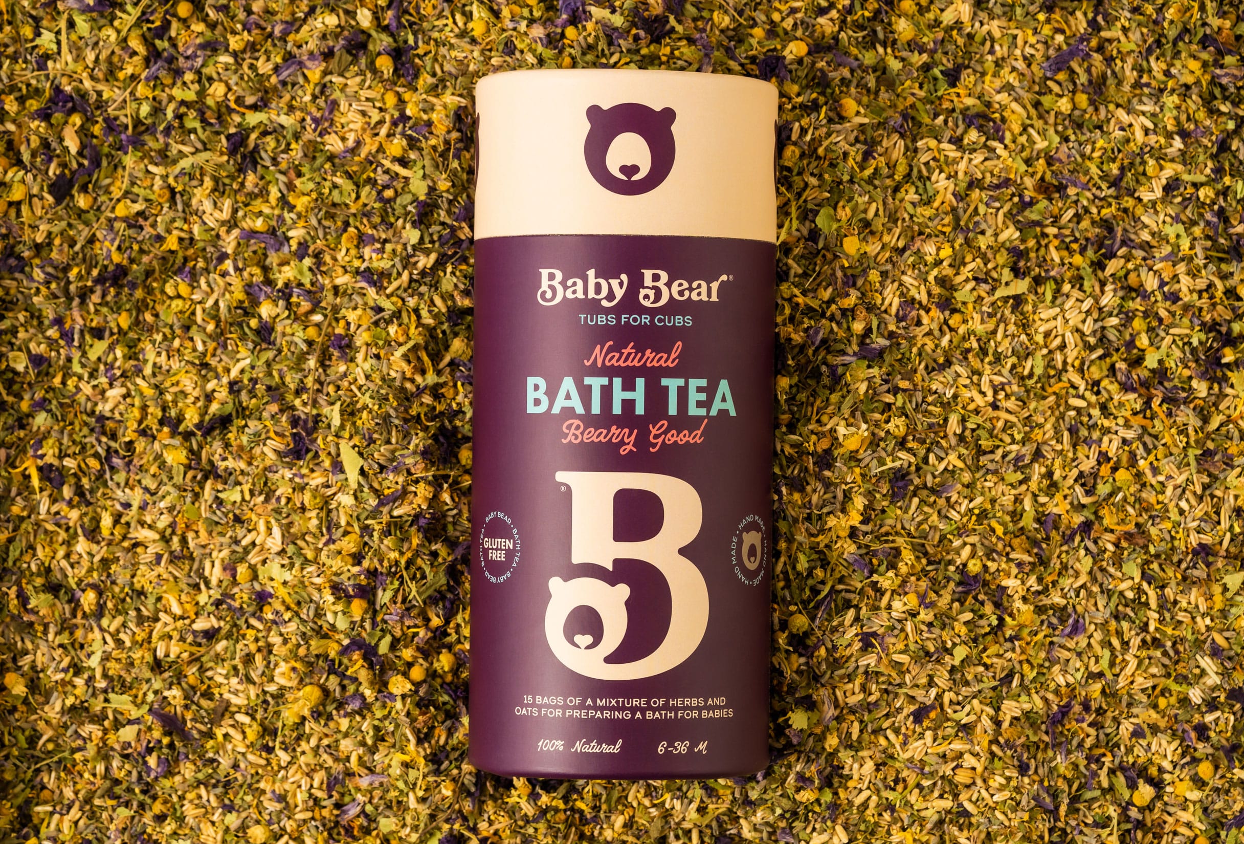
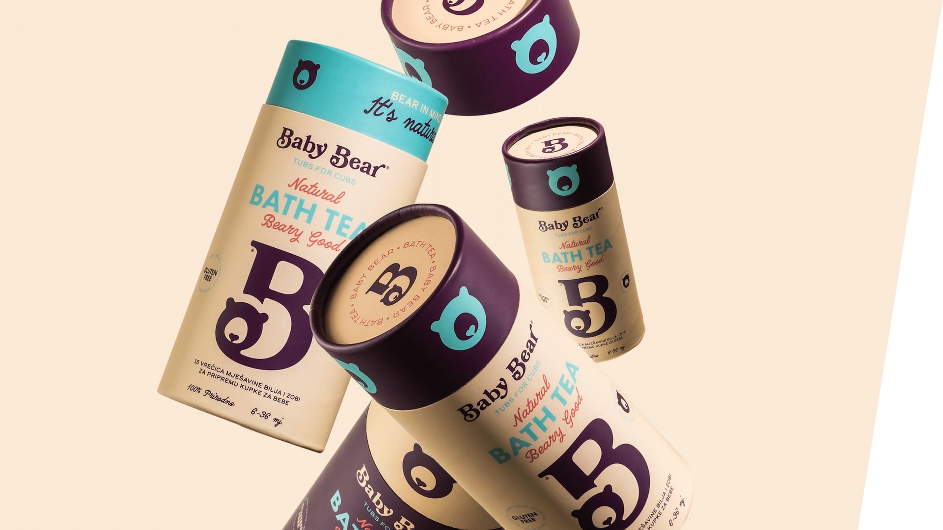
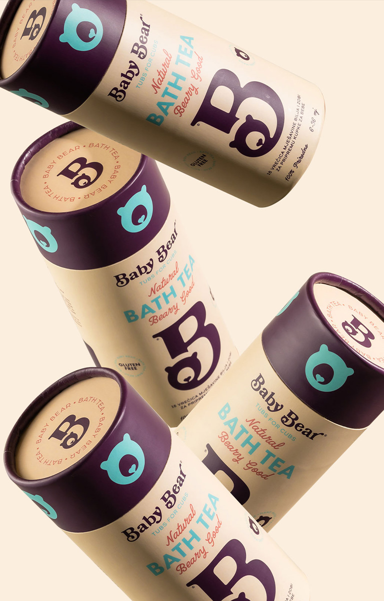
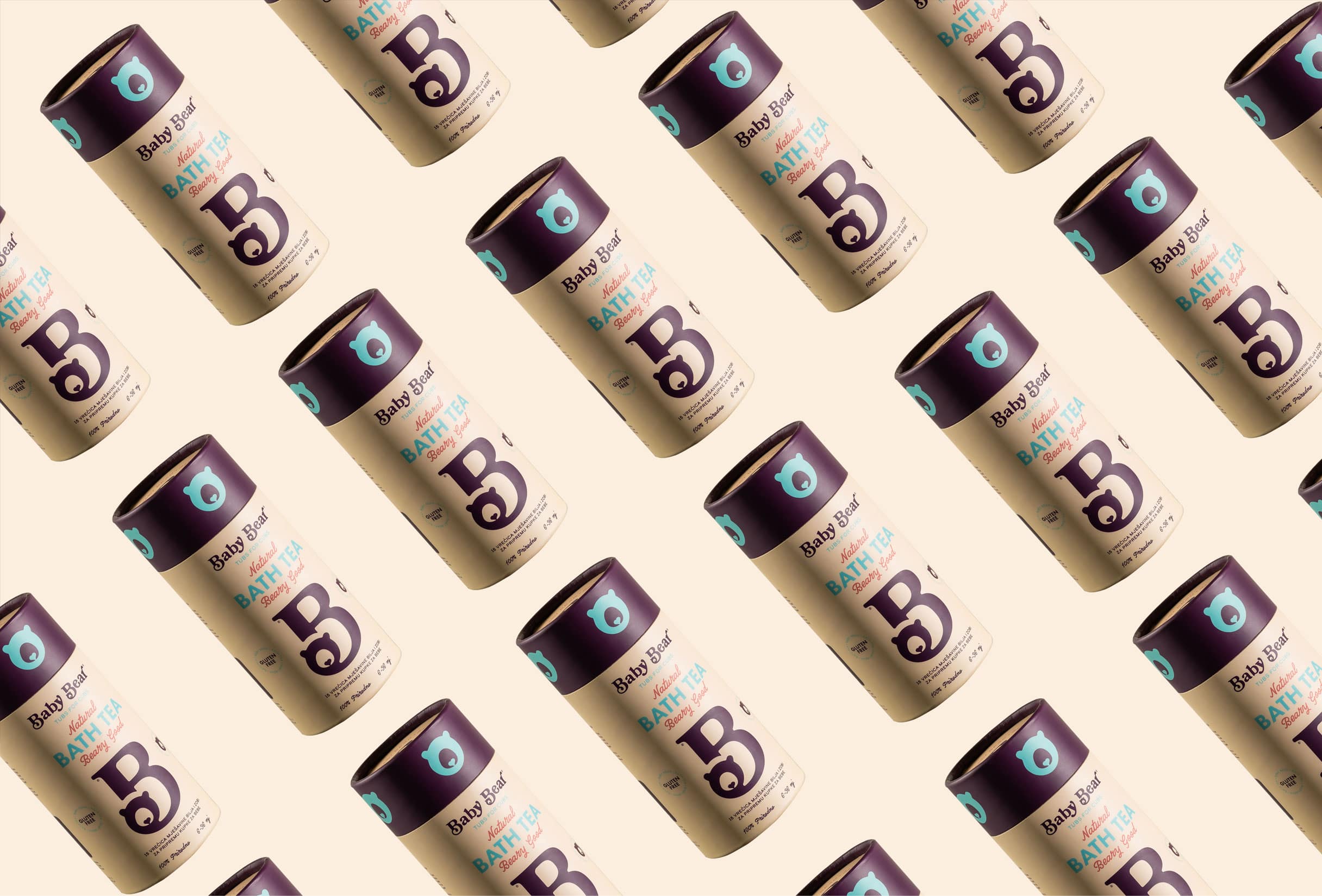
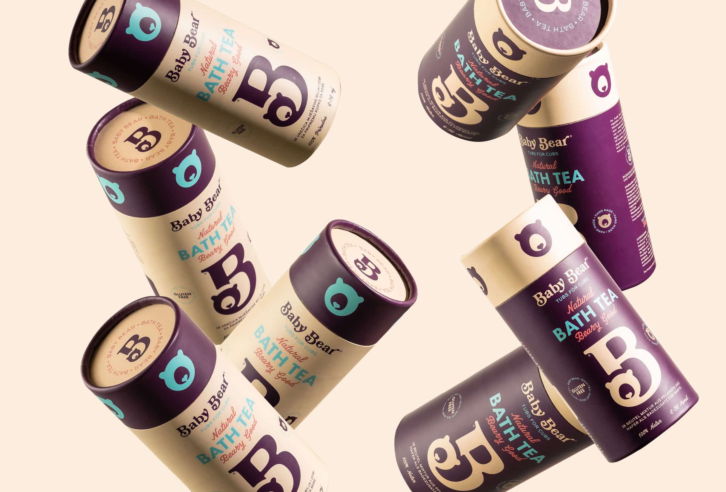
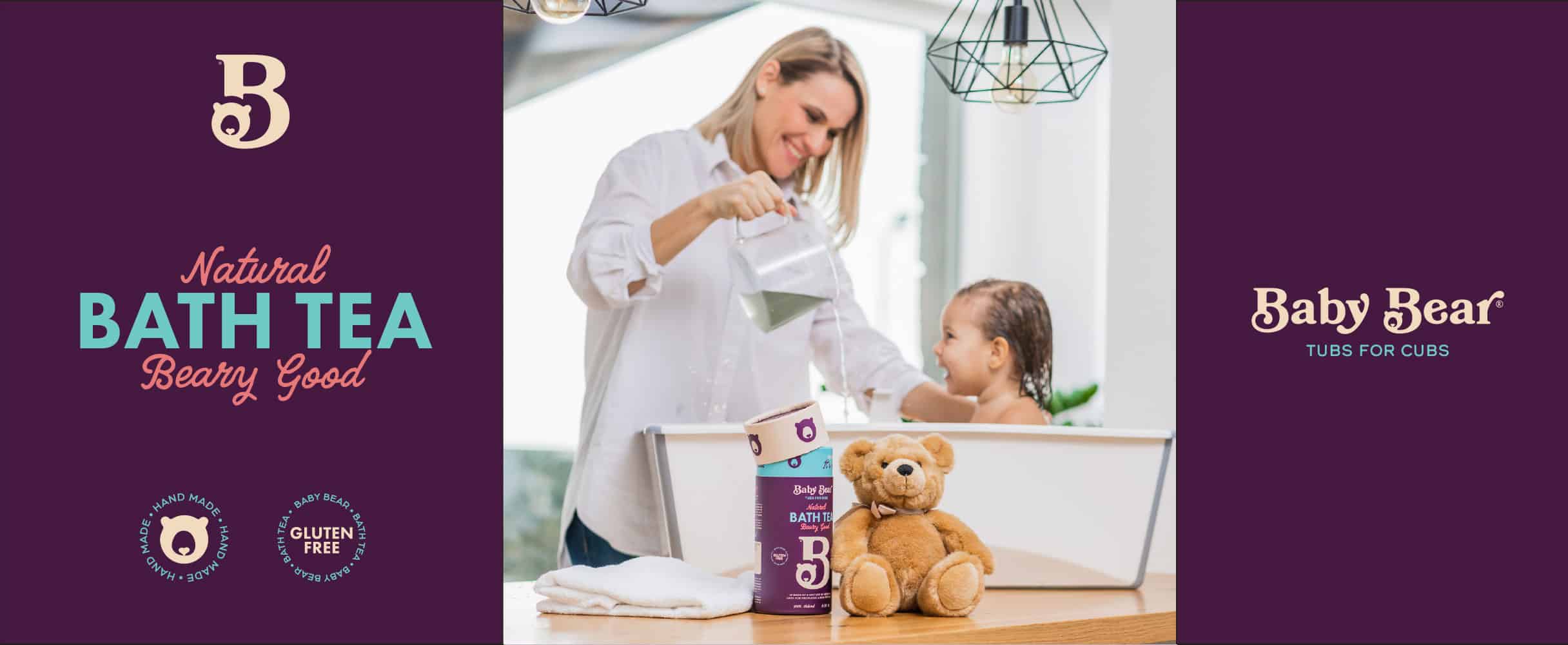
Branding Verbal identity Visual identity / packaging WebsiteBaby Bear is a herbal bath for babies with a protective, soothing and nurturing effect, created after many years of dedicated work and cooperation with experts in the fields of paediatrics, dermatology and phytotherapy. It is made according to a unique recipe: a completely natural mixture of six flowers, one leaf and one fruit.
Verbal identity
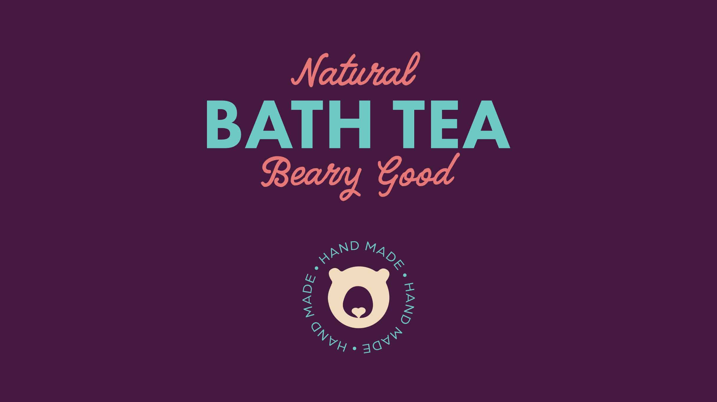
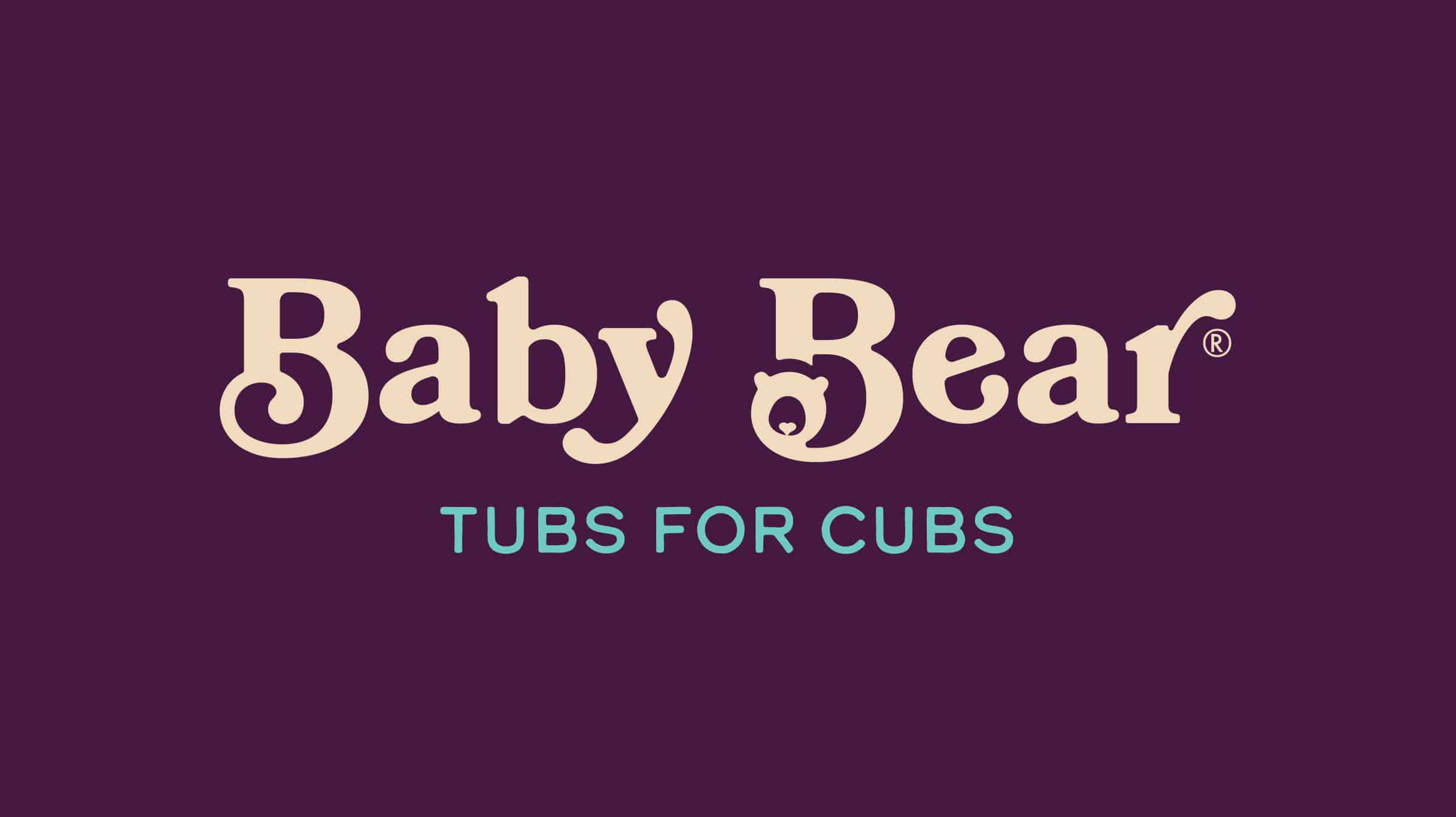
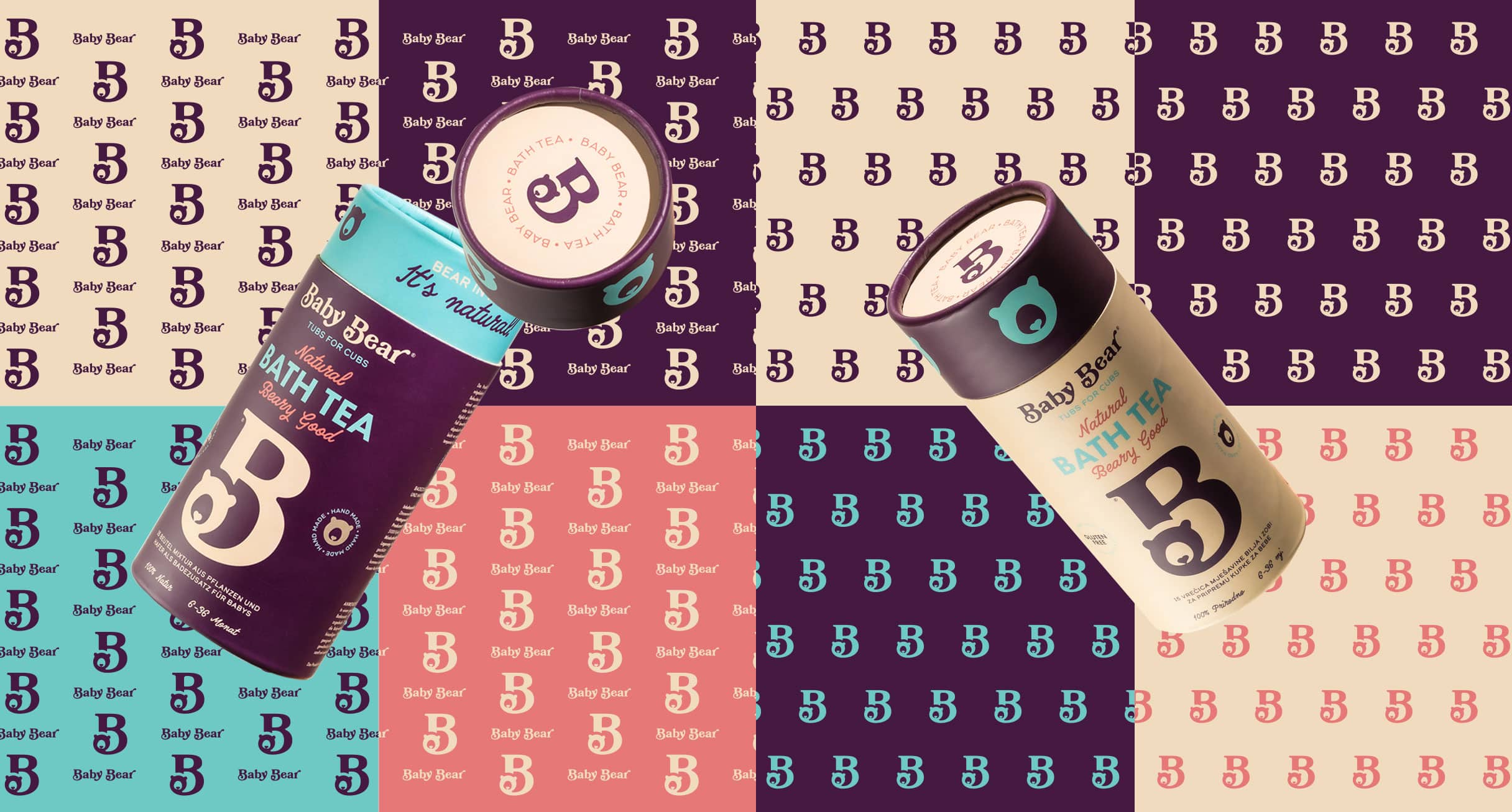
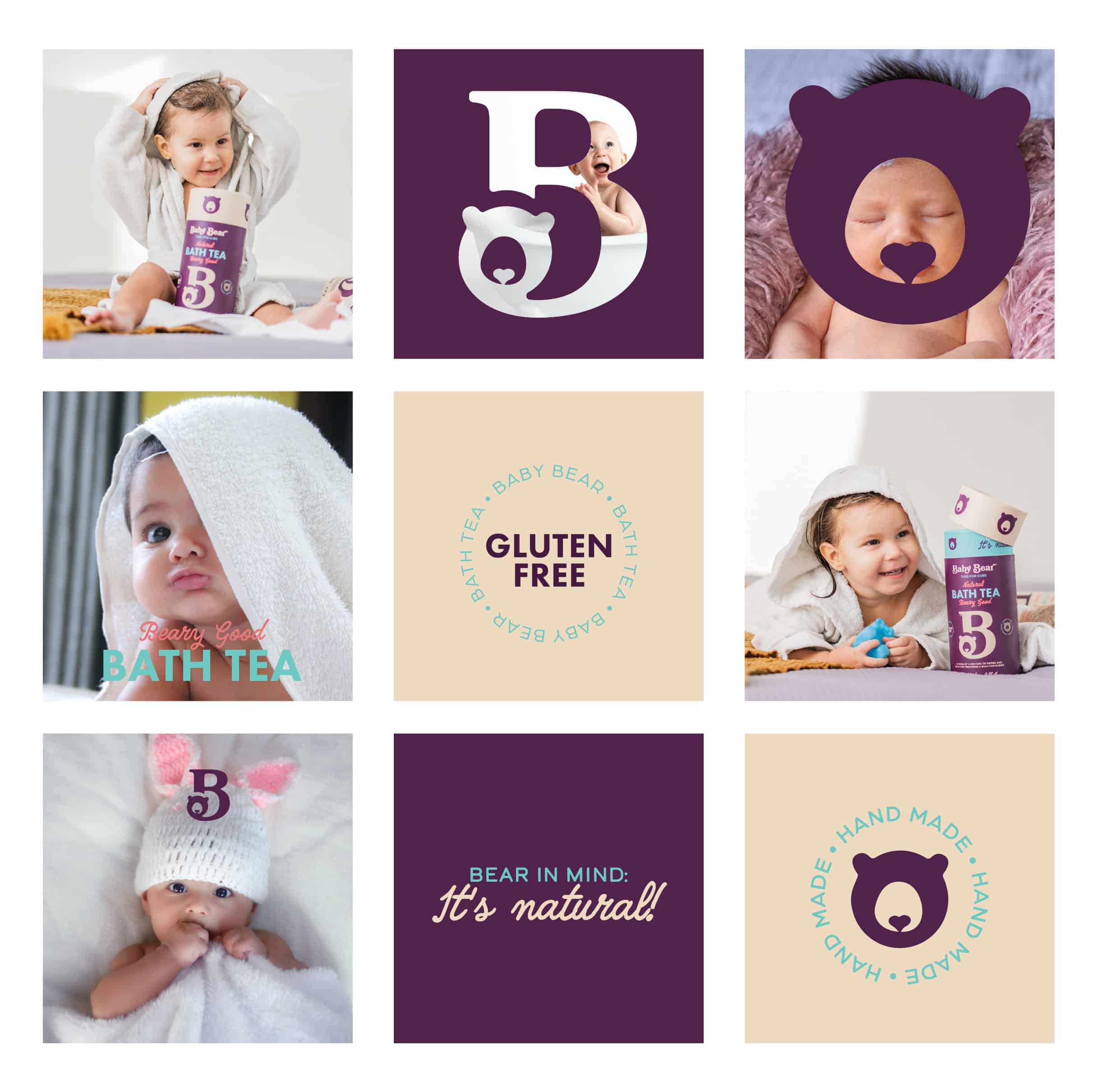
We wanted to emphasise the natural origin of the product, so instead of plants, we placed an animal in the brand name - cute and cuddly, growing under the watchful eye of its mother - prepared to do her best for her cub. The inspiration for the brand’s name came from the symbol of everyones childhood - a teddybear. This toy represents a true friend of every child and is immediately associated with a warm and gentle hug, comfort, safety and love.
Baby Bear is a playful name that immediately indicates that it is a product for children. In addition to the educational part, its goal is to bring the product closer to customers in a fun way. The name and signature are accompanied by modern communication through word games that convey brand messages in a memorable way.
Visual identity / packaging
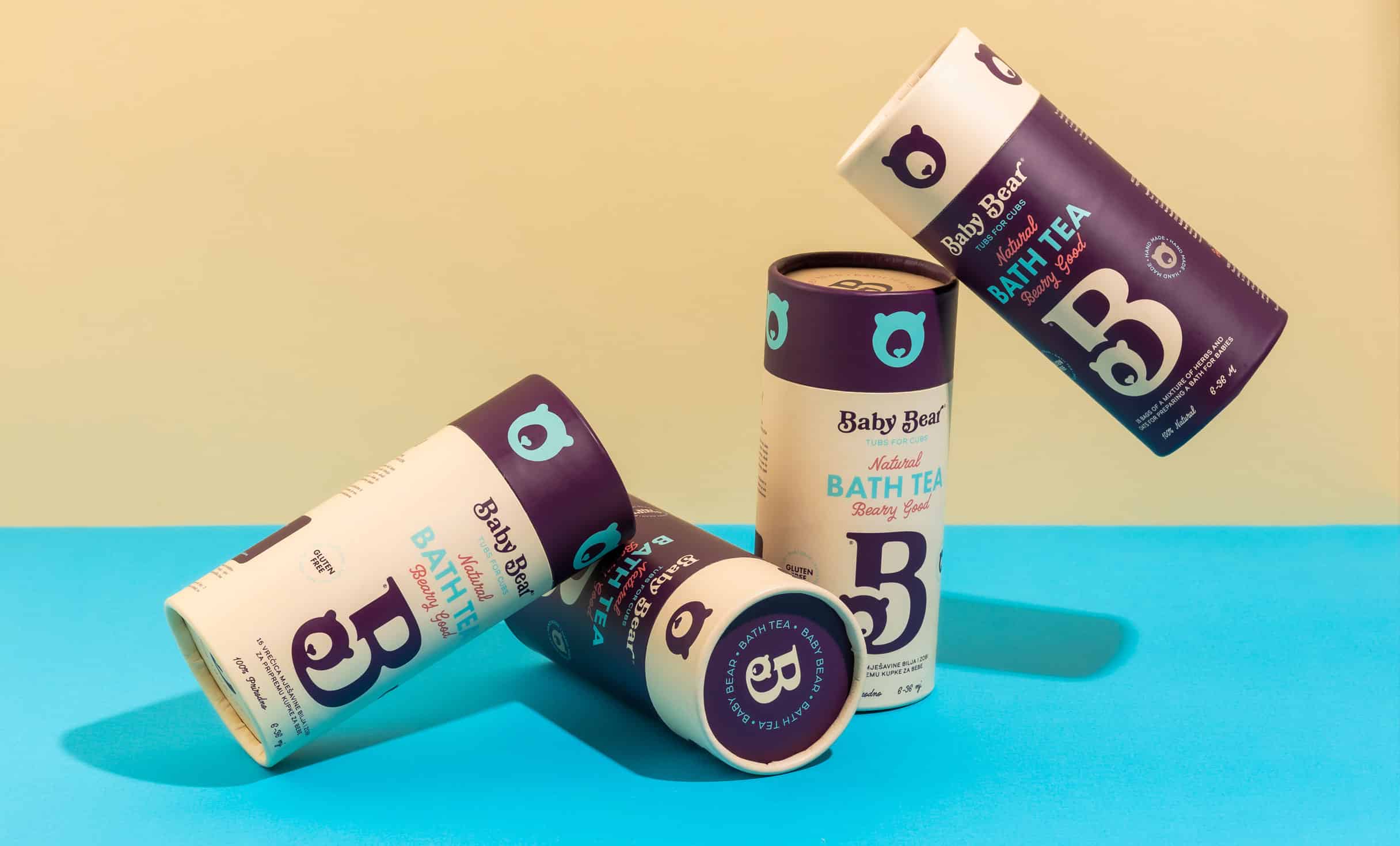
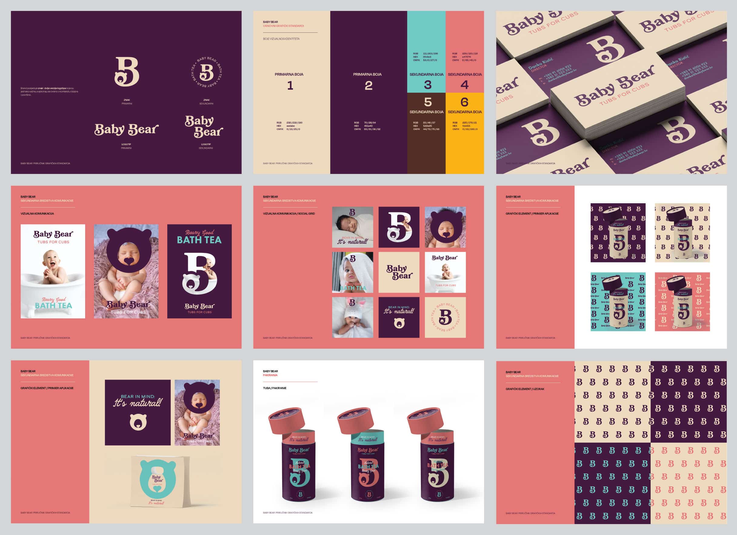
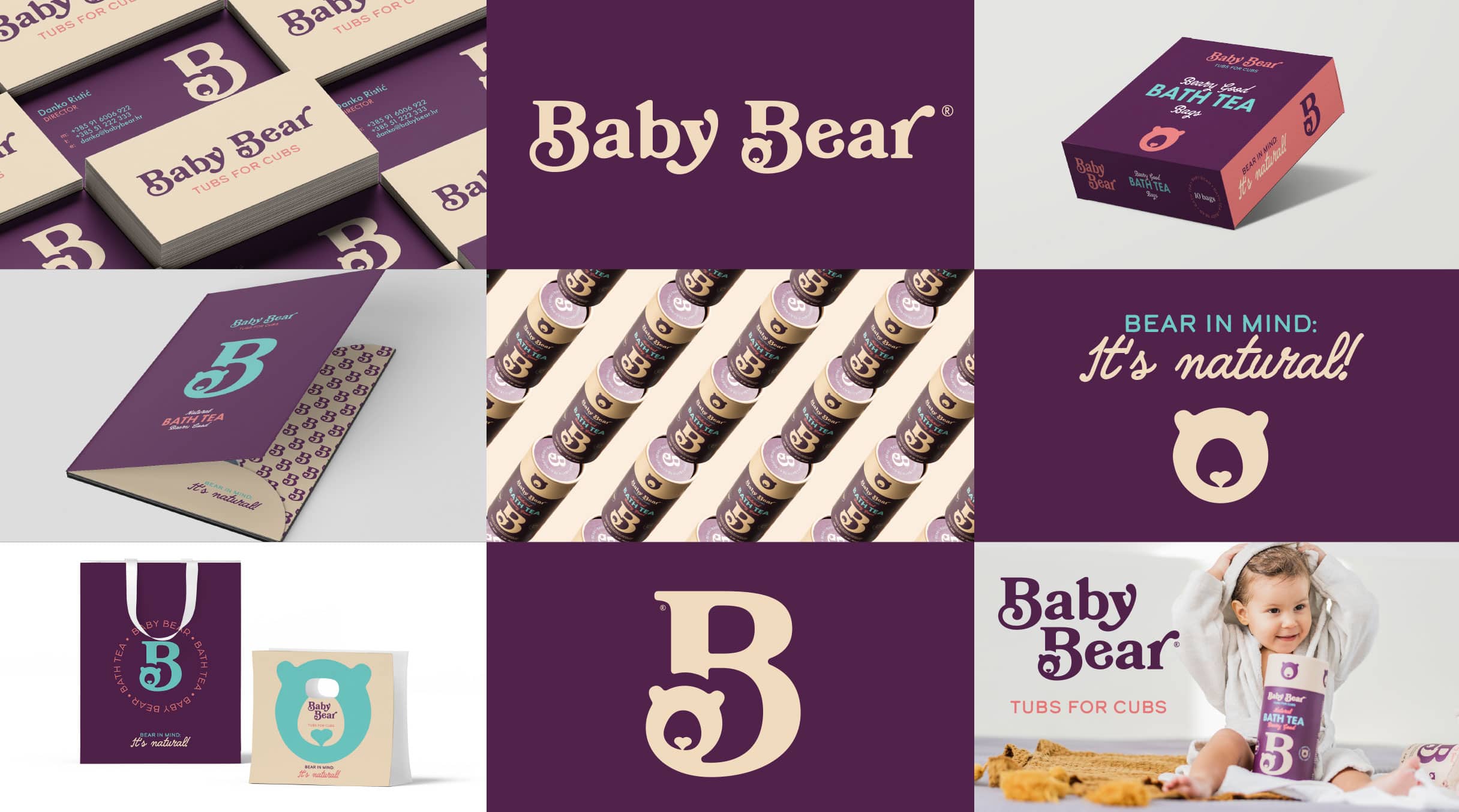
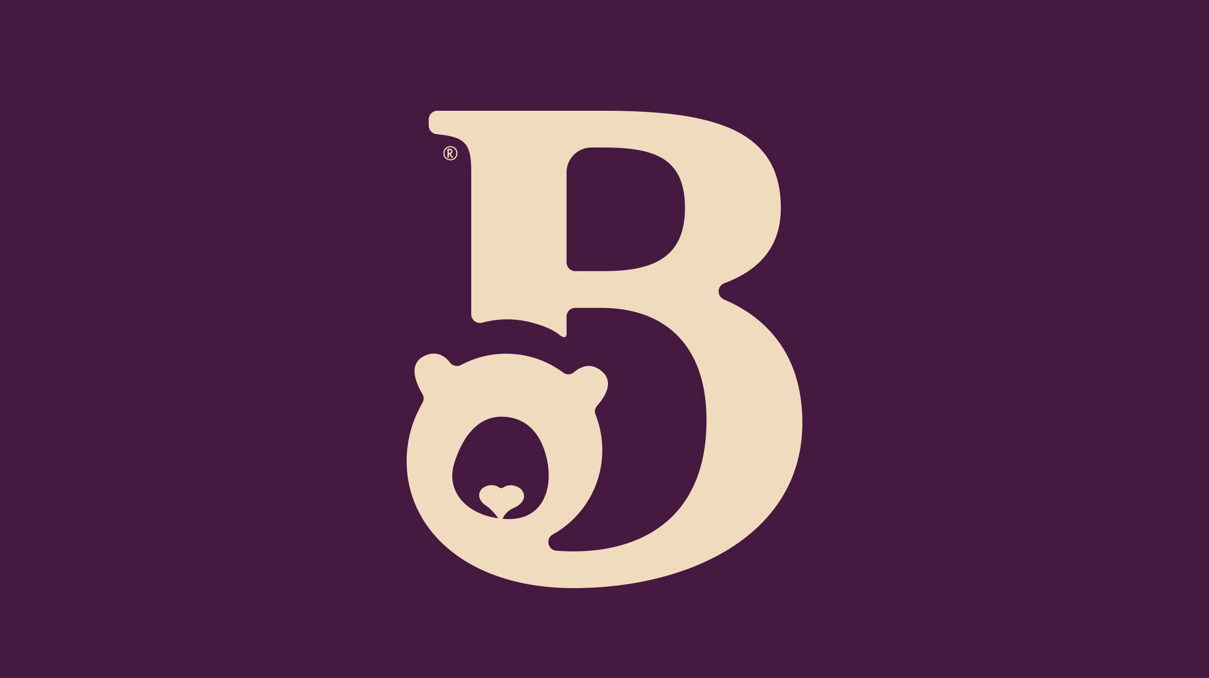
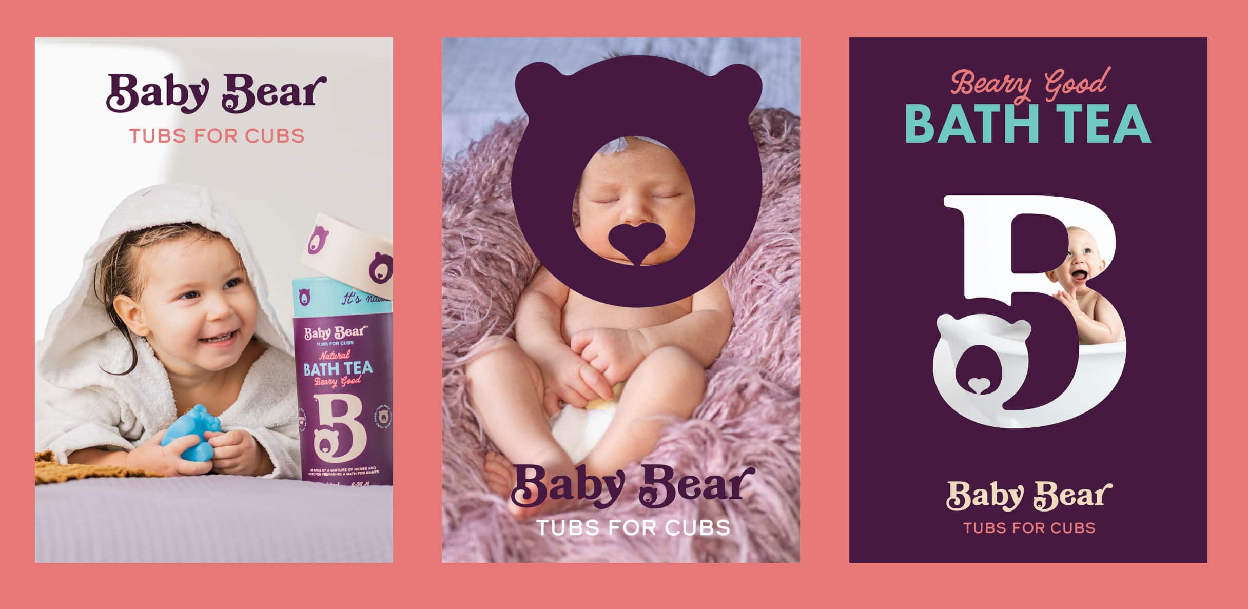
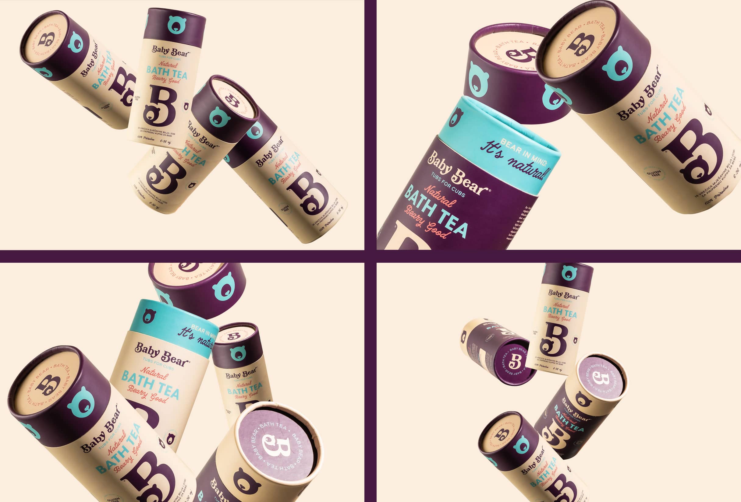
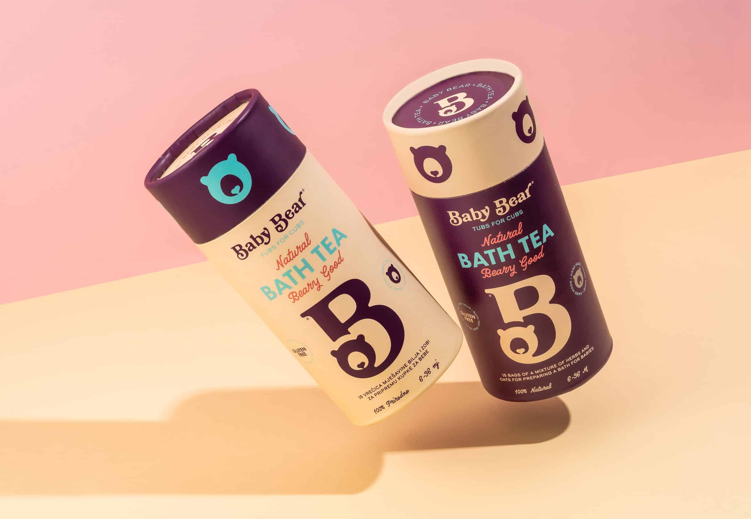
The brand sign consists of the letter "B" - the beginning of both words of the name Baby Bear. Inside the letters is a teddy bear that has a small heart instead of a muzzle - a symbol of the love with which the product was created and the mother's love for the child, which also functions as a separate illustration. The chosen colours communicate the natural origin of the product: the soothing creamy color of oats, the soothing purple color of lavender and black marshmallow, and the blue color that symbolises water, i.e. a bath. A carefully selected combination of typography gives a playful tone to the visual identity.
Website
The web site was developed using the SPA (Single Page Application) method using WordPress CMS. The page contains all information about the product - from ingredients to methods of use.