


KD ČISTOĆA
CLIENT
KD Čistoća, d.o.o.www.cistoca-ri.hr
YEAR
2018SERVICES
Redesign of promotional corporate materialČistoća d.o.o. is an independent company registered for cleaning of all types of facilities, waste removal, and the maintenance and repair of motor vehicles in the area of Primorje-Gorski Kotar County.
Request
To come up with the new design of promotional corporate materials that is going to be shared to business partners and associates at the end of the year.
Challenge
Creating a concept that will suit the request, convey the company's main message, focus on the target audience, and at the same time differ from the previous design.
Solution
We focused on the target group - employed people / partners / associates - and their working environment, and we used office material to try to point out how it can be recycled.
CONCEPT - UREDiOKOLIŠ
Why wouldn’t your office be green?
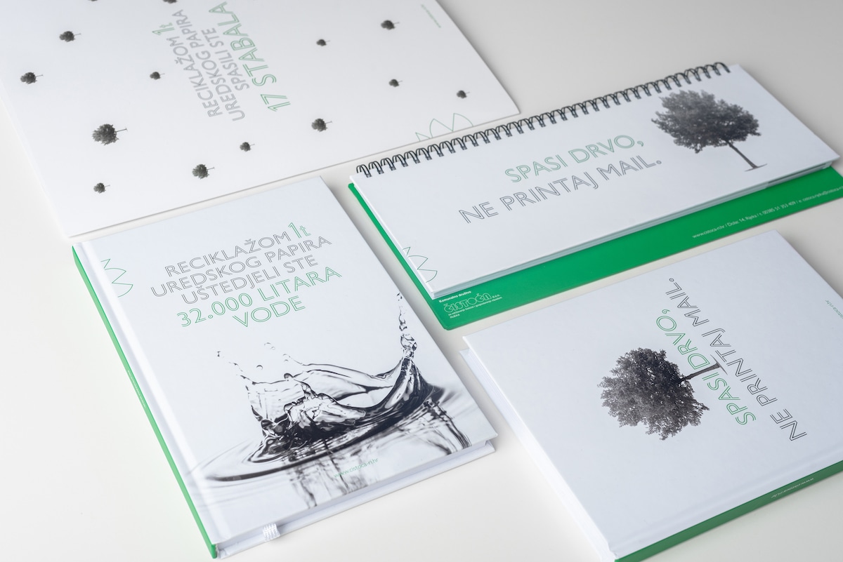
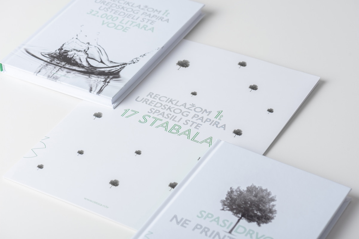
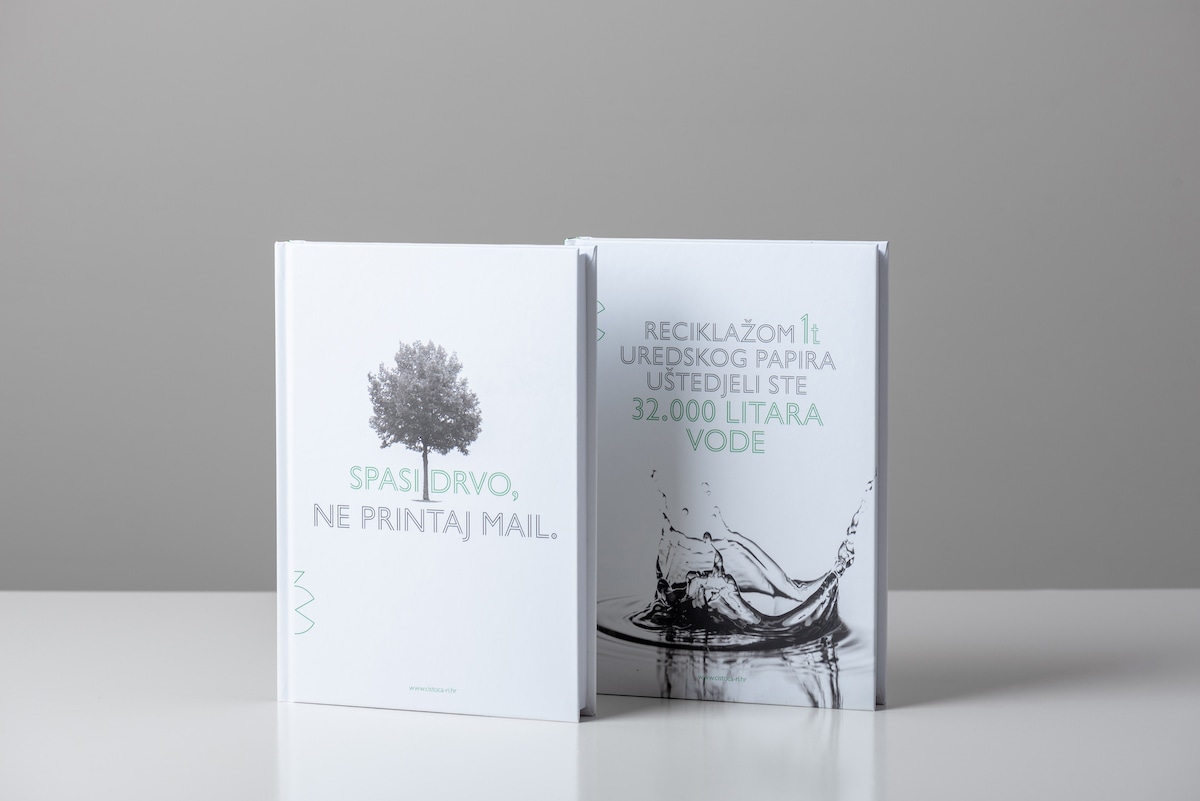
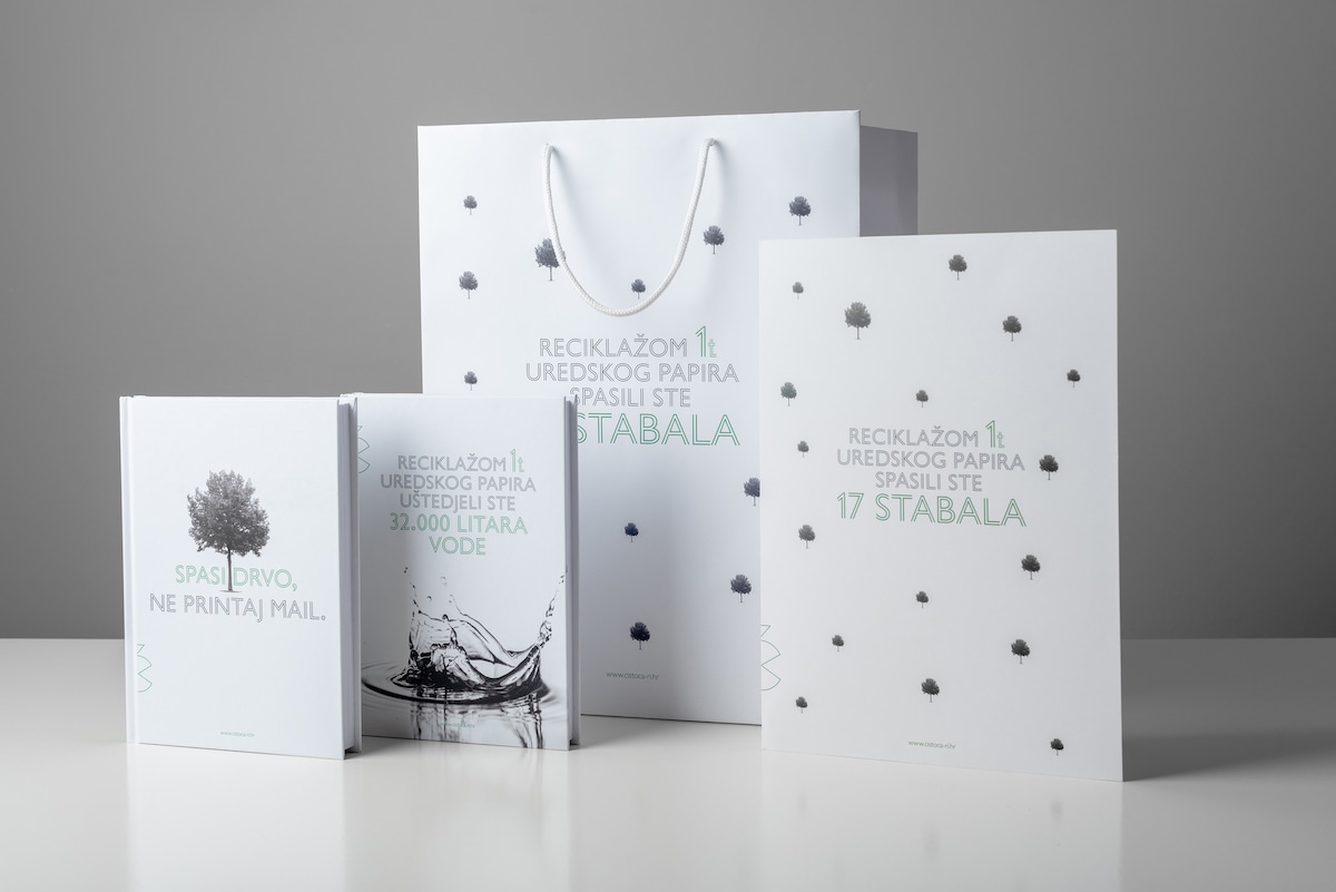
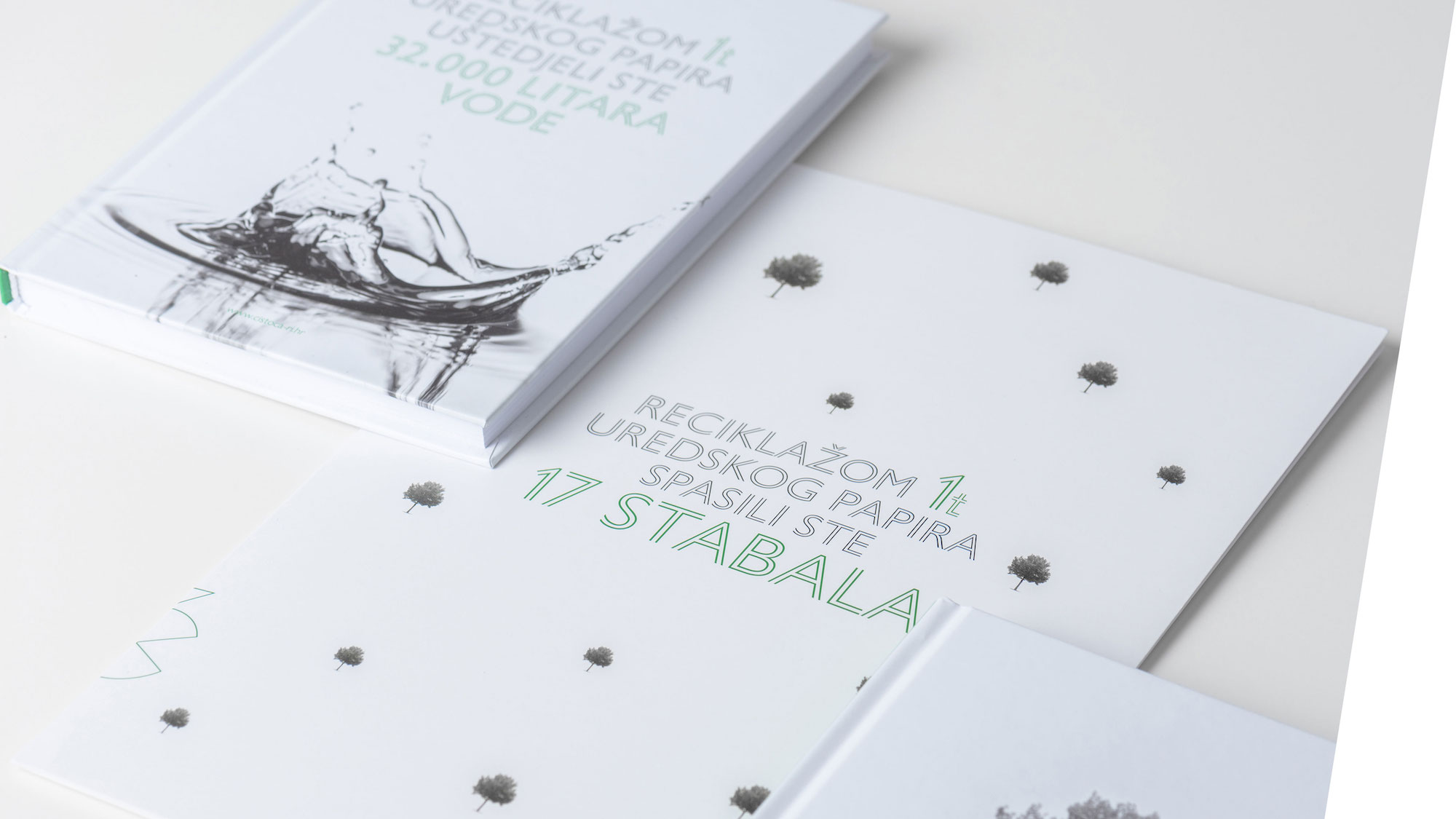
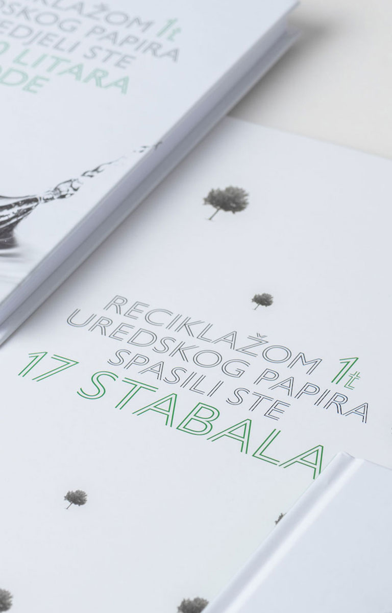
Socially responsible business not only refers to responsible behavior towards the environment, but also to the care of employees and the community, as well as to current and future business partners. Since the agency's task was to refresh promotional materials, we came up with the design of educational context that would encourage material recipients (business partners and associates) to lead responsible businesses in terms of environmental protection, i.e. messages that would encourage them to make their offices greener.
We have designed a series of messages that relate to rational behavior in the use of devices and materials: recycling of glass and plastic waste, office paper, stimulating energy savings, etc.
DESIGN
Reflecting on the brand of "Čistoća", we realized that this particular brand is ideal for adopting new, economical design trends thus setting an example for others. The brand itself will be the carrier of the idea of its activity and philosophy.
How we recycled the logo?
• In order not to discard the brand recognition that has existed for 66 years, the existing logo was simplified, refreshed and digitized.
• By using a minimalist approach we focused on the initial letter, the letter "č" (reminiscent of the popular PACMAN), which at the same time becomes the collector and consumer of waste, thus emphasizing the company's business. By using brand symbol, instead of the entire logo, digital communication will be made easier, and physical items, i.e. prints - with their minimalism, will save ink. The idea is that the brand symbol itself encourages saving and care for the environment.