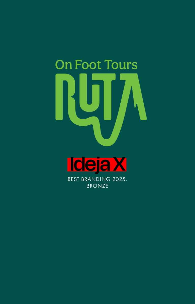

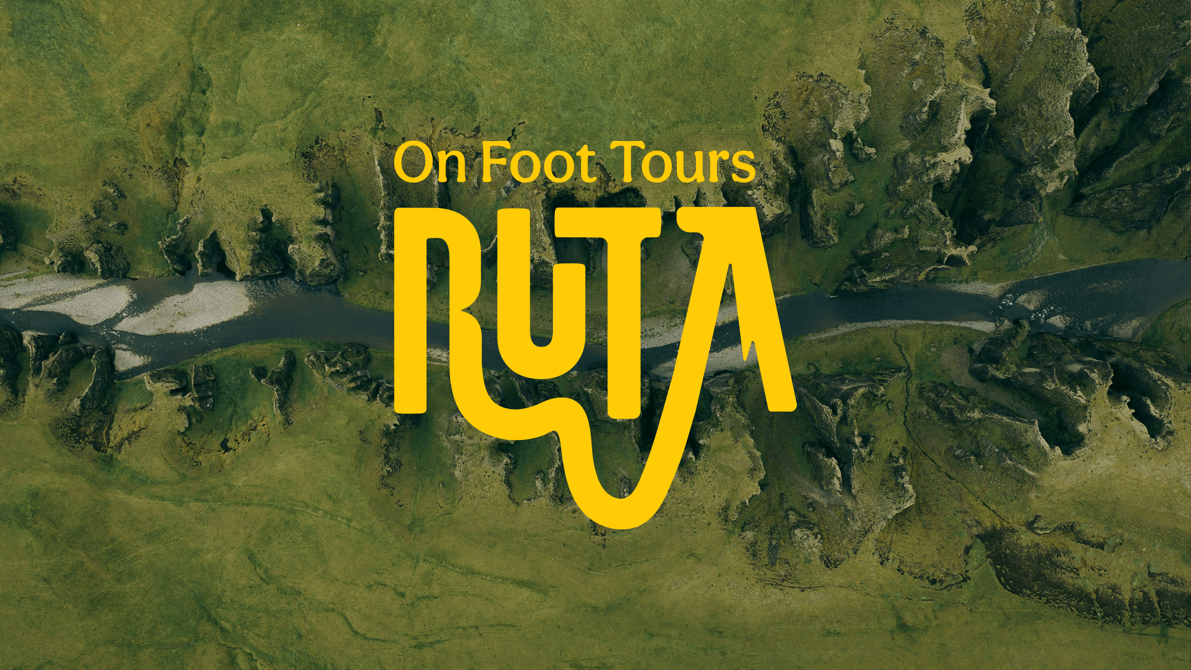
RUTA
CLIENT
Vanja Tintorinstagram.com/rutatours.hr
YEAR
2025SERVICES
Branding Naming Verbal Identity Visual Identity
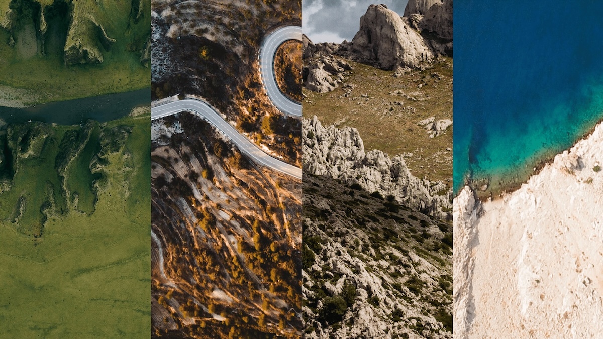
Ruta is the brainchild of a young couple, who, after years in the tourism industry, set out to create something of their own – and entirely different. With the signature on foot, Ruta leads travelers through carefully crafted itineraries across Croatia’s mountains and coastline, far from tourist clichés and straight into local stories and untouched nature – all by walking.
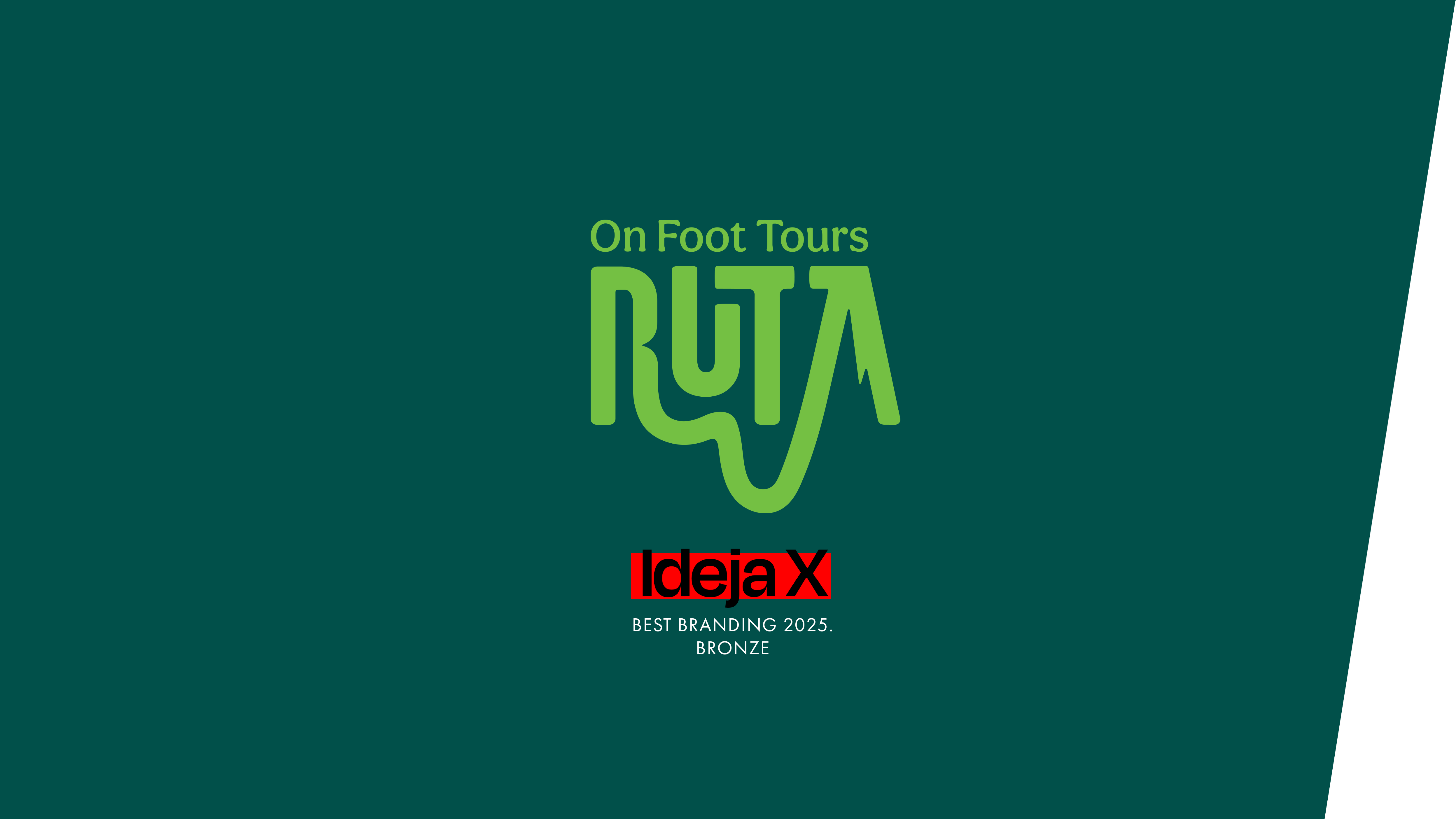
As outdoor enthusiasts ourselves, we immediately clicked with Ruta’s philosophy and jumped into building a brand that quite literally walks off the beaten path. The project was also recognized by the industry – Ruta won the Bronze award at IdejaX 2025 in the Best of Branding category.
Strategic Approach & Market Analysis
Since we were involved from day one, it was essential that Ruta authentically reflect the founders’ vision. That vision was shaped during a co-creation workshop, which defined the strategic direction. Ruta positions itself as a champion of slow travel – a journey focused on experience rather than destination. No rushing, just full immersion in nature, culture, and local communities. Sustainability, positive local impact, and environmental consciousness form the backbone of the brand, along with a sense of freedom, well-being, and connection. Our task was to translate this philosophy into a brand that would resonate with target audiences – particularly those in Scandinavia and North America. At the same time, we aimed to present Ruta as an experience that enriches both the traveler and the destination, with authenticity and the intimacy of small groups at its core.
Verbal Identity
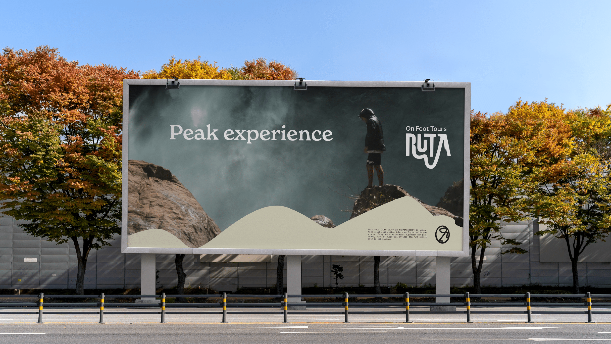
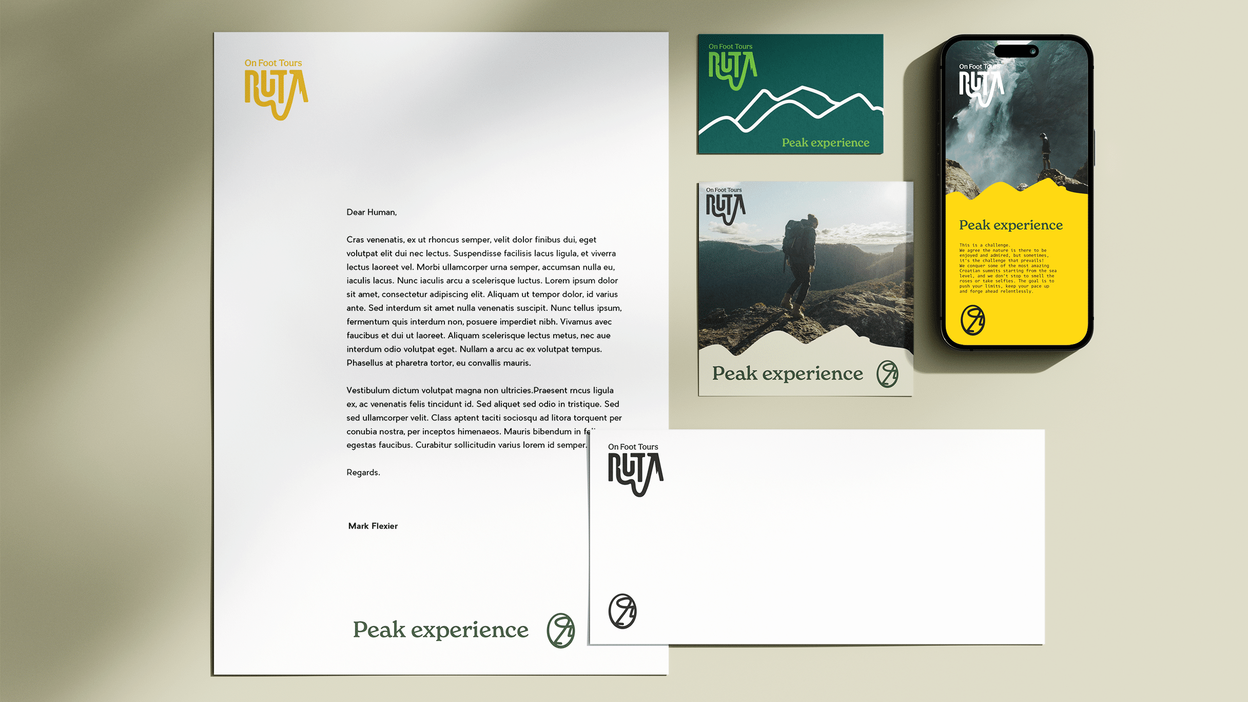
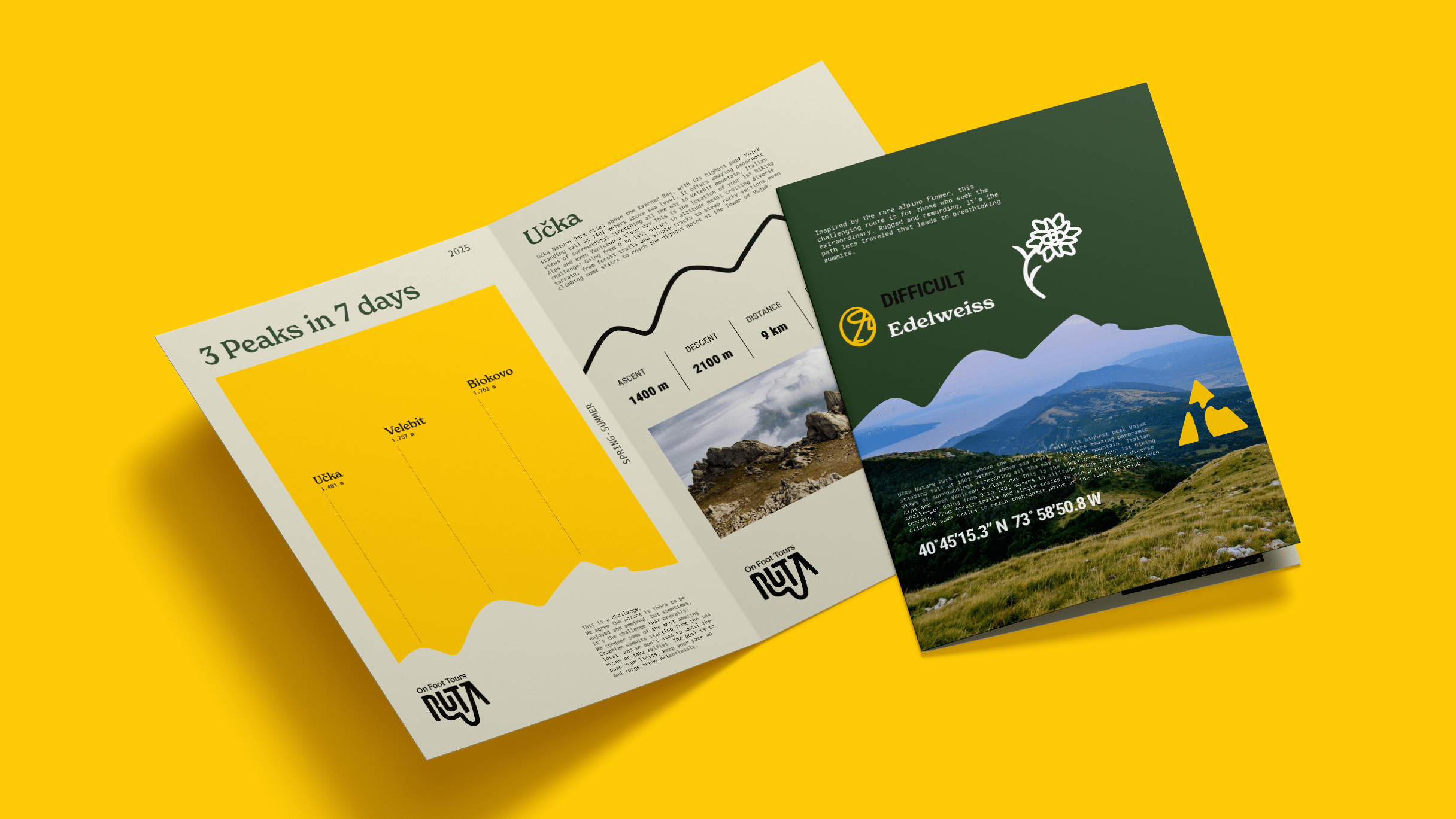
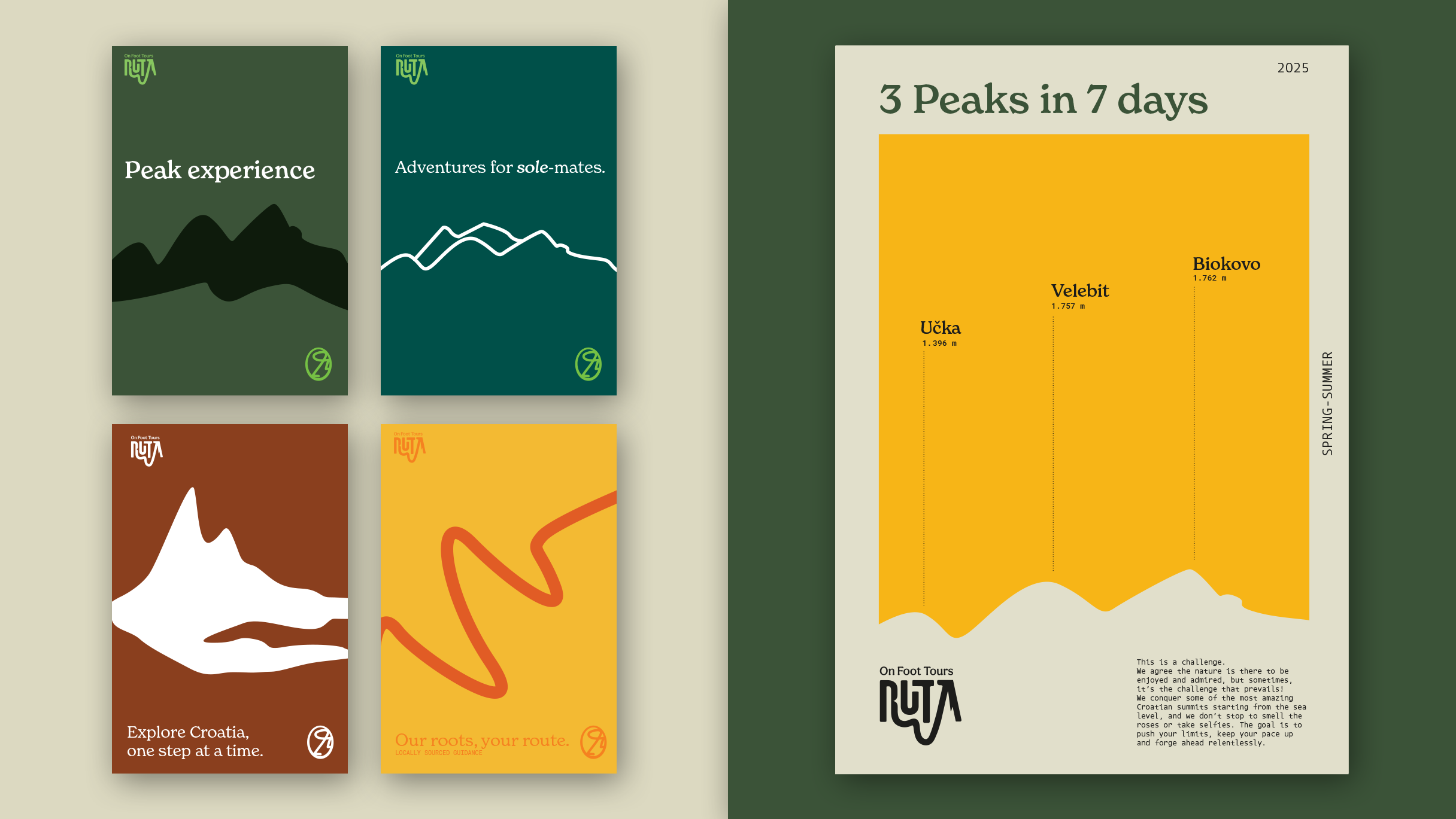
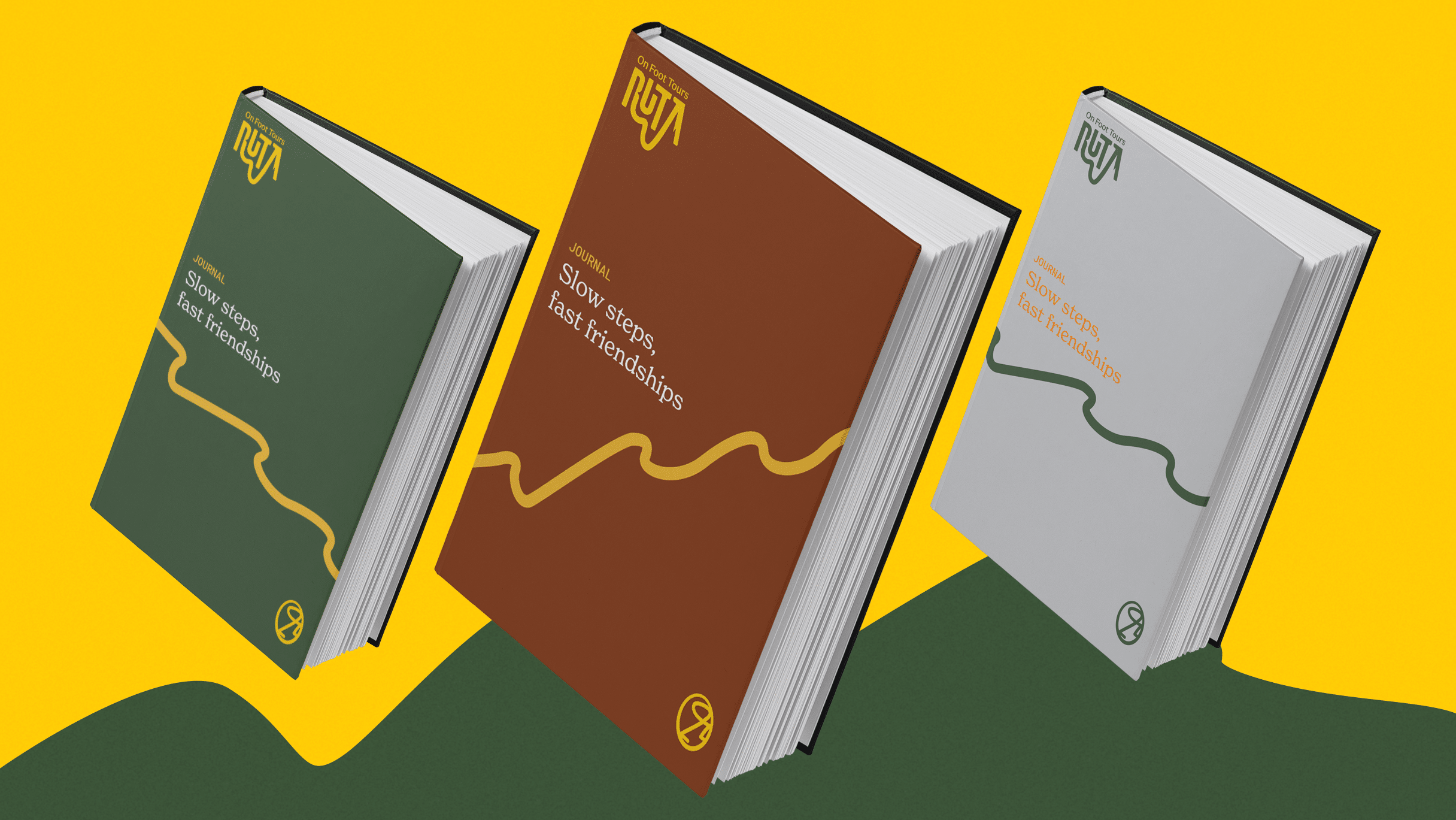
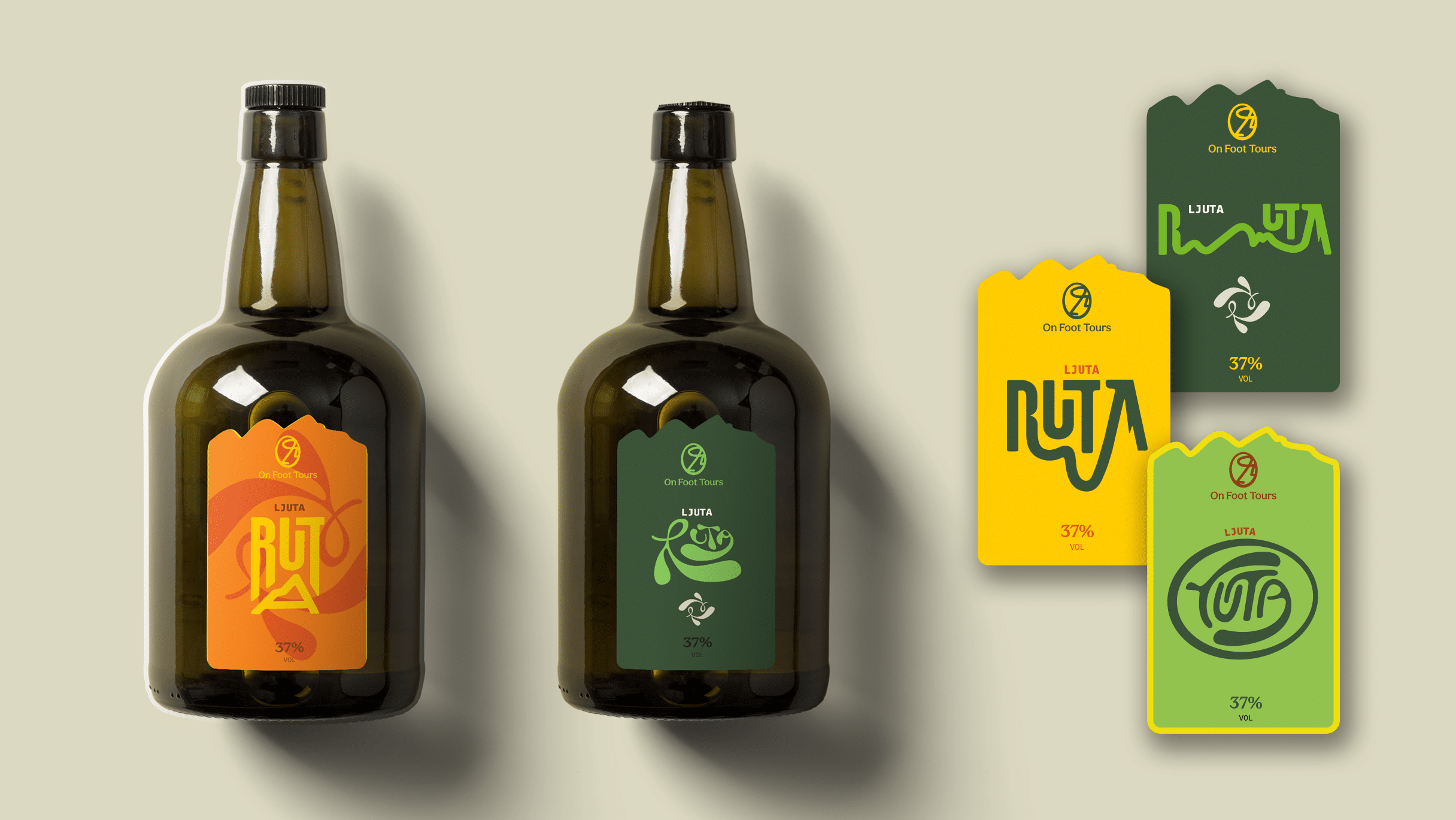
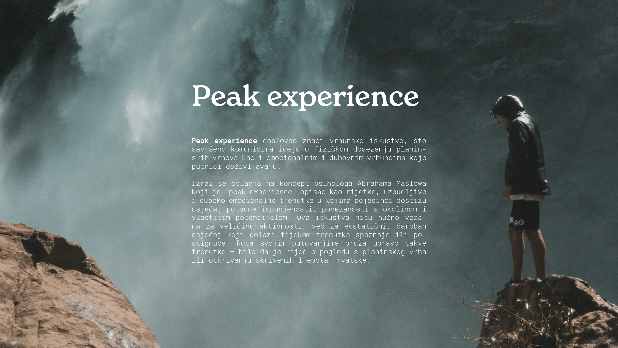
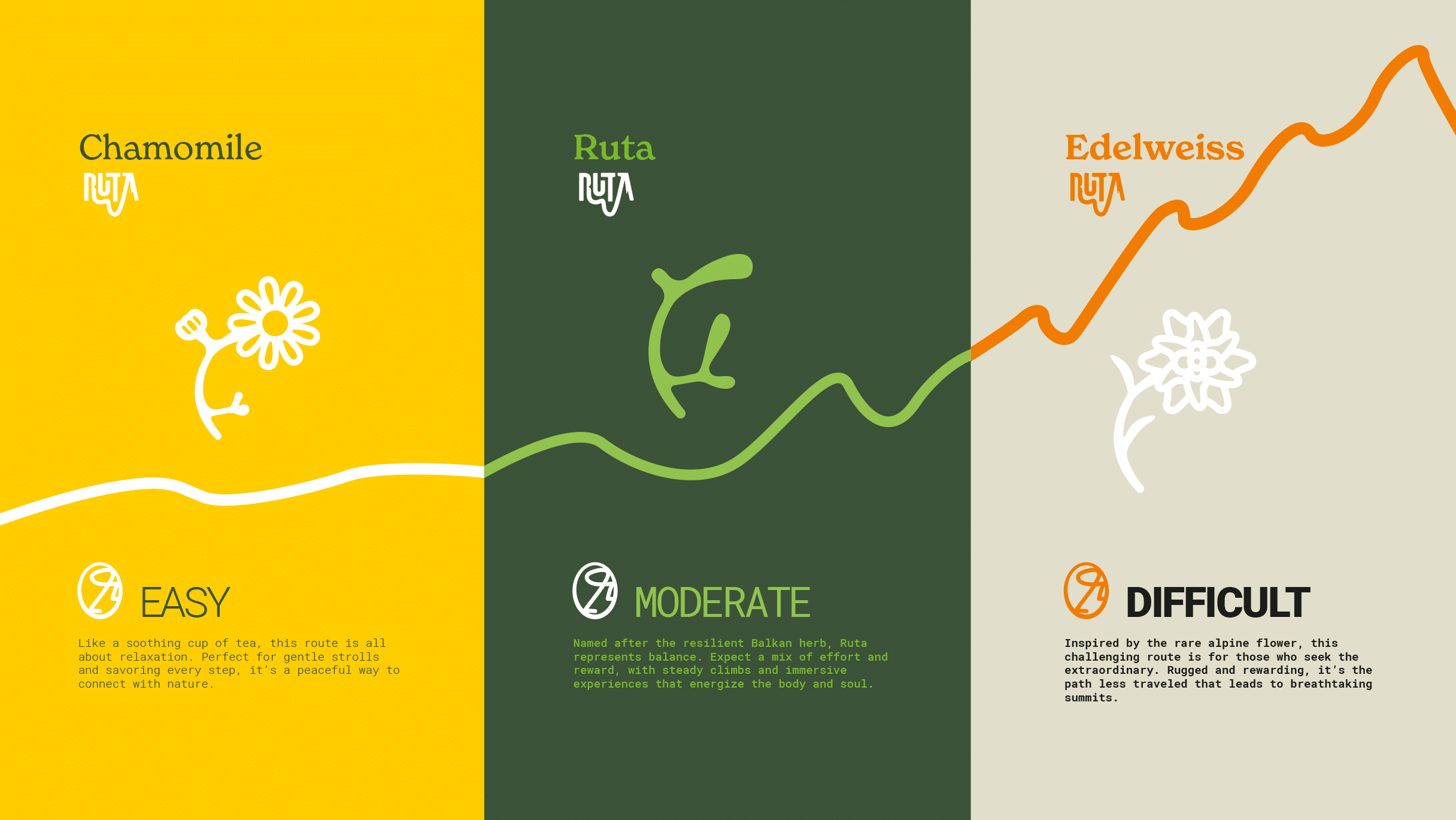
The name Ruta means route, direction, or travel plan – while also referencing rutvica (Ruta graveolens), a Balkan herb with deep cultural and healing roots. This duality – rational and emotional – became the foundation of the brand’s verbal identity. The tagline On Foot Tours and slogan Peak Experience position Ruta as a brand that offers more than a physical journey – it’s about emotional highs, connection with nature, and moments of full presence. The verbal identity is enriched by brand messages that reflect Ruta’s spirit: Our roots, your route; Locally sourced guidance; Adventures for sole-mates; Explore Croatia, one step at a time; Walk the unseen; Travel at nature’s pace. We also developed a symbolic system to categorize routes based on intensity – from the light and gentle Chamomile, to the balanced Rue, and the demanding Edelweiss – adding another layer of connection between language and experience.
Visual Identity
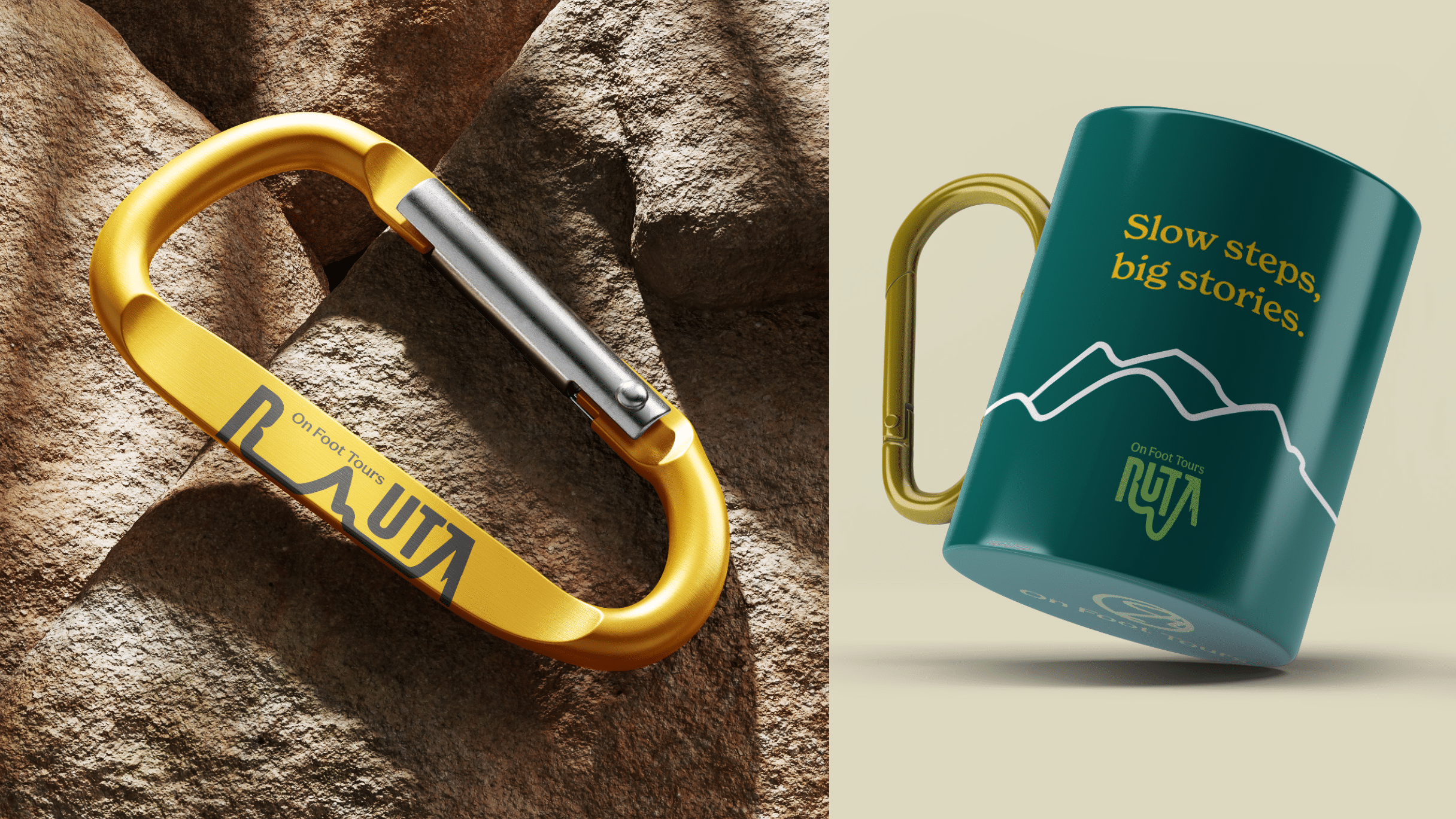
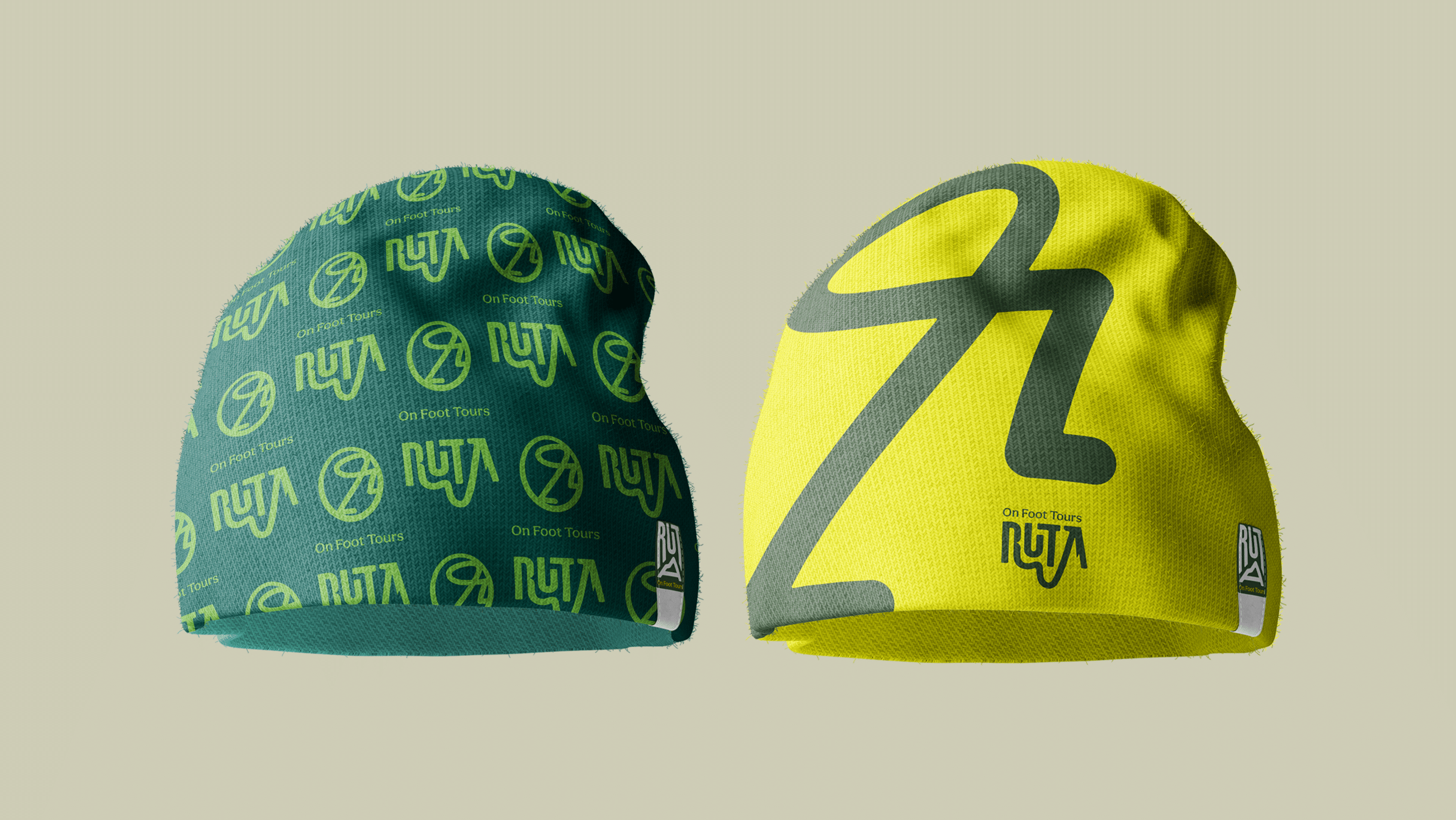
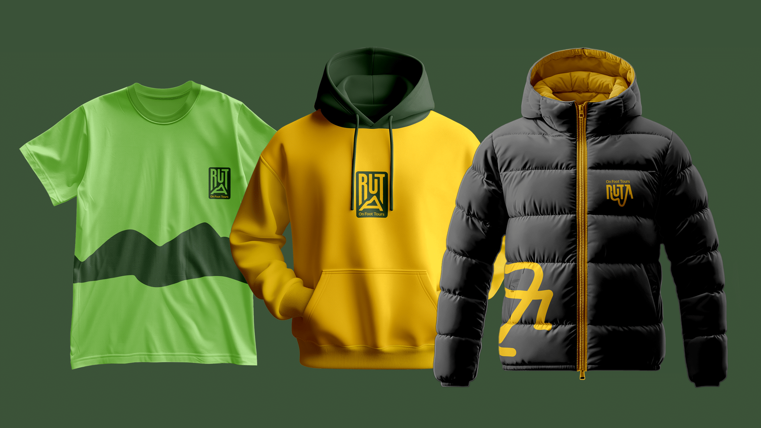
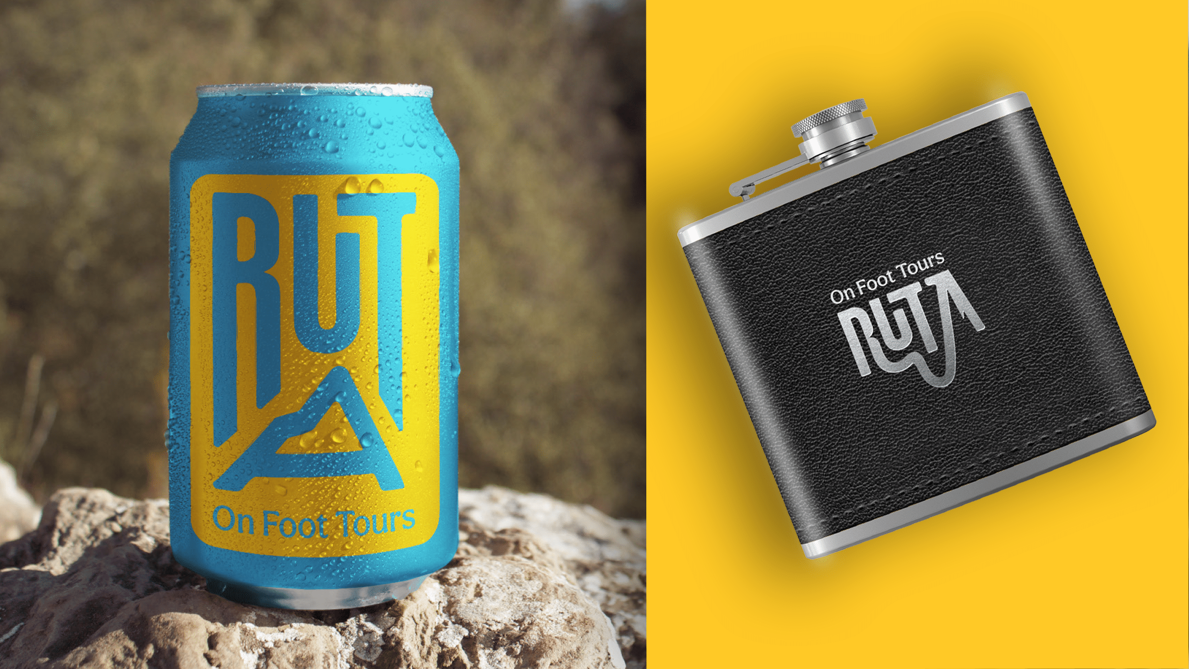
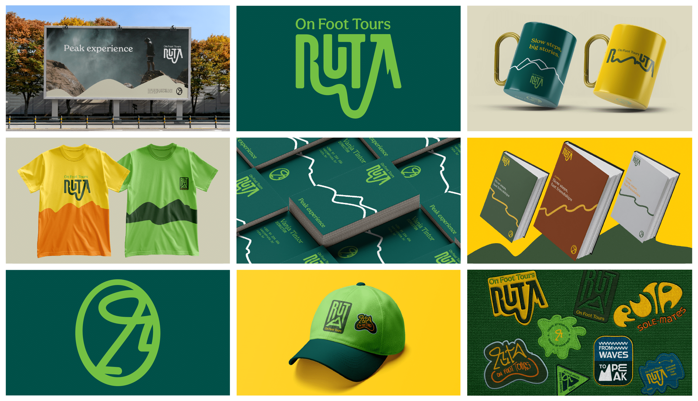
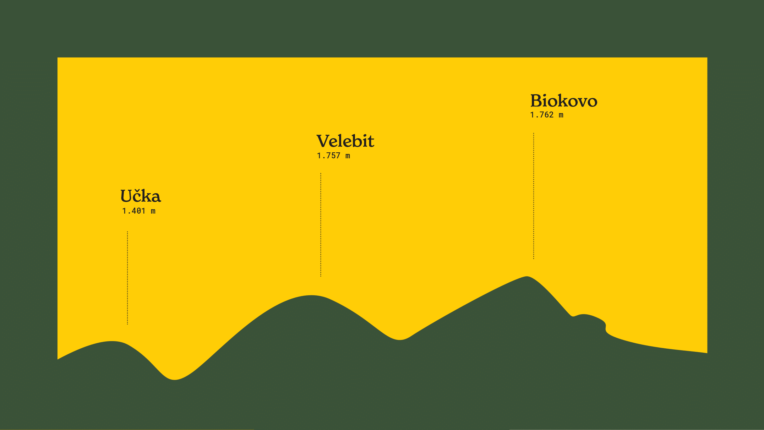
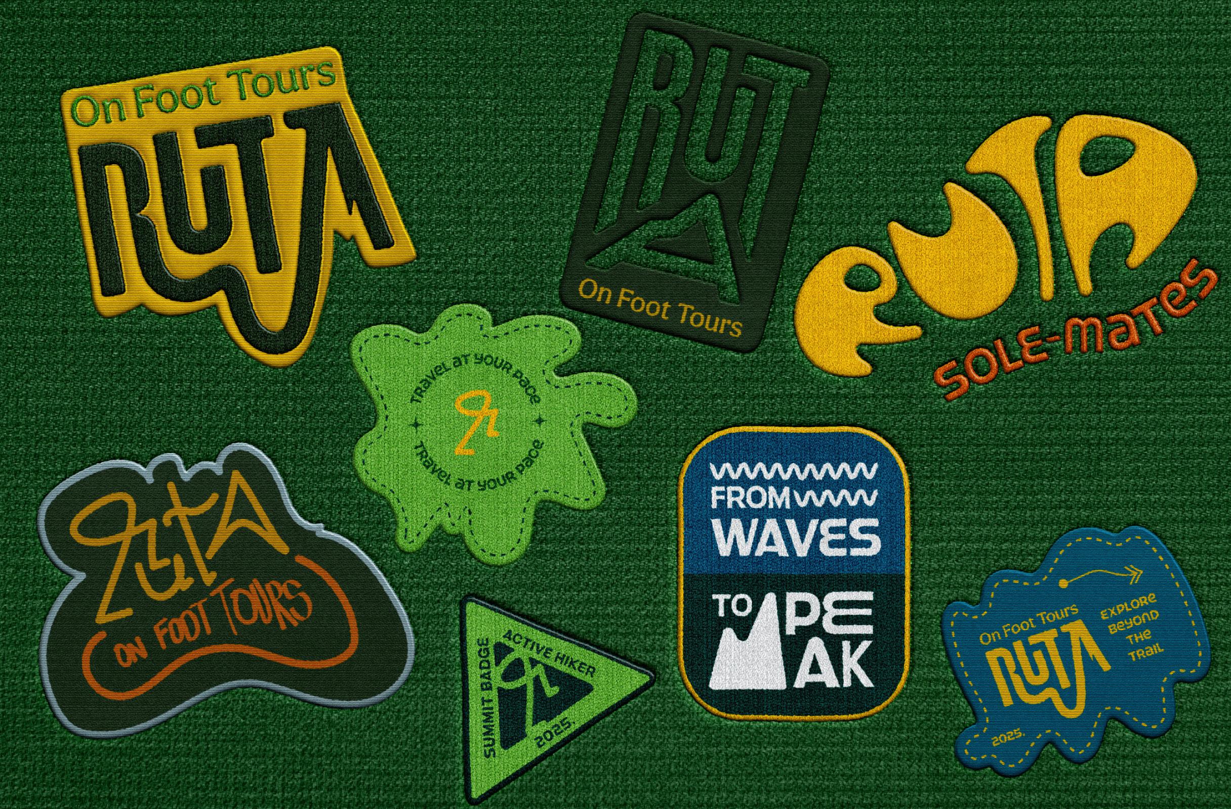
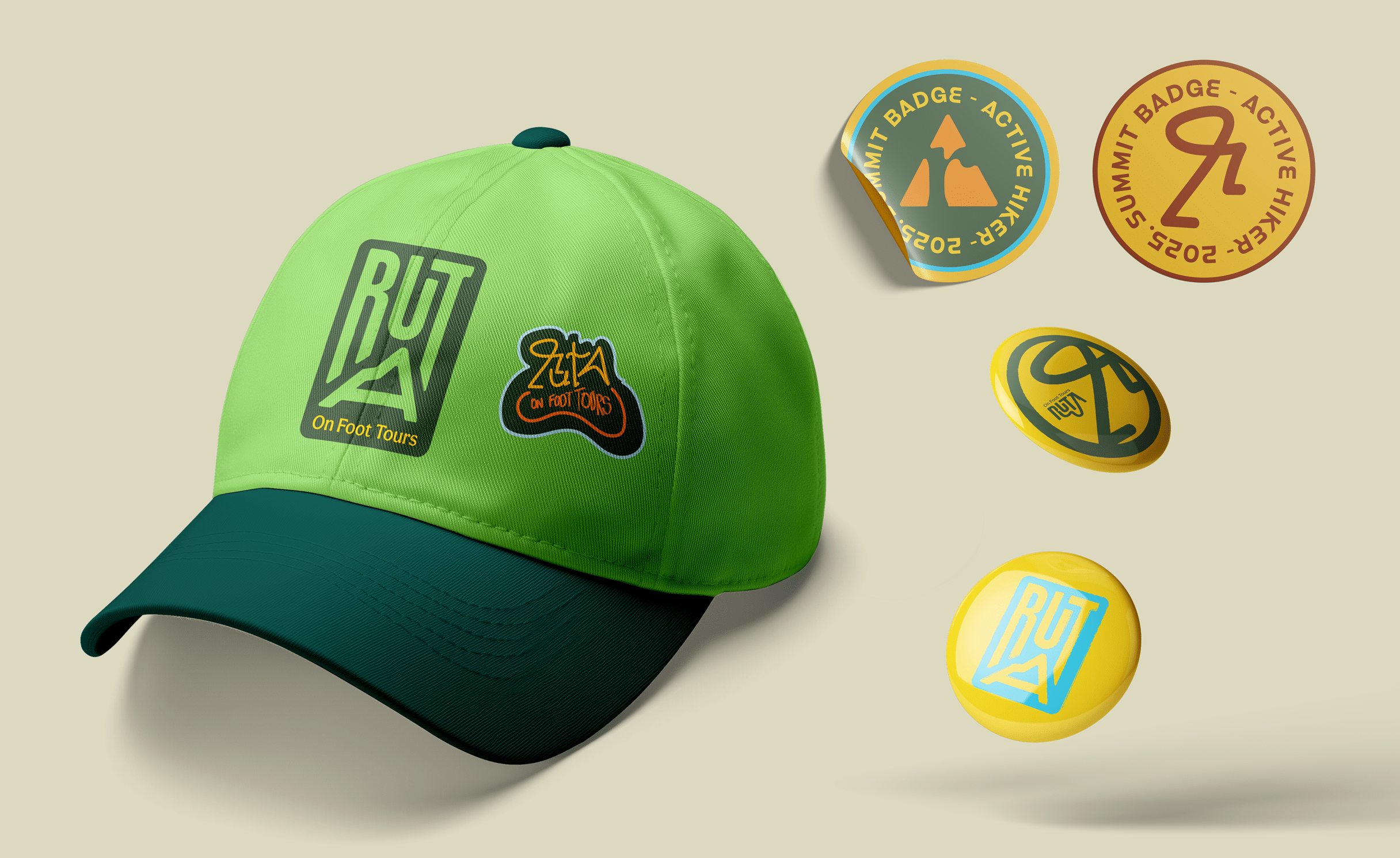
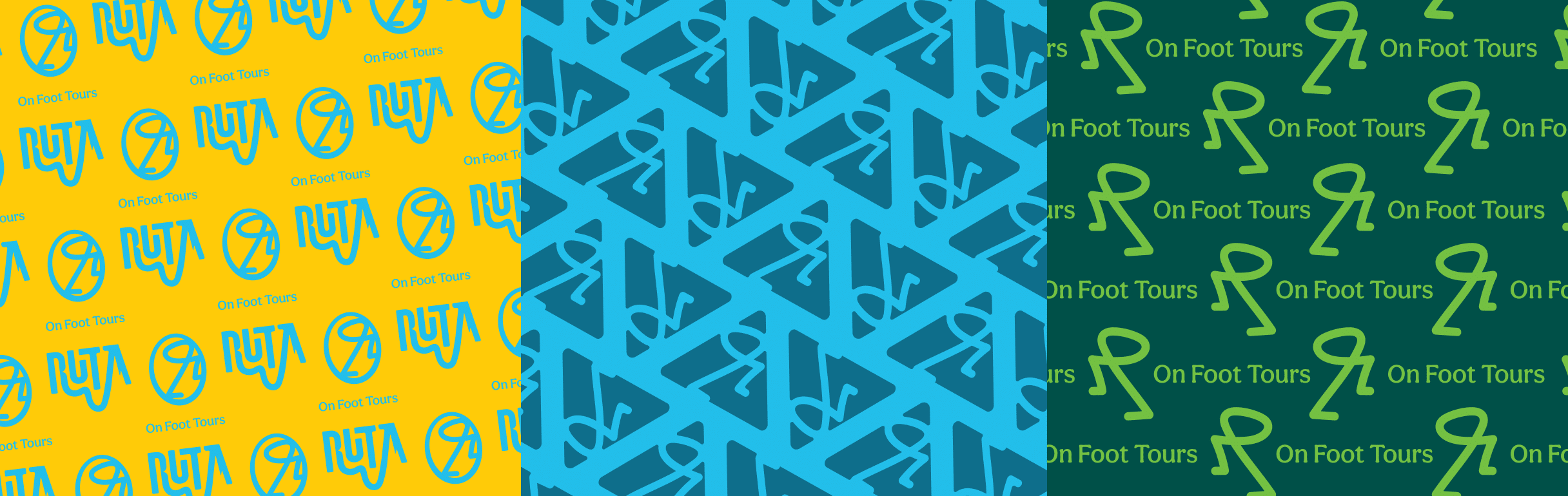
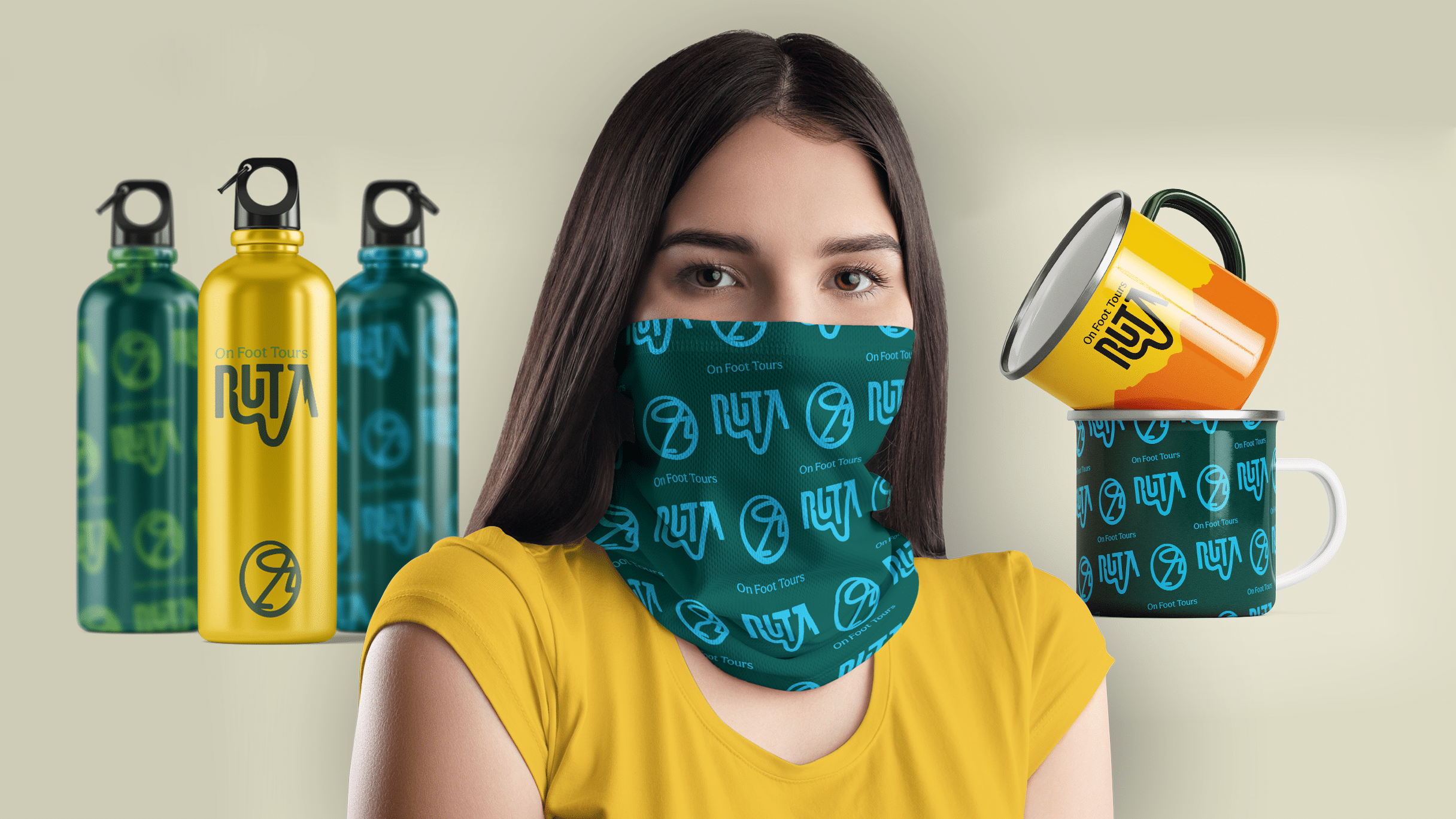
Ruta’s visual identity is designed to modularly adapt to the variety of tours offered. Movement is central to Ruta, and we expressed that in every design element. The logo follows a hand-drawn route, with a dynamic, ever-climbing mascot in the shape of the letter R – always moving, always ascending. The color palette is drawn from nature, giving the brand a vibrant, lively, and genuinely outdoor look and feel. The typography draws inspiration from vintage mountaineering and sports magazines – retro at heart, but modern in execution. The visual system is further enriched with stickers and patches – nods to the outdoor culture – combined with bold messaging and expressive illustrations that capture every layer of the brand. The landscape itself became a visual language, while outdoor enthusiasts inspired its real-life applications – from T-shirts and hats to bottles and, of course, Ljuta Ruta, a rakija label created for toasting each conquered peak.
Results
Ruta’s branding is ready to go – awaiting its first travelers as the team finalizes and perfects the routes. Even before launch, the brand’s potential was recognized by industry professionals. Ruta was awarded Bronze at IdejaX 2025 in the Best of Branding category – a testament to its carefully crafted, consistent, and emotionally powerful identity.