MARI MULIER
CLIENT
Vernesa Miletić TerzićYEAR
2023SERVICES
Branding Verbal identity Visual identity Brand strategy Adjustment of the interior Website
The client is the owner of a hair salon in Solin that specialises in the installation of premium hair extensions. With over 15 years of experience, they have brought numerous new working methods to Croatia and constantly perfected application techniques. The client contacted us when her existing salon, Beauty Brand, reached its business limits and did not reflect the visual identity or personality of the top-notch service and products it offered.
Business growth required a new brand to position it in the market in a new light. A larger market, new target audiences, more employees, new services, higher prices, and a new space presented us with the task of creating a new brand that would be well-structured in all its segments, leading to sustainable and long-term business growth. Thanks to the timely decision to rebrand, Mari Mulier achieved its goal: we changed the brand image, expanded it to the national market, increased the number of clients, and justified the price increase due to the new interior of the larger salon, a new offering of premium products, and even better service and client education.
Verbal identity
The first step was to change the existing name Brand Beauty. The generic name made it difficult to be memorable and distinctive. The name itself, along with the absence of a brand signature, did not clearly communicate the segment of the beauty industry it represented. All of this led to the brand being "drowned out" in a sea of similar names.
We started with a workshop, and from it, we concluded that we needed a modern but classic and elegant name with character and a unique sound. We needed a name that would embody a combination of the archetype of the Sageman, covering the new area of education and the Academy the client wanted to launch, and the Lover, conveying her passion for hair and the sense of delight that clients feel after having extensions installed.
The chosen name was Mari Mulier, which, in a literal translation from Latin, means "woman of the sea." The inspiration came from sirens, beautiful mythological beings known for their long, flowing hair. This also connected with the maritime, Dalmatian character of the brand, as well as with ocean waves – the most common hairstyle for long hair. We added the signature Hair Couture to emphasise the business segment related to hair and the individual, tailored approach to each client's wishes and possibilities.
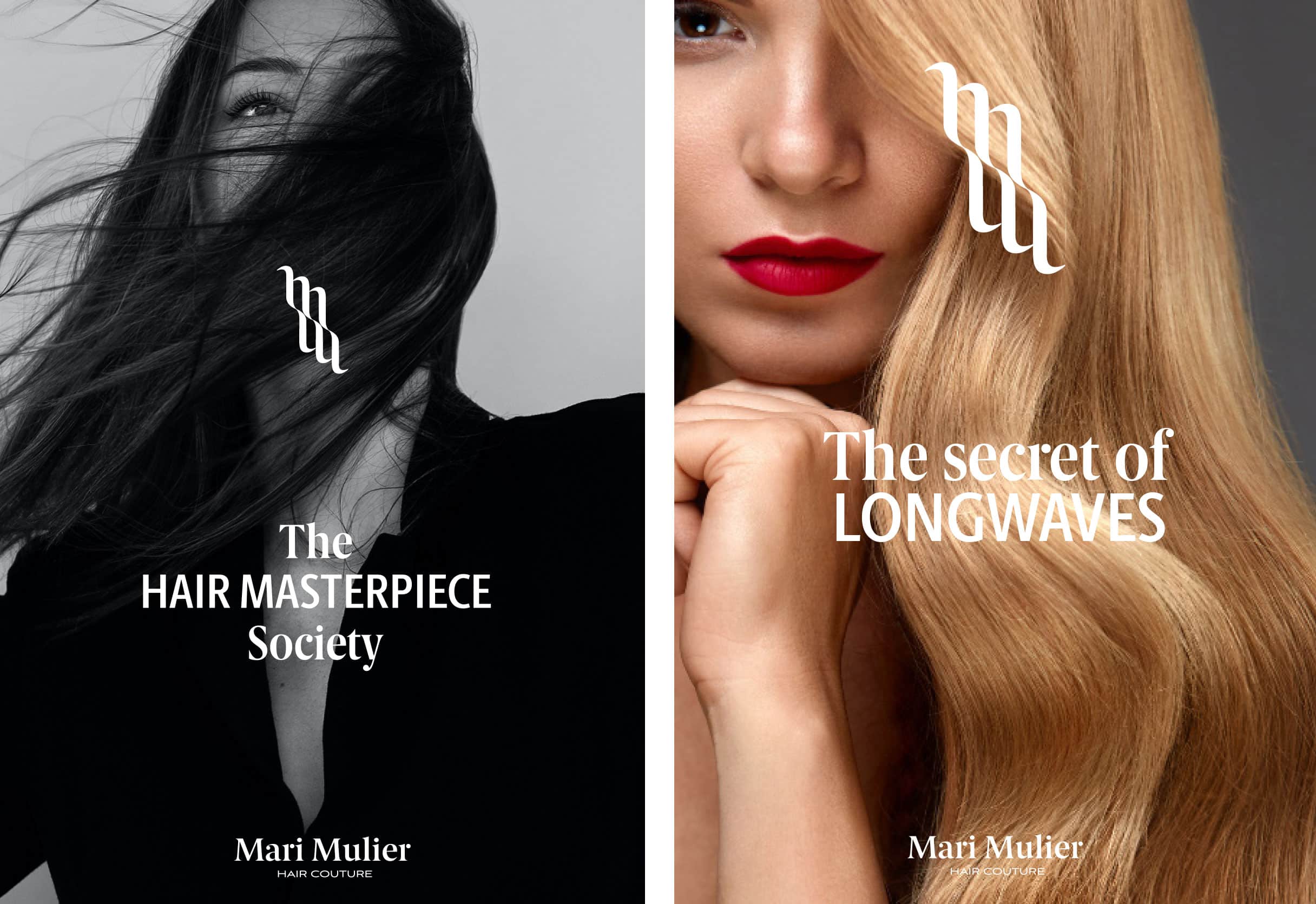
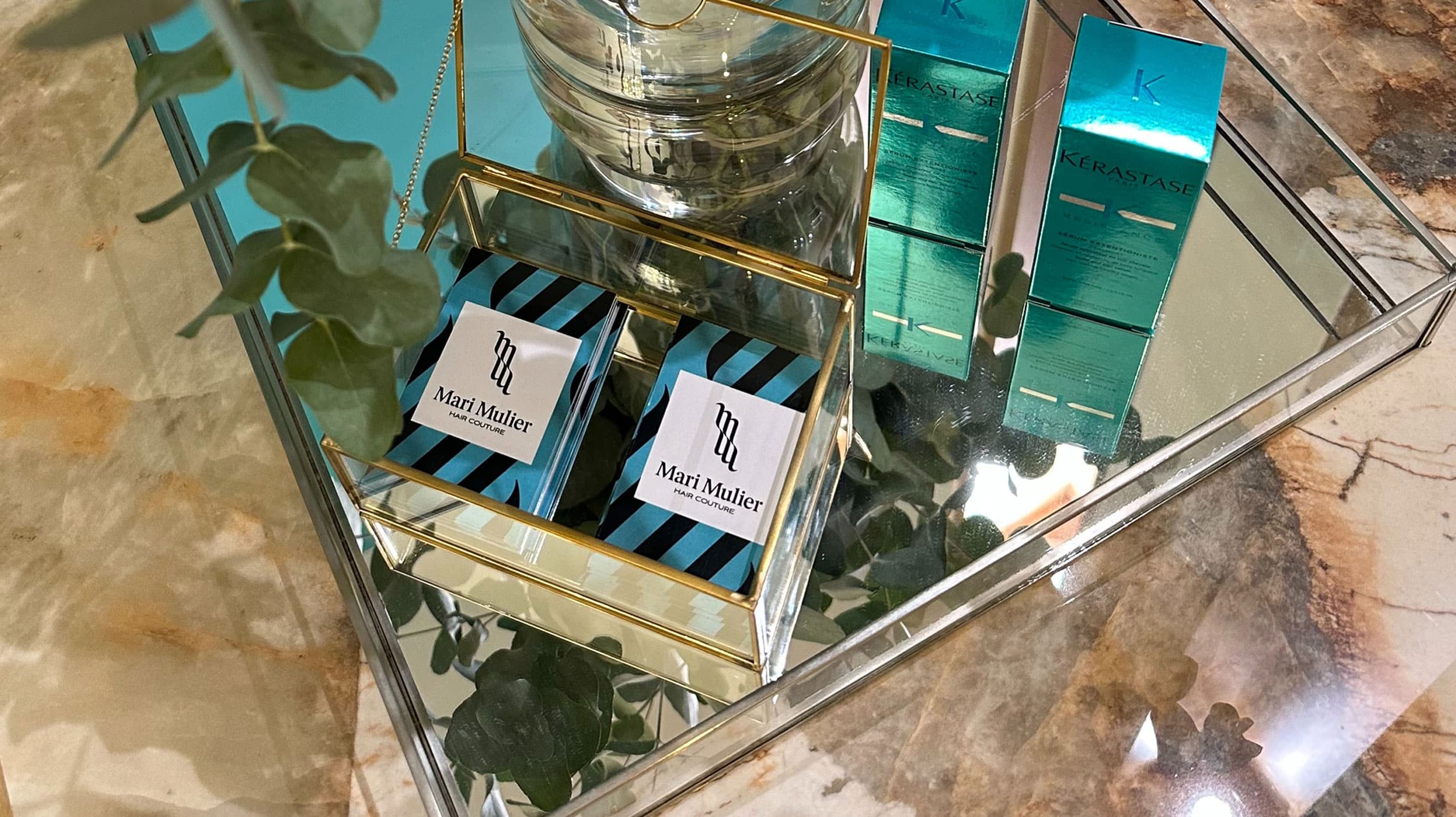
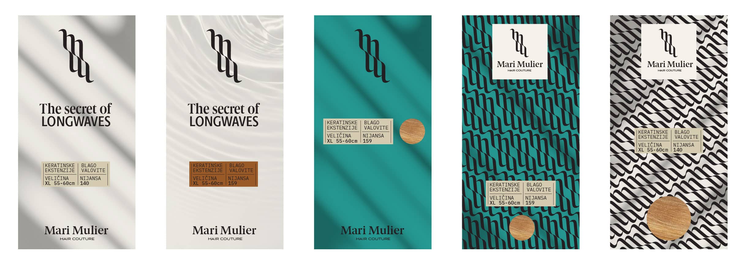
To the verbal identity, we added brand messages. "The secret of longwaves," where the concept of length was taken both as something related to the long wave (in our case, the long duration of wearing extensions) and something that works on long waves (creating long waves of hair). The second message is "The Hair masterpiece society," communicating top-notch service and craftsmanship, simultaneously creating a community and a sense of belonging, supporting our Sage archetype. The third message is "The Hair lovers," which equally gives a sense of community, containing passion and love for what we do. This message aligns with the Lover archetype.
Visual identity
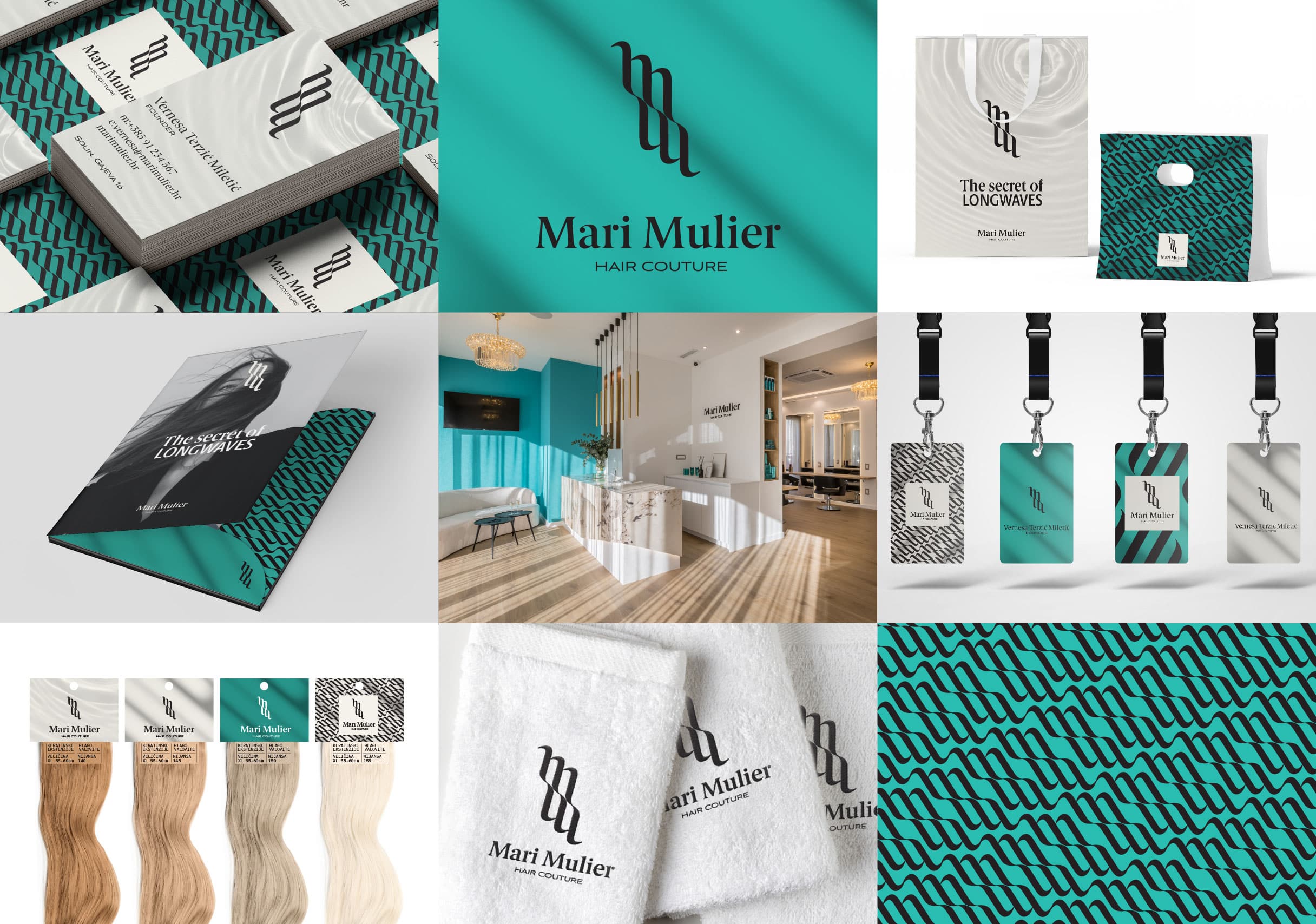
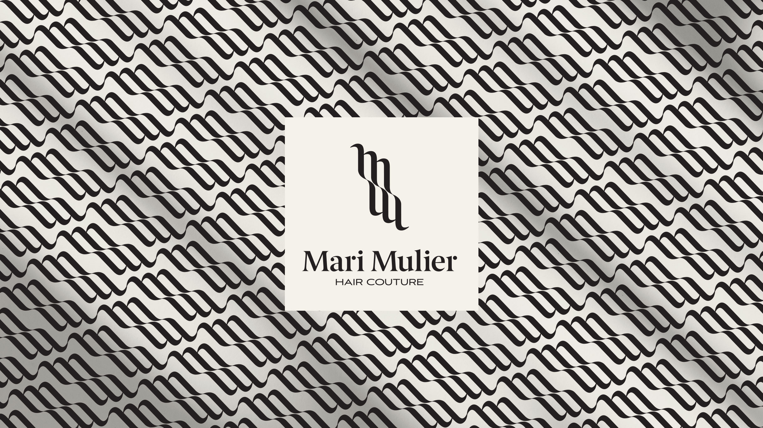
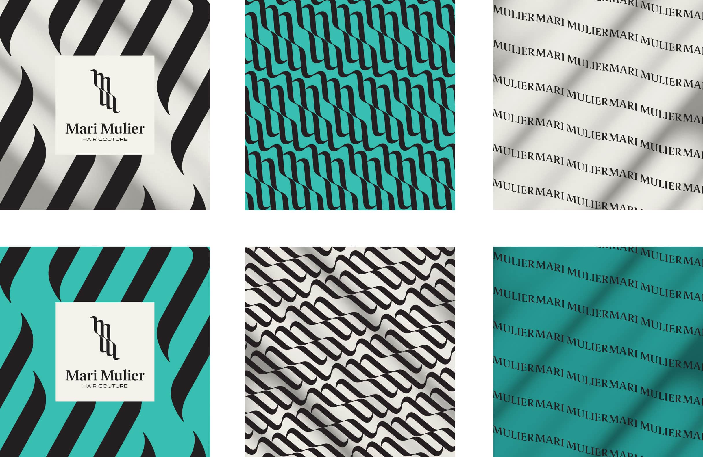
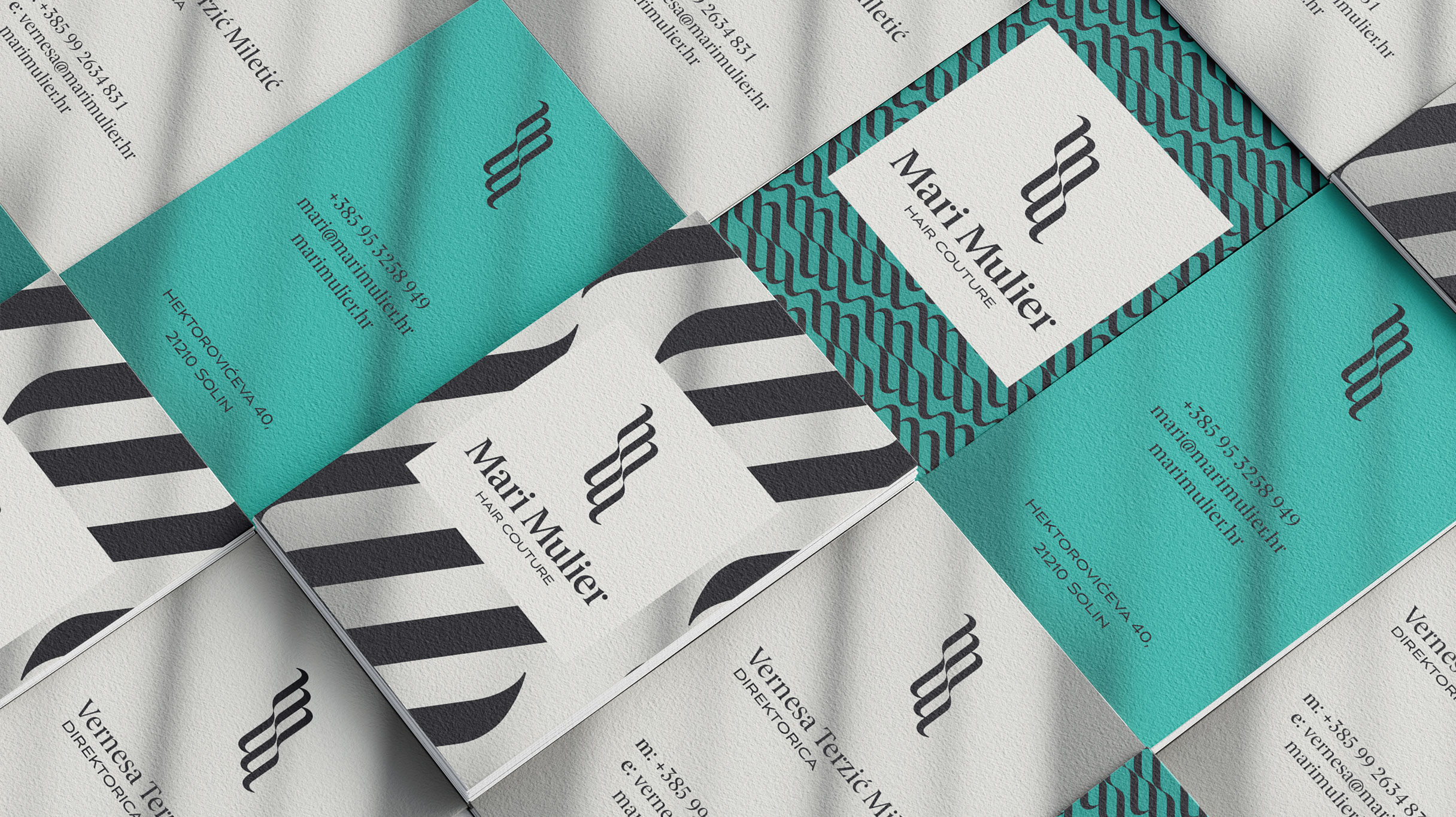
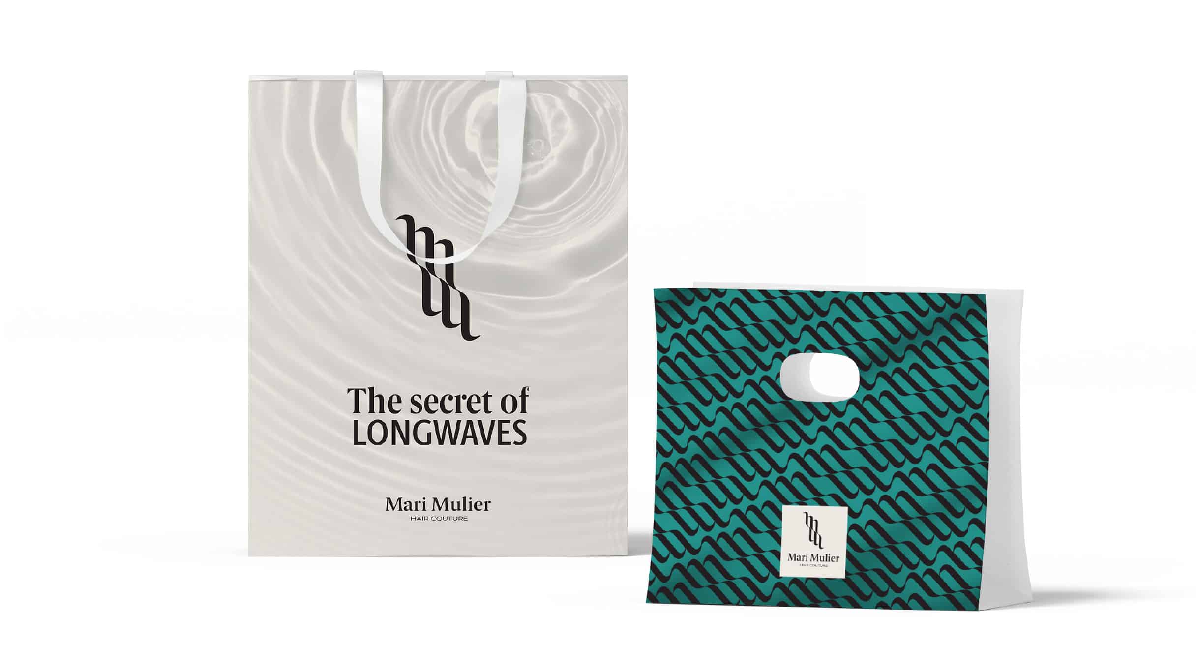
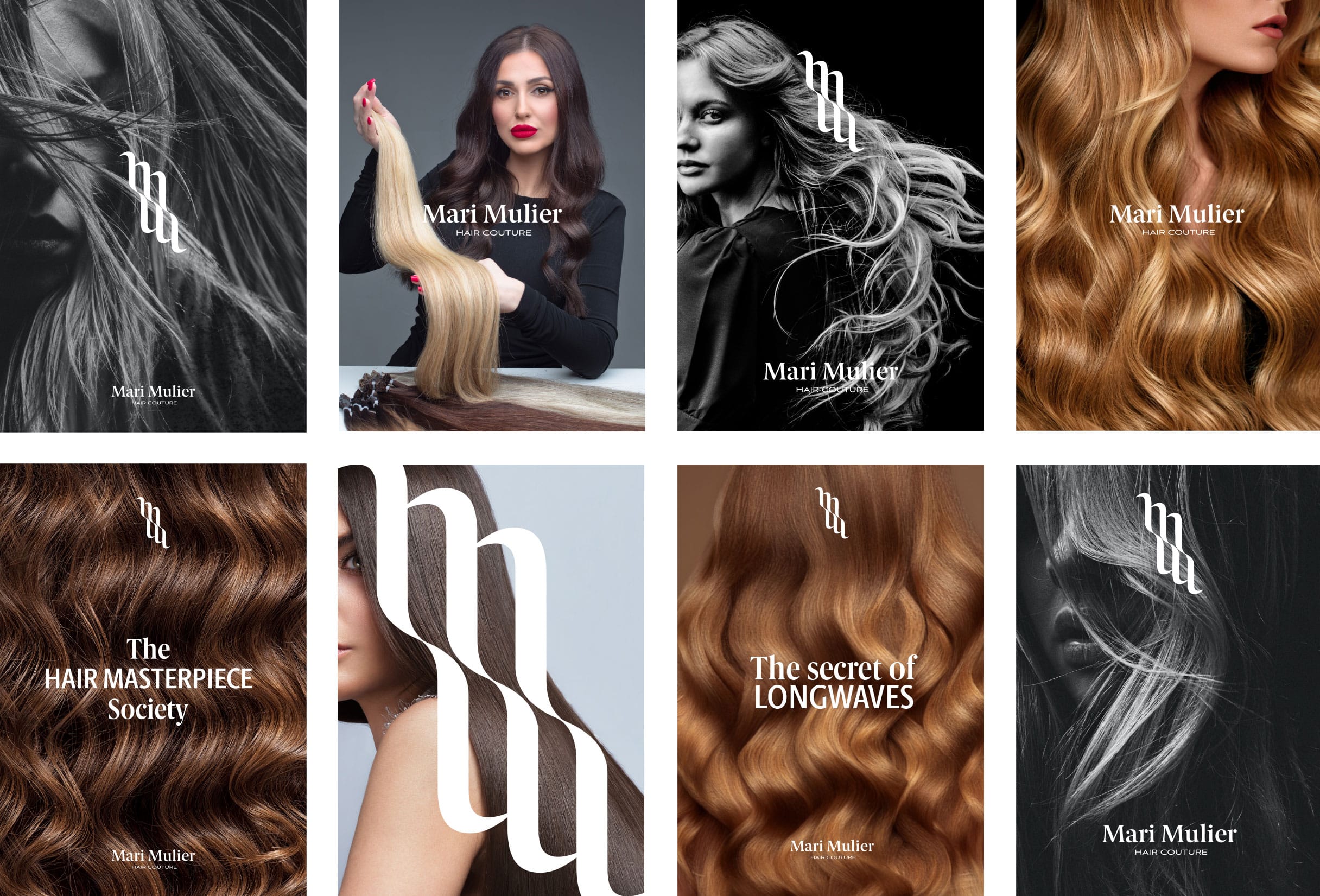
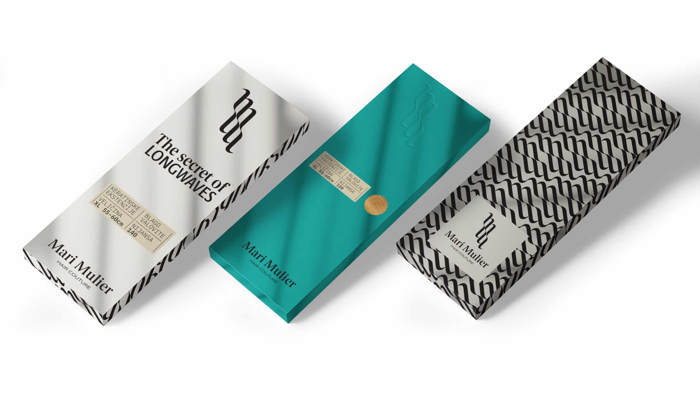
During the creation of the visual identity, we leveraged the new name by turning the initials of the brand, MM, to face each other, creating an illusion of ocean waves and long, flowing hair. This arrangement formed the brand's symbol. For the typographic part of the logo, we selected an elegant serif font to emphasise the classic beauty that the brand strives for.
In addition to black and white, which highlight the refinement of the brand, we added aquamarine blue. This color derives its name from the Latin words "aqua" and "marine," meaning water and sea. According to ancient legends, the gemstone of the same name originates from the depths of the sea and represents the treasures of sea goddesses and sirens. It is considered a protector of sailors and seafarers.
Brand strategy
To ensure that the newly conceived brand is not only aesthetically pleasing but also functional, we developed a brand strategy. Covering almost 100 pages, we addressed all facets of the brand, from its essence and functionalities to personality, vision, and mission, as well as the brand's promises and detailed target audiences. The strategy extended to the digital presentation of the brand in the online environment and the physical presentation of the brand in the salon. This encompassed aspects such as staff behaviour and appearance, the scent, and the overall atmosphere of the salon.
Adjustment of the interior
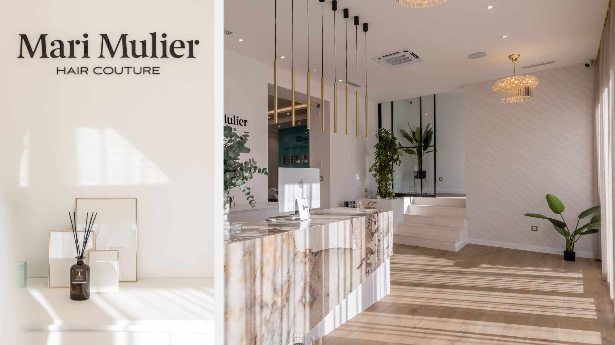
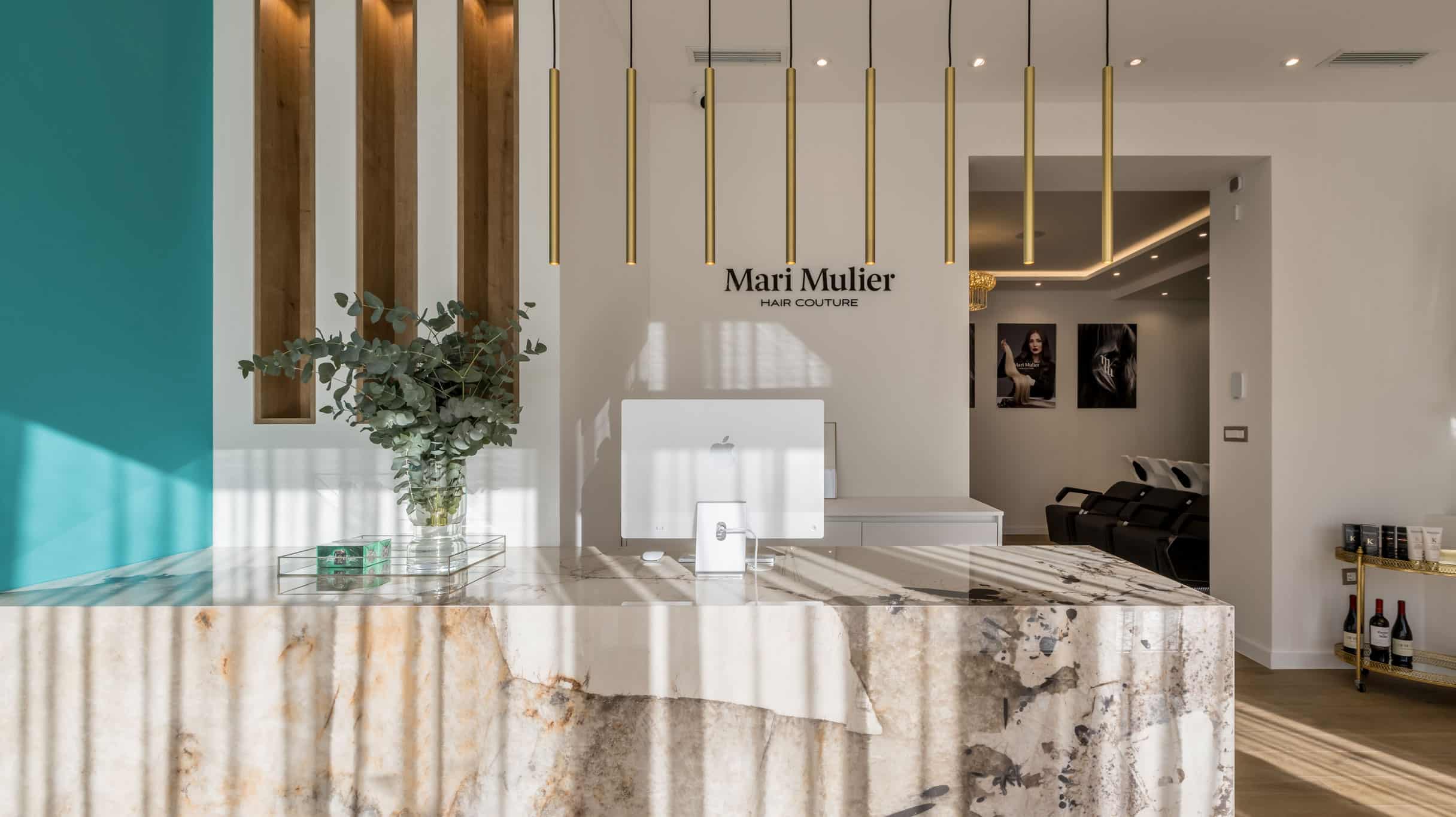
In collaboration with the architect who designed the interior of the new salon, we created brand image photographs as well as wallpapers that contributed to the brand's recognition within the space. The brand colours and patterns seamlessly integrated into the new atmosphere of the premium salon, enhancing the overall aesthetic appeal.
Website
The website was designed with a focus on the high aesthetics of the brand. Our goal was to emphasise the importance of educating clients about extensions, covering aspects such as the installation process, maintenance, hair quality, and more.
What our client said about us
While in search for a marketing agency to handle the rebranding of my existing brand and beyond, I researched all the leading agencies in the country. I had a clear goal and idea of what I wanted to achieve, but I needed an agency to guide me toward that goal. The objective was to create a new brand that would showcase my service and quality, enabling growth and positioning in the market. I chose Fabula based on their work, which I saw and compared with the works of others.
Together, we achieved exactly that in just a few months.
Collaborating with Fabula meant a lot for my company.
For Mladenka and her entire team, I can say they are professionals who leave nothing to chance. The work on the project and communication went smoothly, and considering everything mentioned, I decided to continue the collaboration. I entrusted them with the management of the company's marketing, which quickly proved to be an excellent decision.
Thanks to Mladenka, Tena, Marko, Nikolina, and others who worked on the Mari Mulier project for their promptness, kindness, professionalism, and patience.
Vernesa
