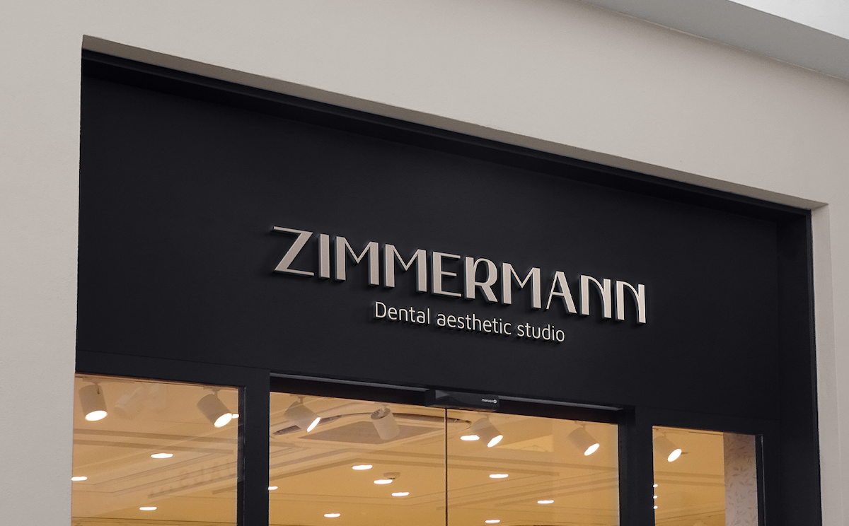


ZIMMERMANN
CLIENT
Zimmermann dentalYEAR
2022SERVICES
REBRANDING VERBAL IDENTITY VISUAL IDENTITYZimmermann Dental is one of the first private practices in Croatia that started with its work back in 1989. In addition to the family stamp and tradition, Dr. Marko Zimmermann wanted to further emphasise the values in visual and verbal communication of his brand - such as continuous education, academic excellence and a different approach to patients - values which inevitably condition dental service of exceptional quality.
Verbal identity
The client decided to keep the surname Zimmermann in the name of the brand. Surname Zimmermann for years has been perceived in Rijeka and its surroundings as a synonym for quality dental service with a long family tradition.
We added the signature dental aesthetic studio through which we clearly communicated which types of dental services are in brand’s focus, and at the same time emphasised Zimmermann as a studio that voluntarily moves away from the so-called fast-food dentistry with an emphasis on personalised service in which the patient and his experience are the beginning and the end of everything.
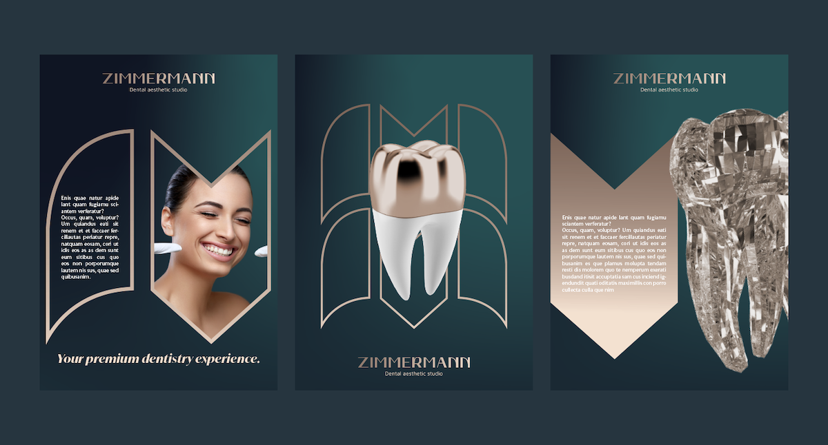
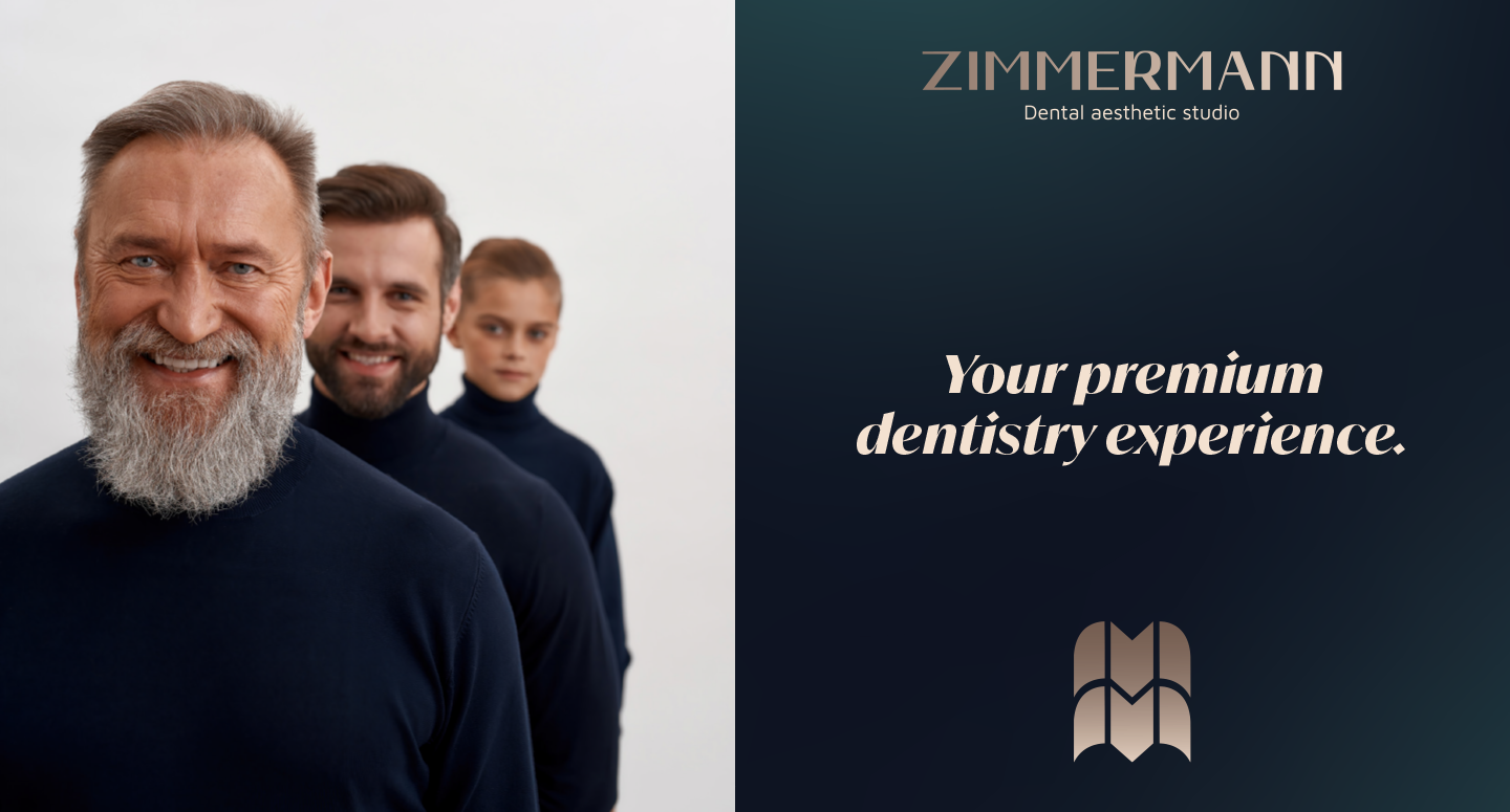
We completed the verbal identity with the slogan Premium dentistry experience which focuses on patients experience. In today's dentistry, education and technology are available to everyone. What makes the difference between dental offices, clinics and polyclinics is the patient's experience which reflects in his perception of the environment, professional approach, implemented technology, education and the end product.

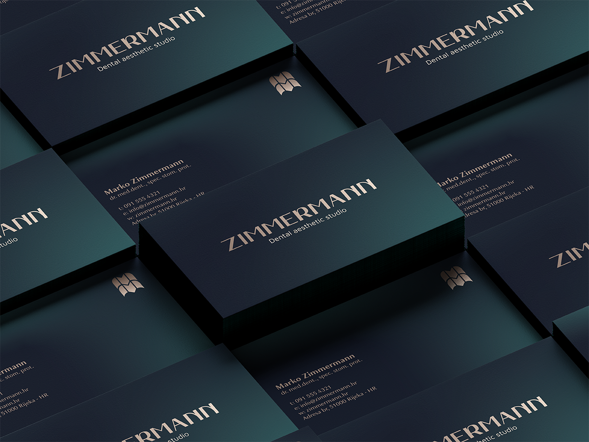
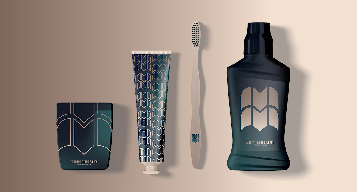
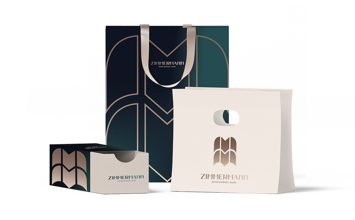
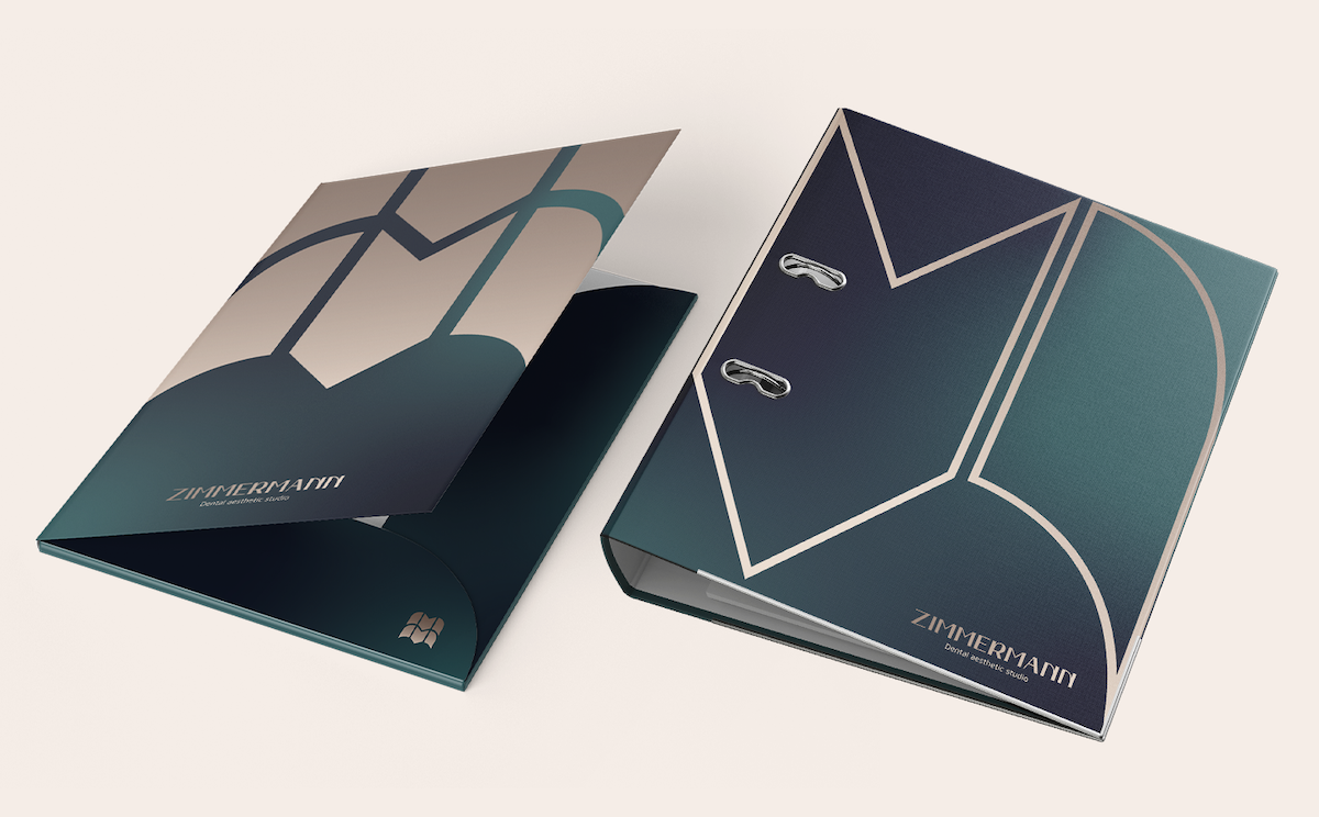
Visual identity
The visual identity naturally reflects the premium dentistry experience moment which in itself represents the essence of the brand. Our goal was to visually distance the brand from frequent visual elements in dentistry and create something that will radiate with luxury and elegance.
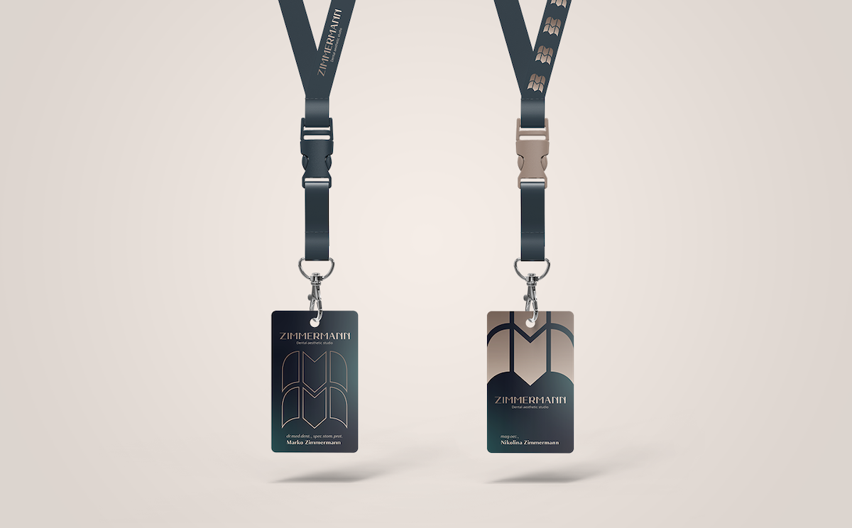
The graphic element we created visually evokes the letter M - the initial letter of Dr. Marko Zimmermann, the holder of Zimmermann's experience and approach, and an abstract and modern variant of the tooth. The typography itself is very elegant and contrasting in its form - a combination of thin and massive lines subtly associates a profession that covers a wide range of services - from conservative to aesthetic.
The choice of colours follows a detachment from the classical expression of dental profession. The emerald blue tone still suggests belonging to the medical profession, while the gentle beige variant was chosen combined with dark background in order to achieve a contrast that looks professional and refined. Both colours are present in gradient form in order to associate with a variety of shades and colours of teeth that are different in every patient.