TOWER CENTER RIJEKA
CLIENT
Tower Center Rijeka, shopping centrewww.tower-center-rijeka.hr
YEAR
2016/2017SERVICES
REBRANDING DESIGN AND COMMUNICATION STRATEGYTower Center Rijeka is one of the most visited shopping centres in Croatia (with an annual average of 5 million visitors) spread over five floors with a wide variety of contents.
Request
The client sought a new visual direction in advertising to shift from old visual solutions to a more modern expression.
Challenge
It was necessary to redesign the logo, in such a way as to remain recognizable and retain the existing identity, but to be up to date.
Solution
Based on the brand platform we developed new communication and visual strategies. We actually shortened the logotype and adapted it to local discourse.
Rebranding
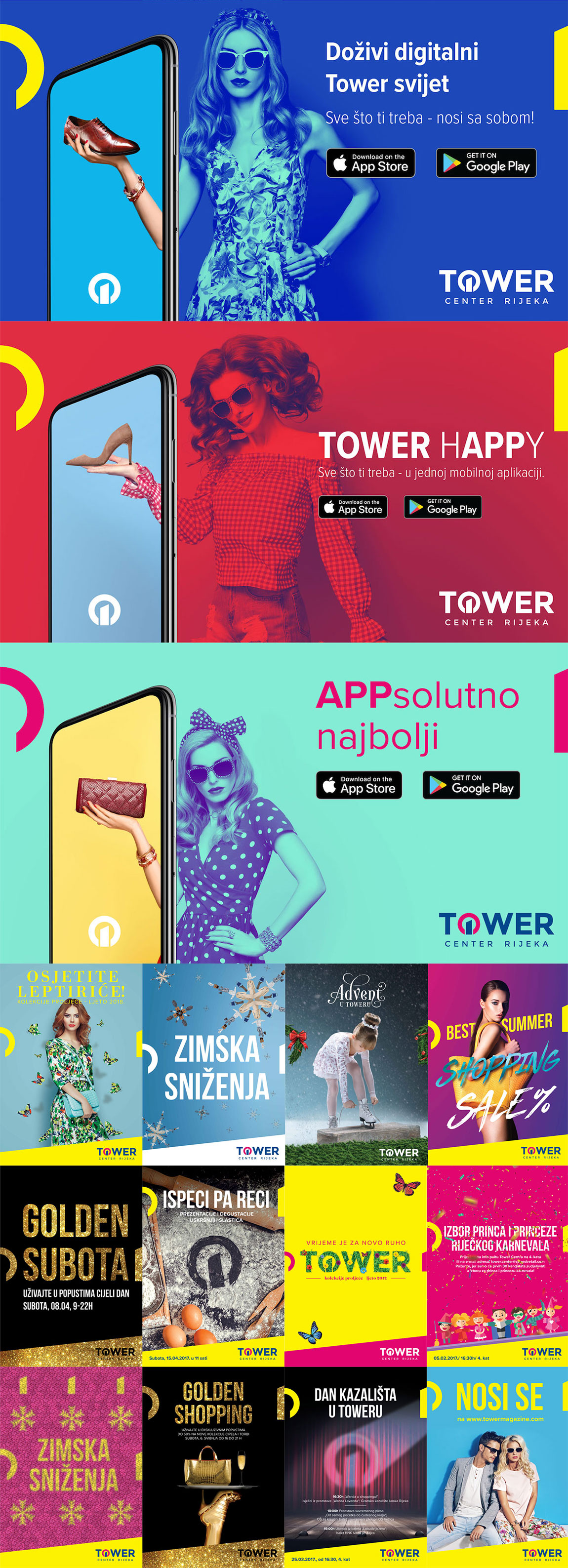
We adapted the logo to local discourse, simplifying it and putting an emphasis on the essential - Tower - which has been a brand for over a decade, and has become a brand itself. We deconstructed the logo in parts and utilised a recognizable structure in new visuals to achieve brand uniformity and distinctiveness.

Design and communication strategy
We used parts of the logo and the slant extending in all materials as a uniform element on all visual solutions and made them the standards of the visual communication.
