

AluK Tim d.o.o.
CLIENT
AluK Tim d.o.o.YEAR
2020.SERVICES
REBRANDING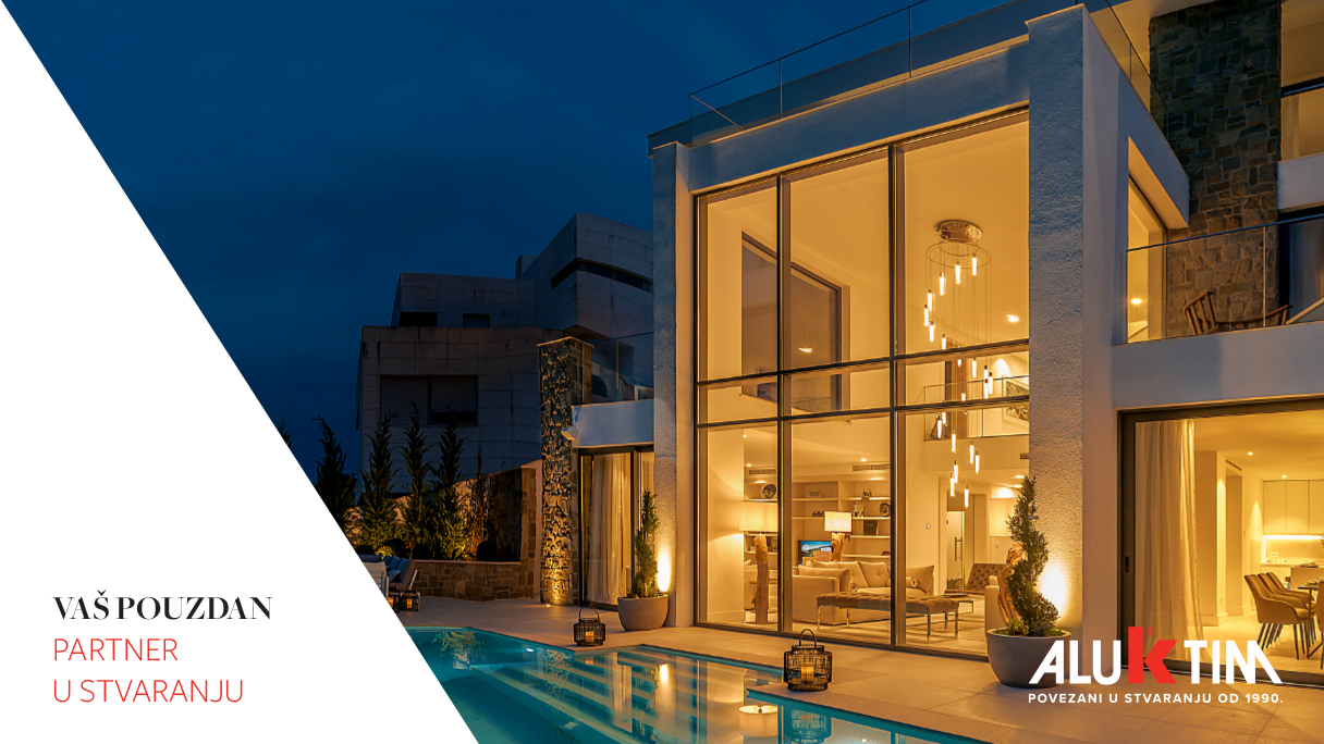
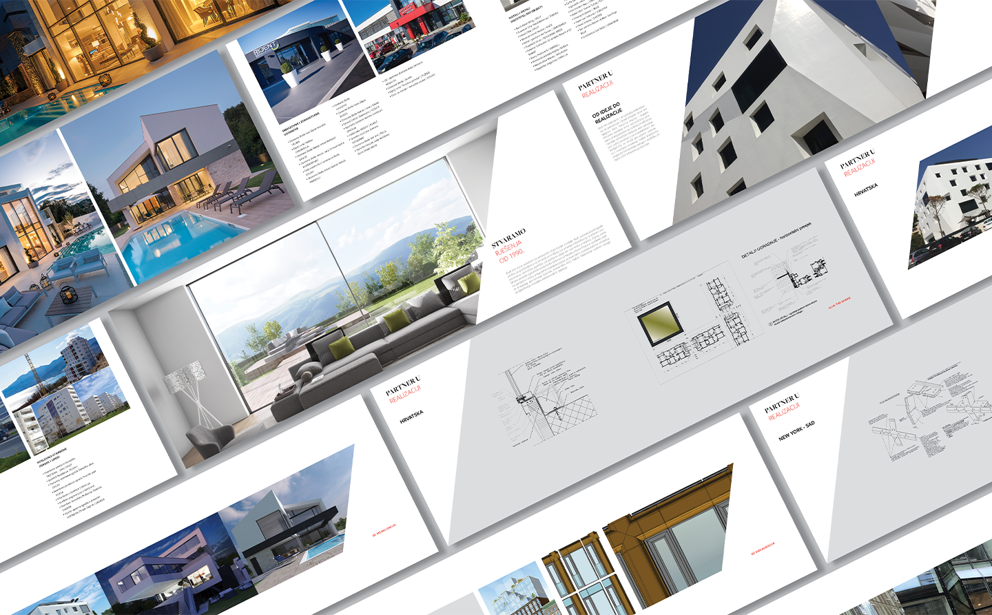
If during the past 30 years you have been renovating or building a real estate, you’ve probably had something to do with AluK Tim. They are authorised representatives and sales distributors of the AluK system of aluminum profiles for construction in Croatia. In addition to sales and distribution, AluK Tim d.o.o. also provides technical support to architects and contractors both in the planning phase and during the development and construction of projects through expert advice related to the installation of AluK products.
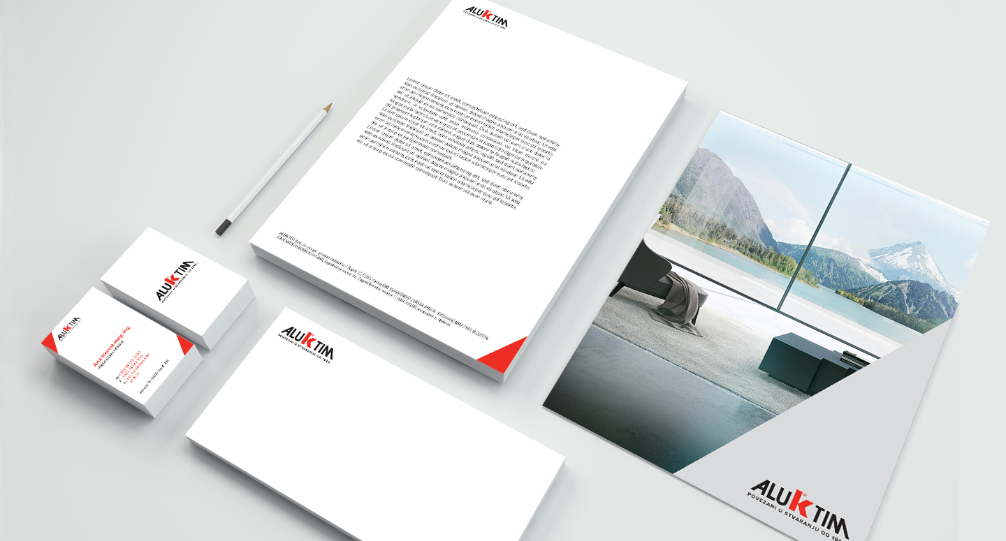
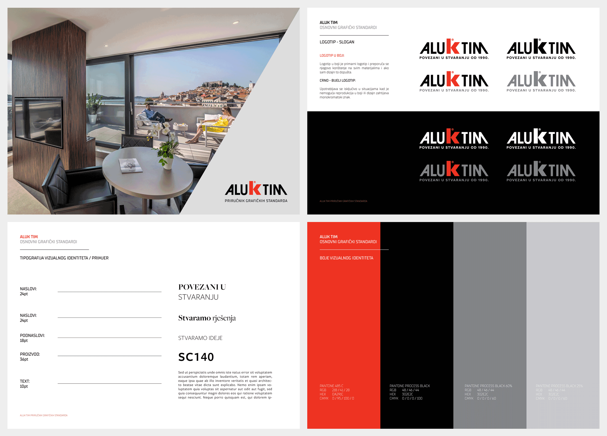
Although AluK Tim already had a recognisable logo, it was necessary to readapt it to the official logo of the Aluk brand and the modern digital contexts.
The existing logo couldn’t be used in the small digital formats the existing typography made it difficult to read and recognise the brand itself.
The biggest challenge was to maintain the recognisable ALUK logo within AluK Tim logo without compromising the recognisability of the existent logo.
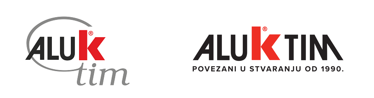
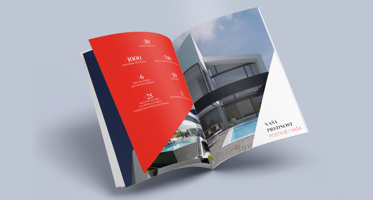
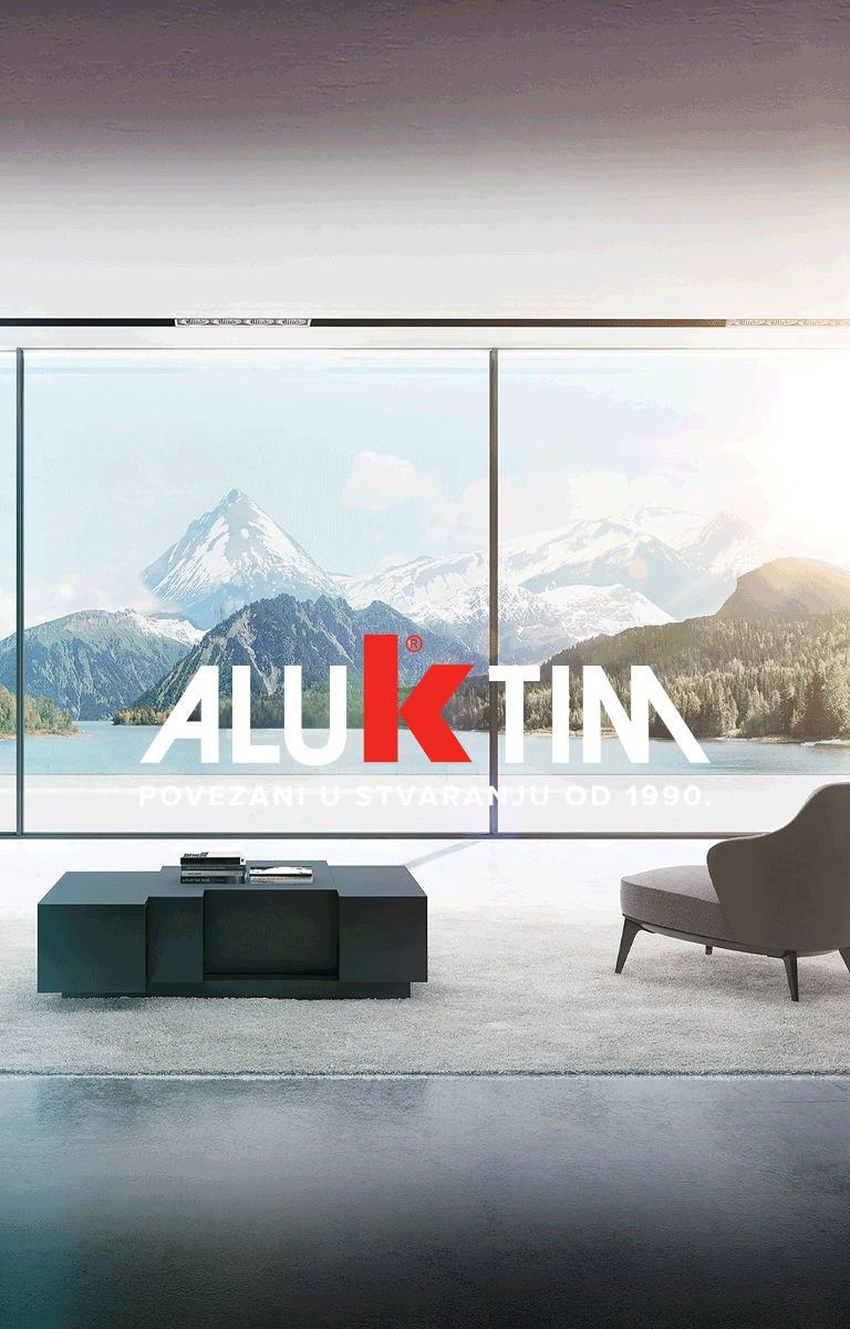
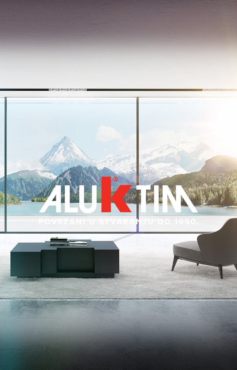
On of the reasons for rebranding was also the 30th anniversary of the AluK Tim brand. It was a perfect motive for a logo’s new story - a logo received a new signature Connected in creation from 1990.
The inspiration for the redesign of the logo was the slope of the letter A at the beginning, which we mirrored to the letter M, creating the symmetry of the whole. We have emphasised the slope as a visual element in other parts of visual communication.