IAUDIT
CLIENT
iAudit d.o.o.YEAR
2024SERVICES
Rebranding Verbal Identity Visual Identity
IAUDIT, an auditing firm from Rijeka, not only focuses on core auditing services but also plays a significant role in business consulting. They approached us intending to refresh their brand through a new visual identity. They aimed to better define their business approach, improve communication with target audiences, and attract new talent to their experienced team. Every rebranding comes with its own set of challenges, requiring alignment between current and future strategies as well as a vision for the brand's development. Our task was to make this financial brand more appealing, easing the perception of auditing as a necessary evil while positioning IAUDIT as an excellent career opportunity for young talents.

Strategic Approach and Market Analysis
From our first meeting with the client, we quickly understood the core values in which IAUDIT builds its success upon a deep passion for its work, simplicity in communication, and a sincere approach that supports the growth of various businesses. Managing a firm is a demanding task, especially when faced with constantly changing financial and regulatory environments. It was important to us that IAUDIT’s target audience, from their first encounter with the brand, could perceive how much the firm would simplify their work and offer clear direction.
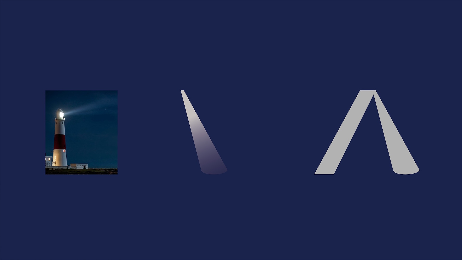
After a detailed market analysis and a review of competitors' visual communications, we selected a lighthouse as the perfect metaphor for IAUDIT: a beam of light that illuminates the way and guides through the unknown. The verbal identity needed to communicate not only with the target audience that transcends national borders in this digital age but also with those starting their careers in finance, who could find a safe harbor and a springboard for growth in IAUDIT.
Verbal Identity
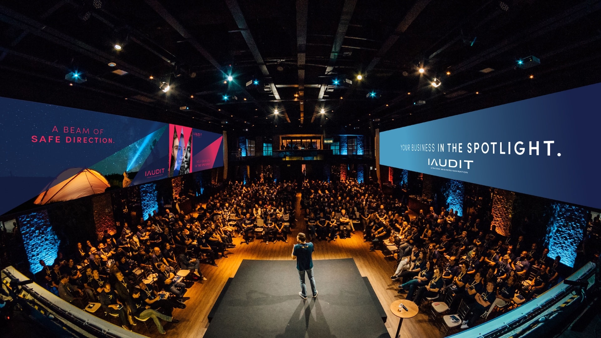
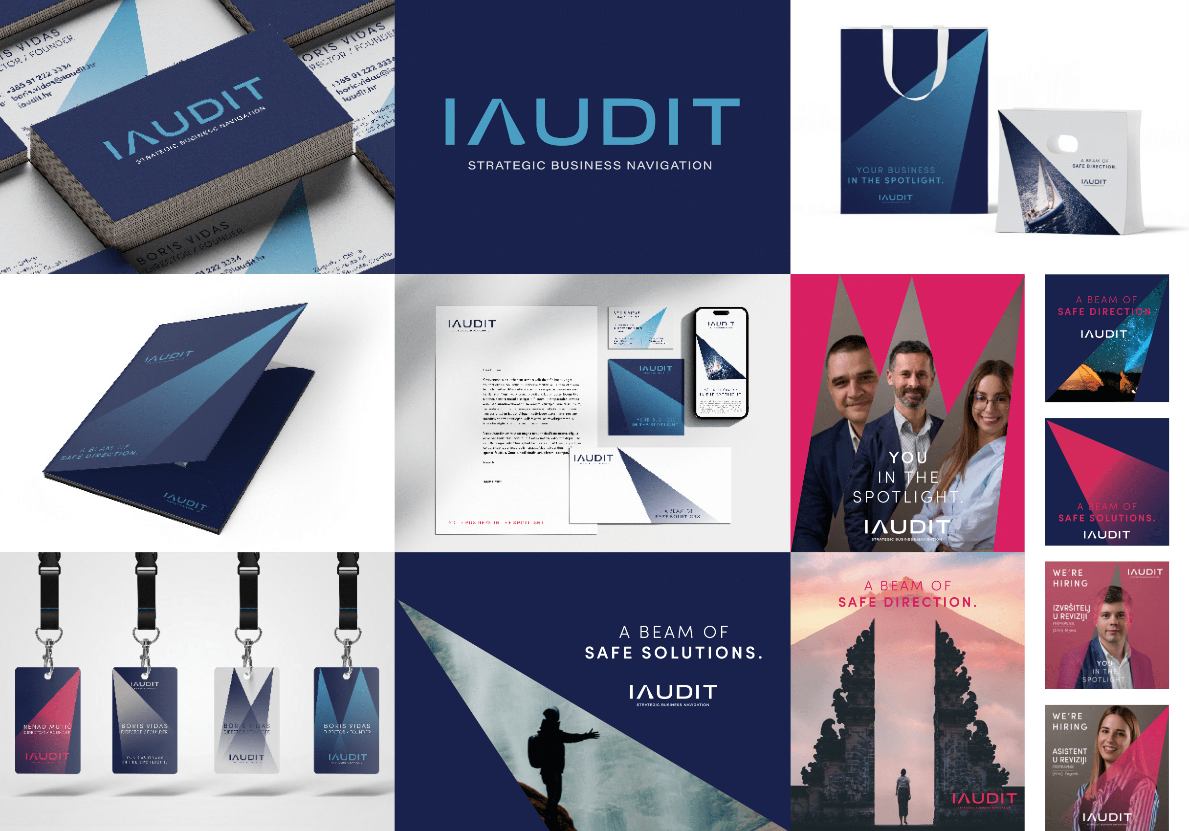
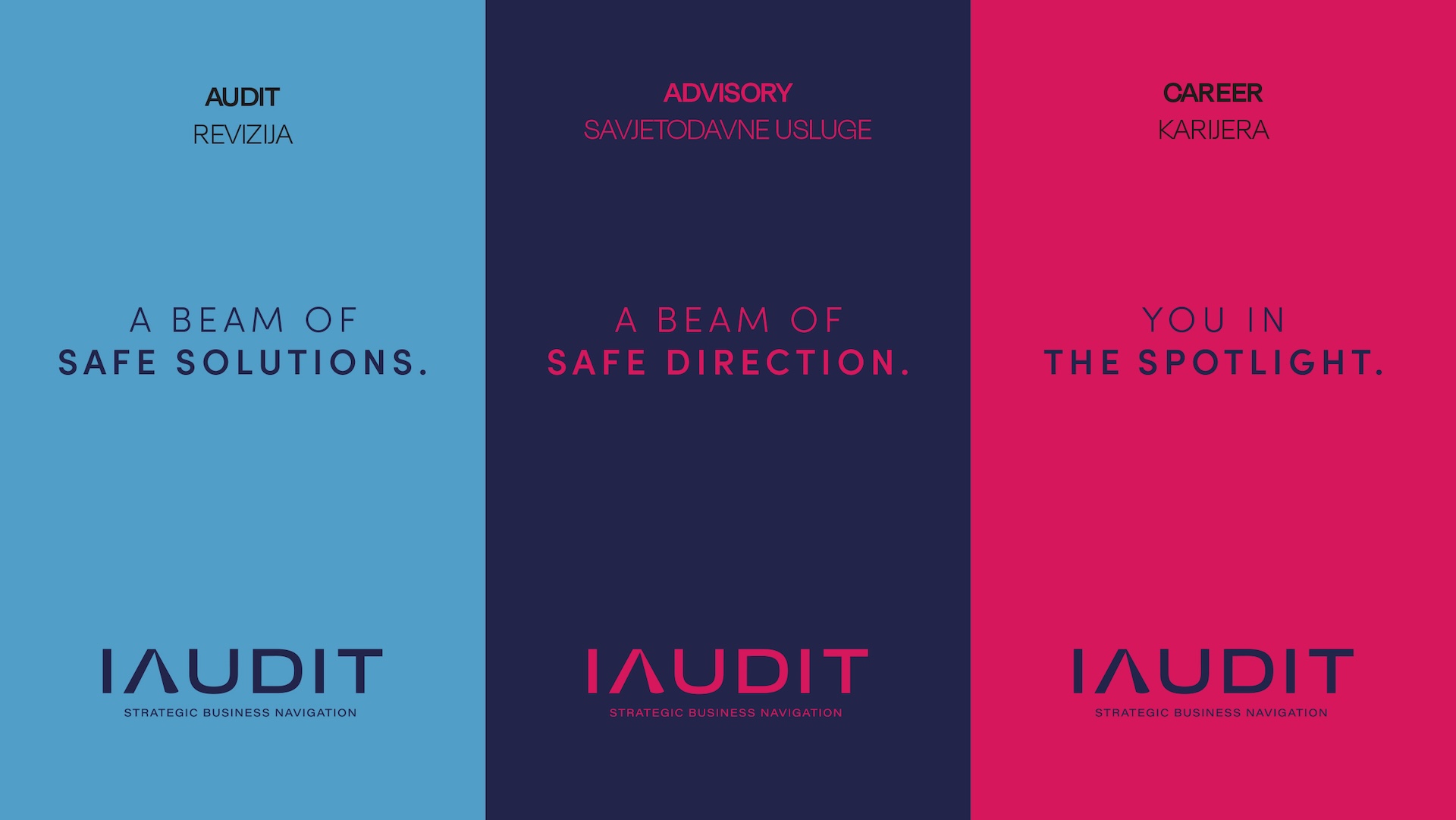
With the new tagline accompanying the rebranding, "Strategic business navigation," we divided audit into three sections: Audit, Advisory, and Career Development. The slogan "Your business in the spotlight" uses the metaphor of a beam of light, symbolizing a strong focus on clients' business and positioning it at the center of attention, rather than a literal interpretation of audit and advisory services.
Each section carries its own message:
Audit: "A beam of safe solutions"
Advisory: "A beam of safe direction"
Career: "You in the spotlight," emphasizing a personalized approach and career development within IAUDIT.
Visual Identity
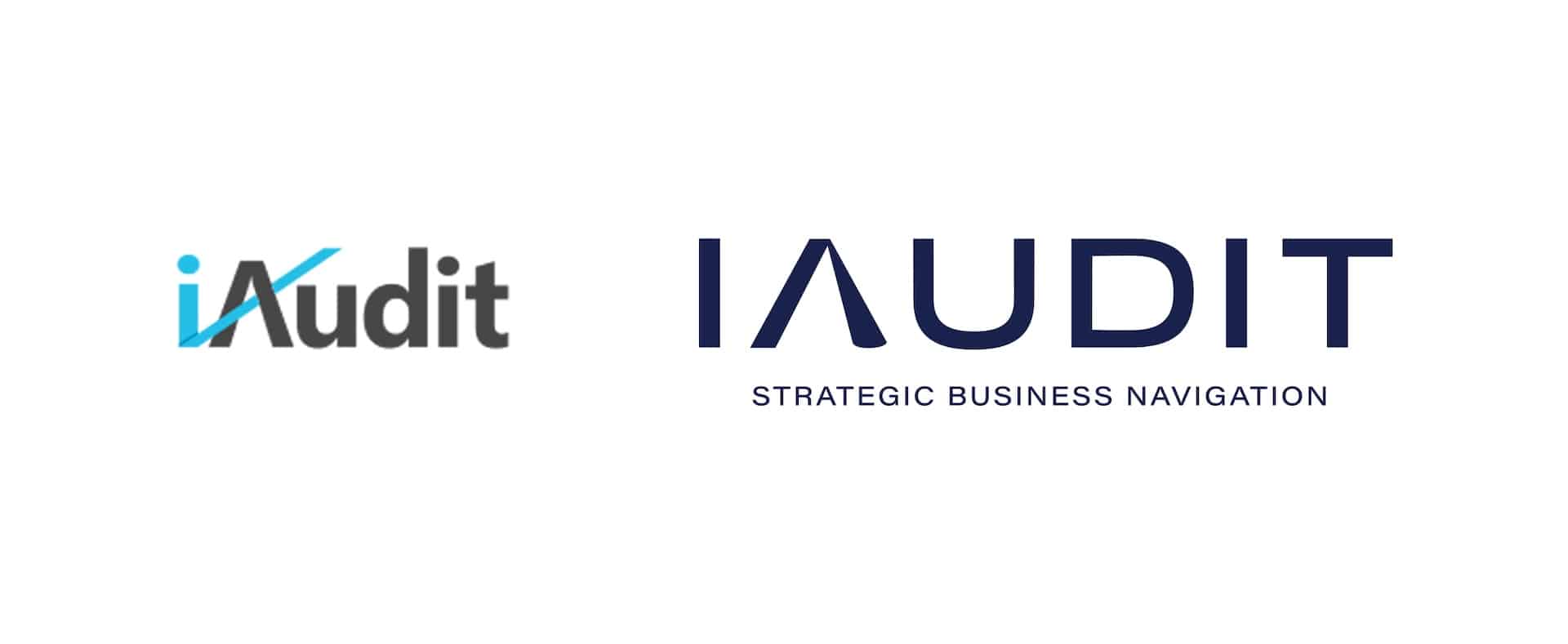
The guiding beam of light is the motif of the rebranding, elegantly incorporated into the leg of the letter "A." Subtle yet expressive enough, it serves as a clever distinction and rounds off the overall rebranding task. The Rijeka-based brand, inspired by maritime themes, is presented with two shades of blue and a concrete-gray color. To the new visual identity, we added a vibrant pink shade intended for the Career section, where passion for the job becomes both inspiration and motivation.
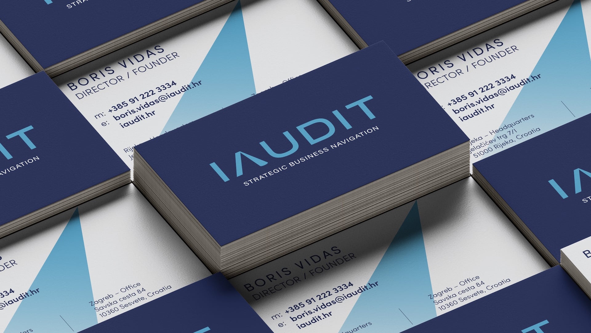
The beam of light proved to be an excellent visual element, adaptable across various communication materials: from letterheads, business cards, and folders to digital post frames. The moodboard of photos the brand uses to contrast the usual stock images of the financial and office industries, celebrating the life and free time of entrepreneurs who have entrusted important regulations and figures to IAUDIT.
Results
The result of IAUDIT’s rebranding successfully combines a modern approach with preserving existing values. The new visual and verbal identities were designed to meet the challenges of digital communication and attract a younger audience while maintaining a high level of professionalism that ensures the trust of long-standing clients.
