NURA
CLIENT
Dina MaršanićYEAR
2024SERVICES
REBRANDING VERBAL IDENTITY VISUAL IDENTITYAt Fabula, branding often marks the beginning of a long-term collaboration through mutual support and business growth. Dina, owner of an aesthetic center, decided to significantly expand her business by opening a specialized clinic focused on medical treatments. The change in service and the opening of a specialized clinic, oriented towards top innovative methods, are best heralded by a new branding initiative.
Strategic Approach and Market Analysis
During her time in the beauty industry, the client gained valuable experience and recognized a growing need for professional and comprehensive skin care. We focused on a newly defined and thoroughly developed brand persona for the clinic, directing our strategy towards communication that clearly identifies and solves specific client problems. Market analysis revealed a niche for specialized and exclusive services combining invasive and non-invasive treatments, aligned with clients' desires and health. Our solutions emphasize the clinic's specialized services, highlighting professionalism and a warm approach.
Verbal Identity
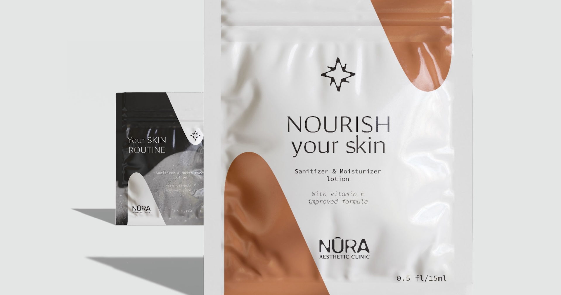
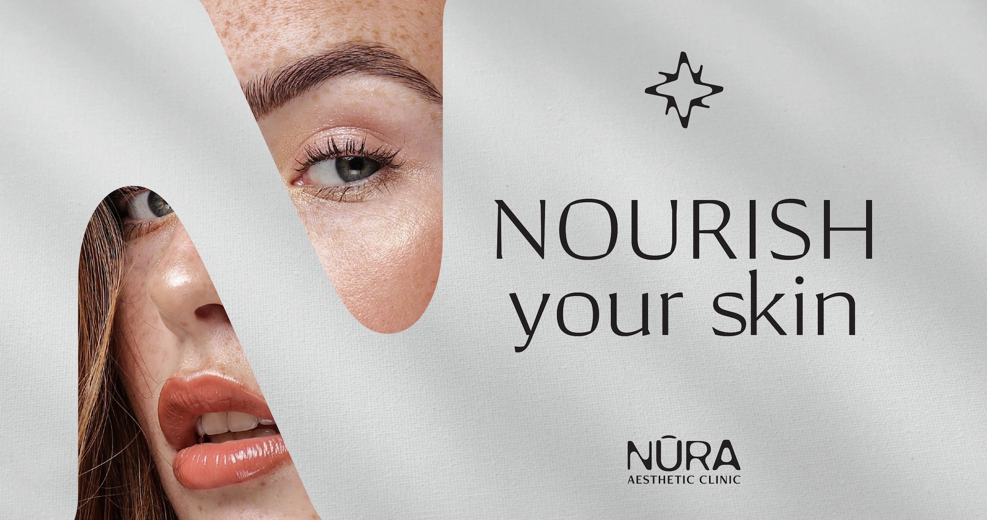
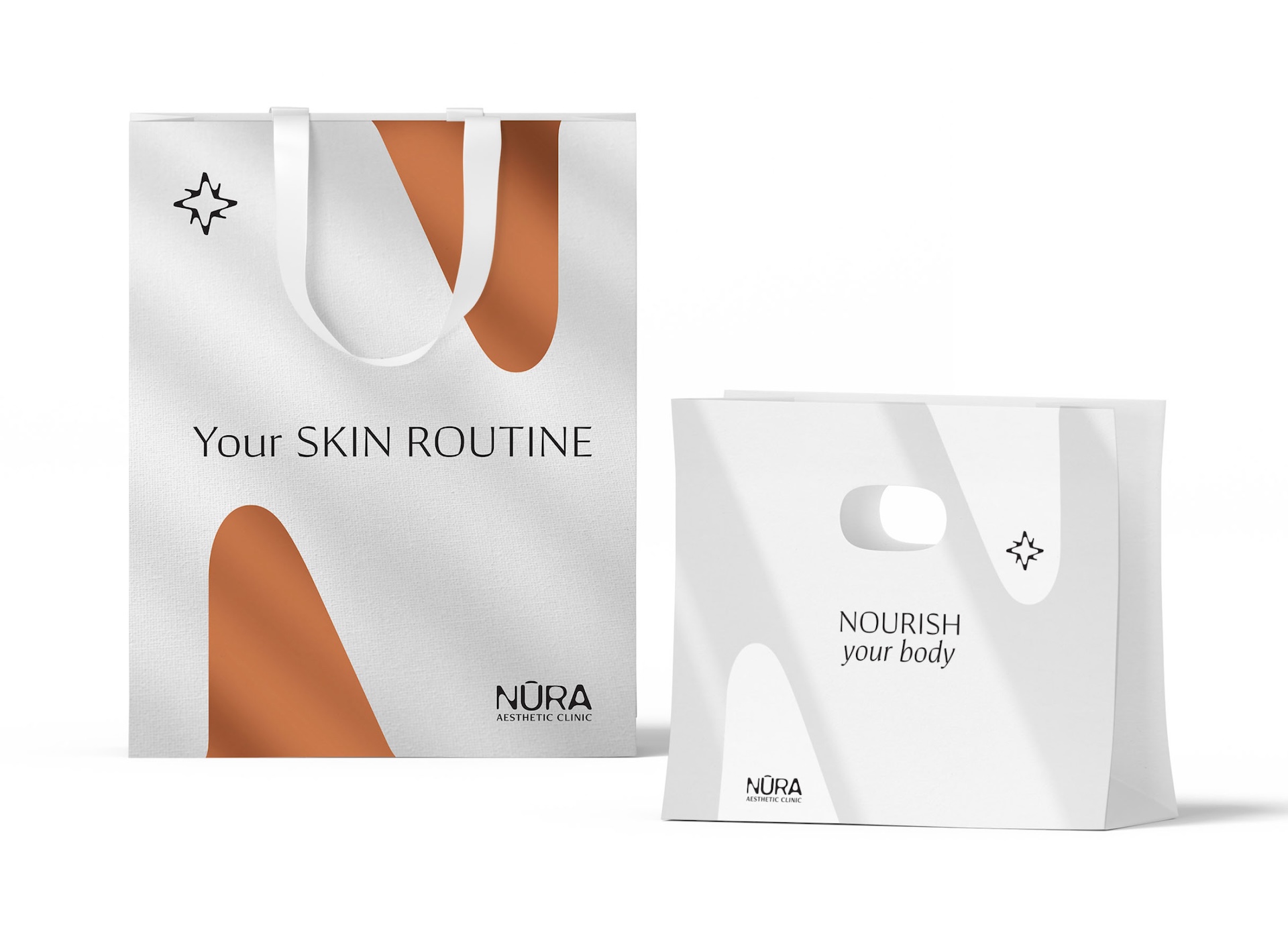
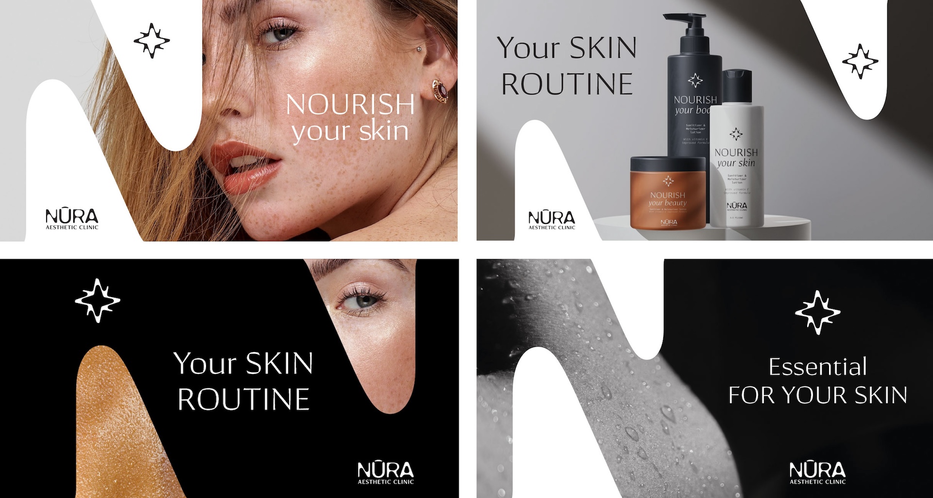
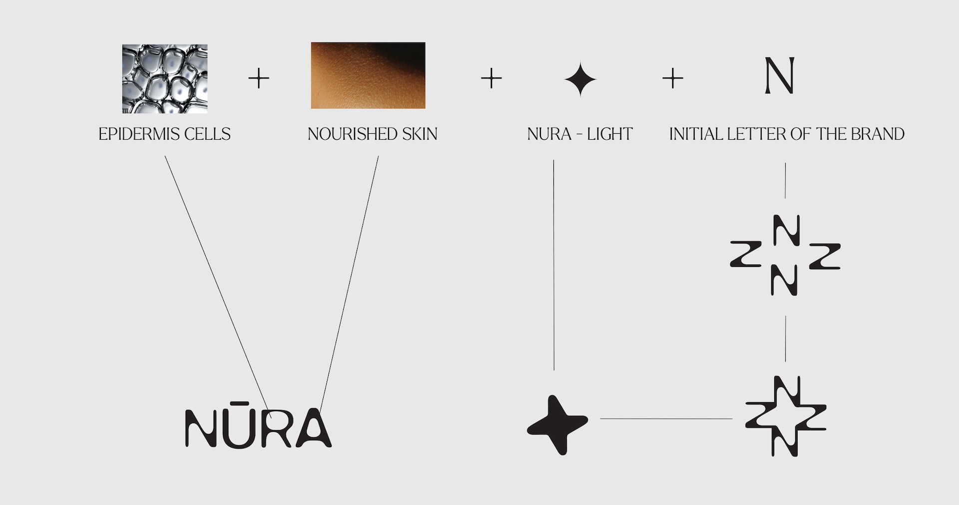
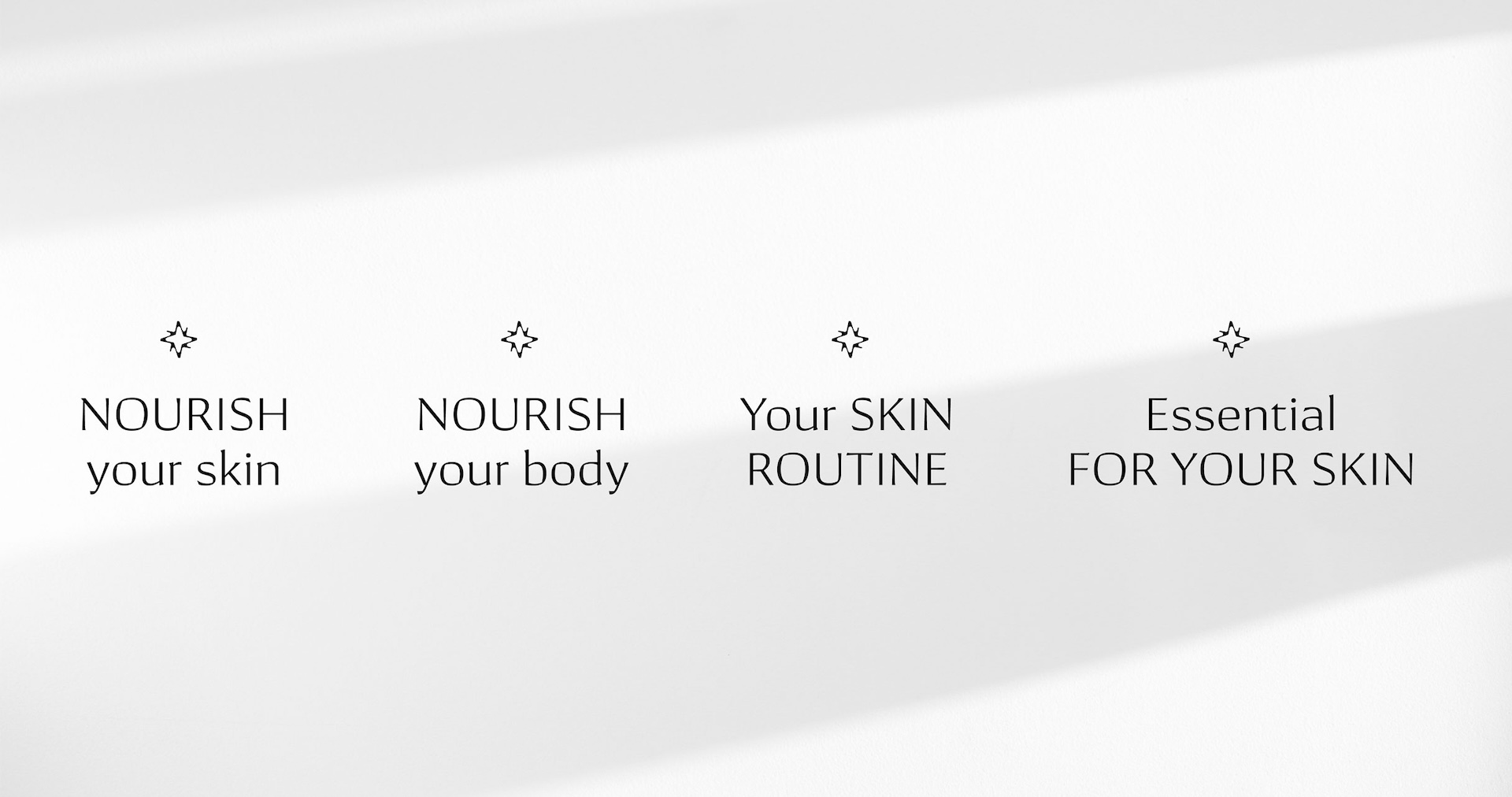
The process of creating a verbal identity started with the selection of the key word "nura," which comes from Latin meaning "clean" and "exclusive," and in Arabic means "light." We obtained a name that communicates clean and cared-for skin and the unique character of the clinic. The brand was supplemented with a modular slogan based on the word Nourish, phonetically reminiscent of the brand name, allowing flexibility in communicating various services.
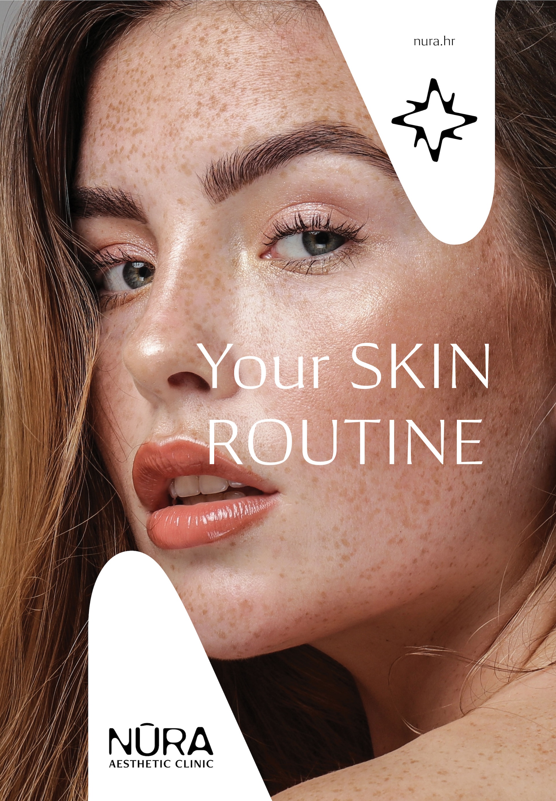
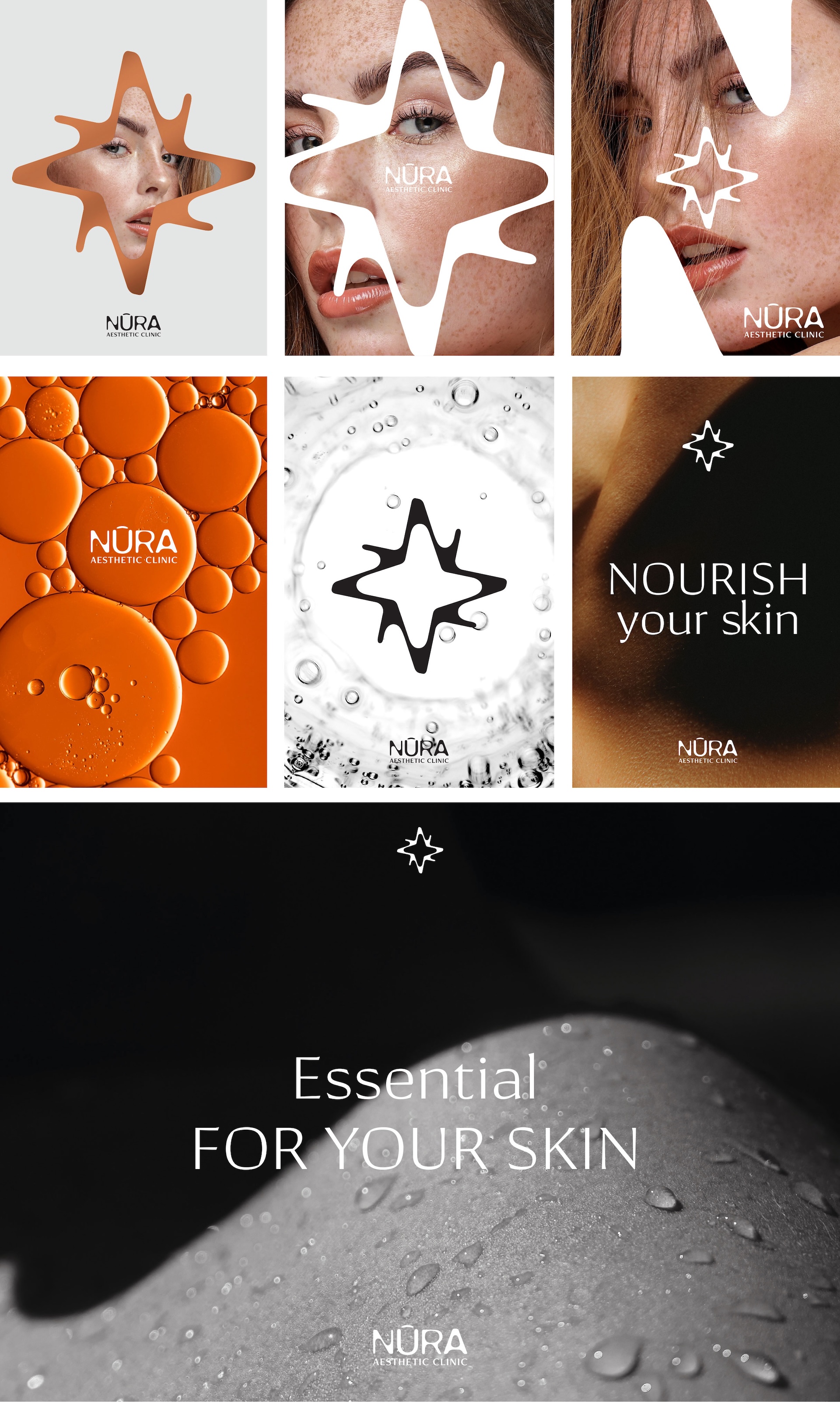
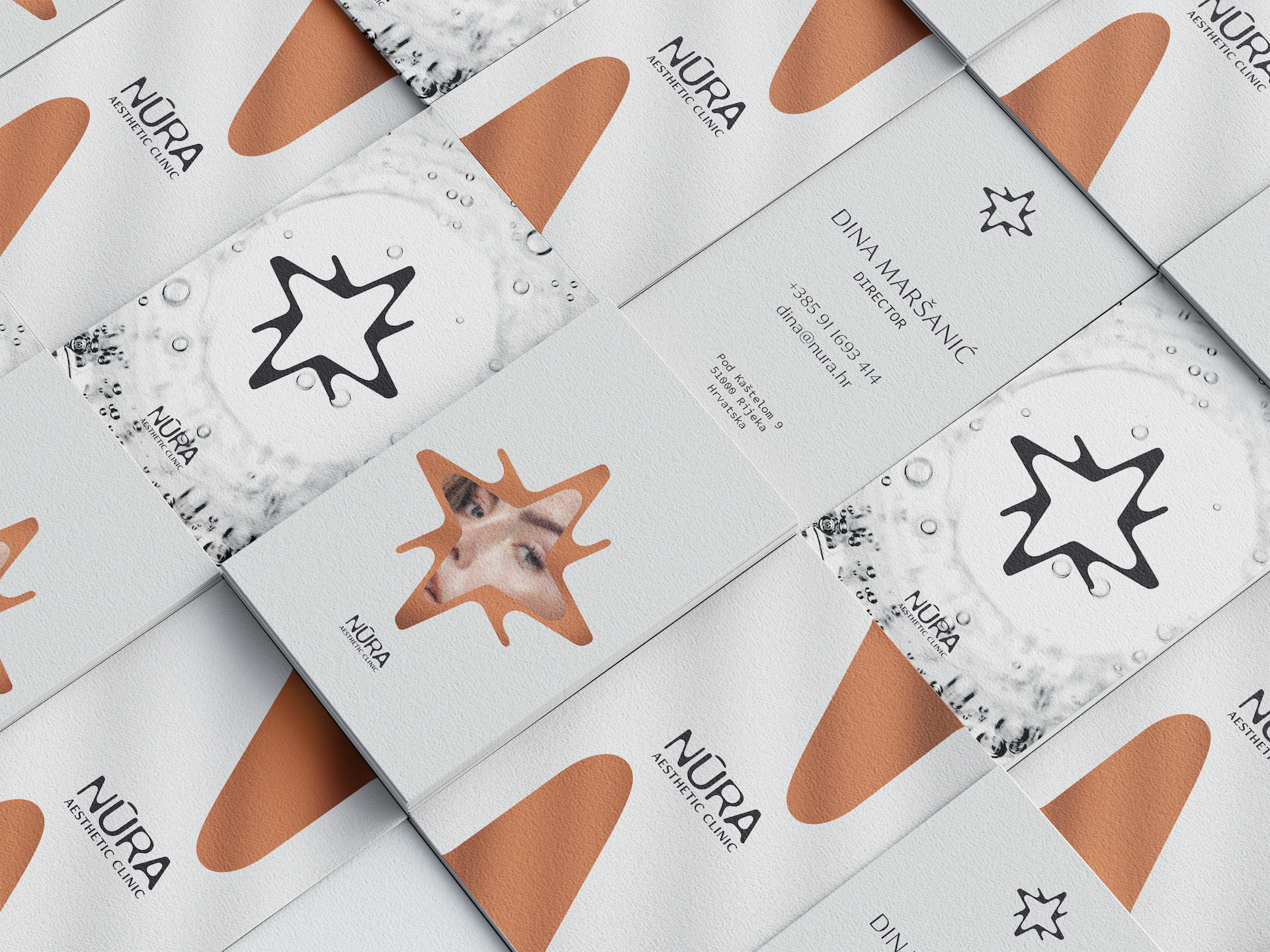
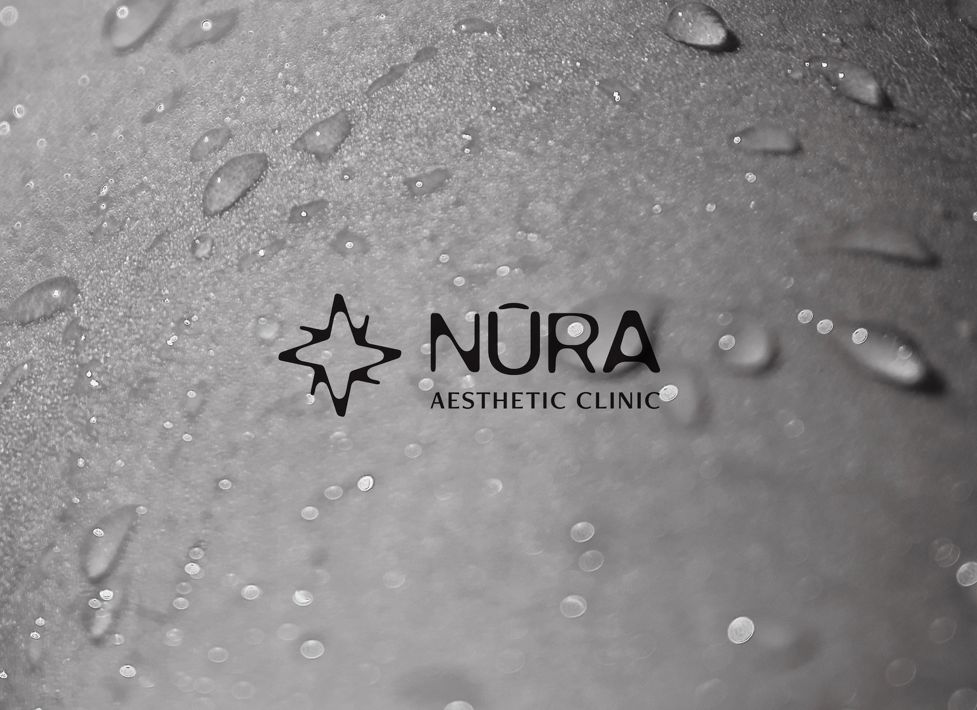
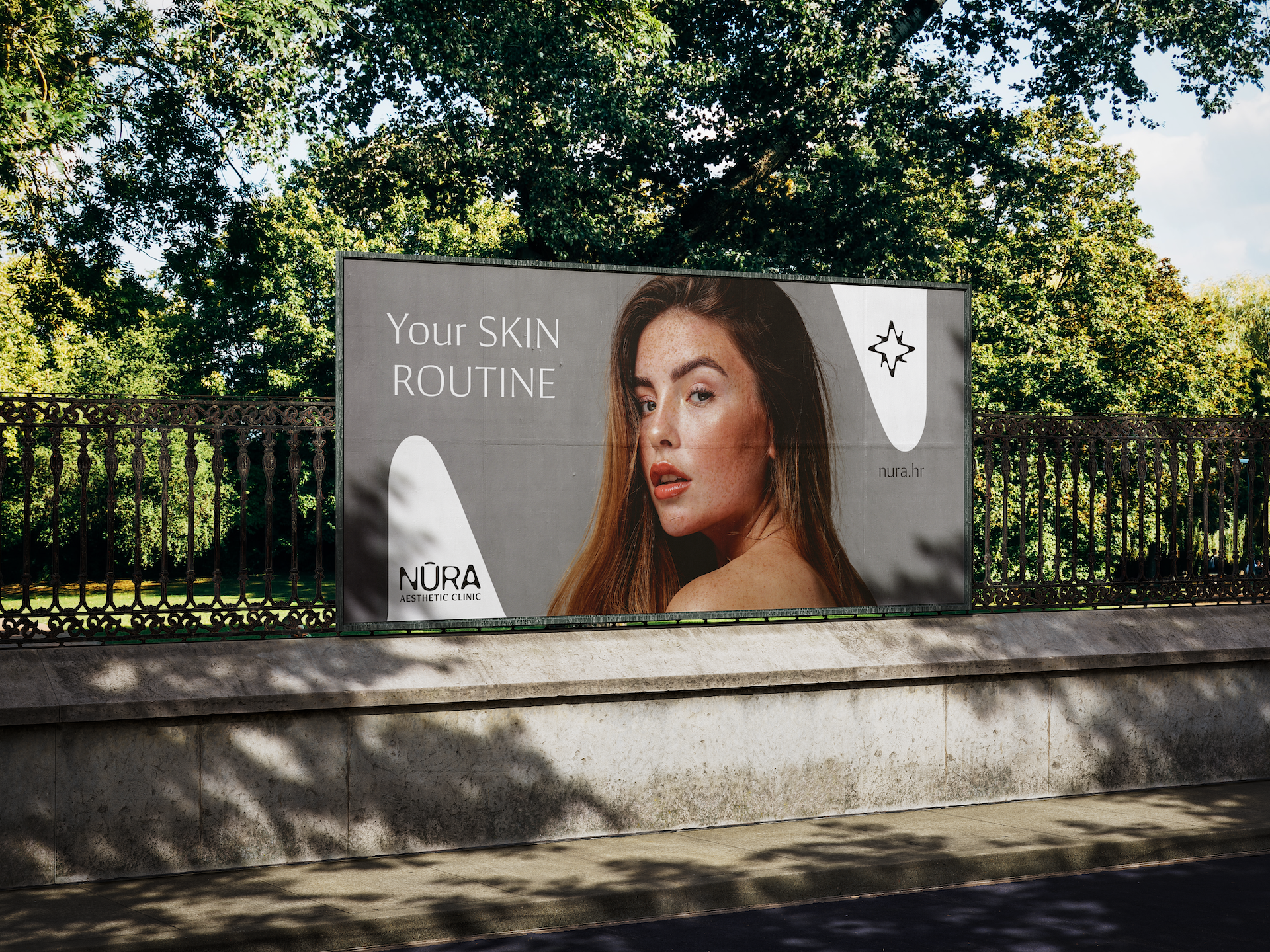
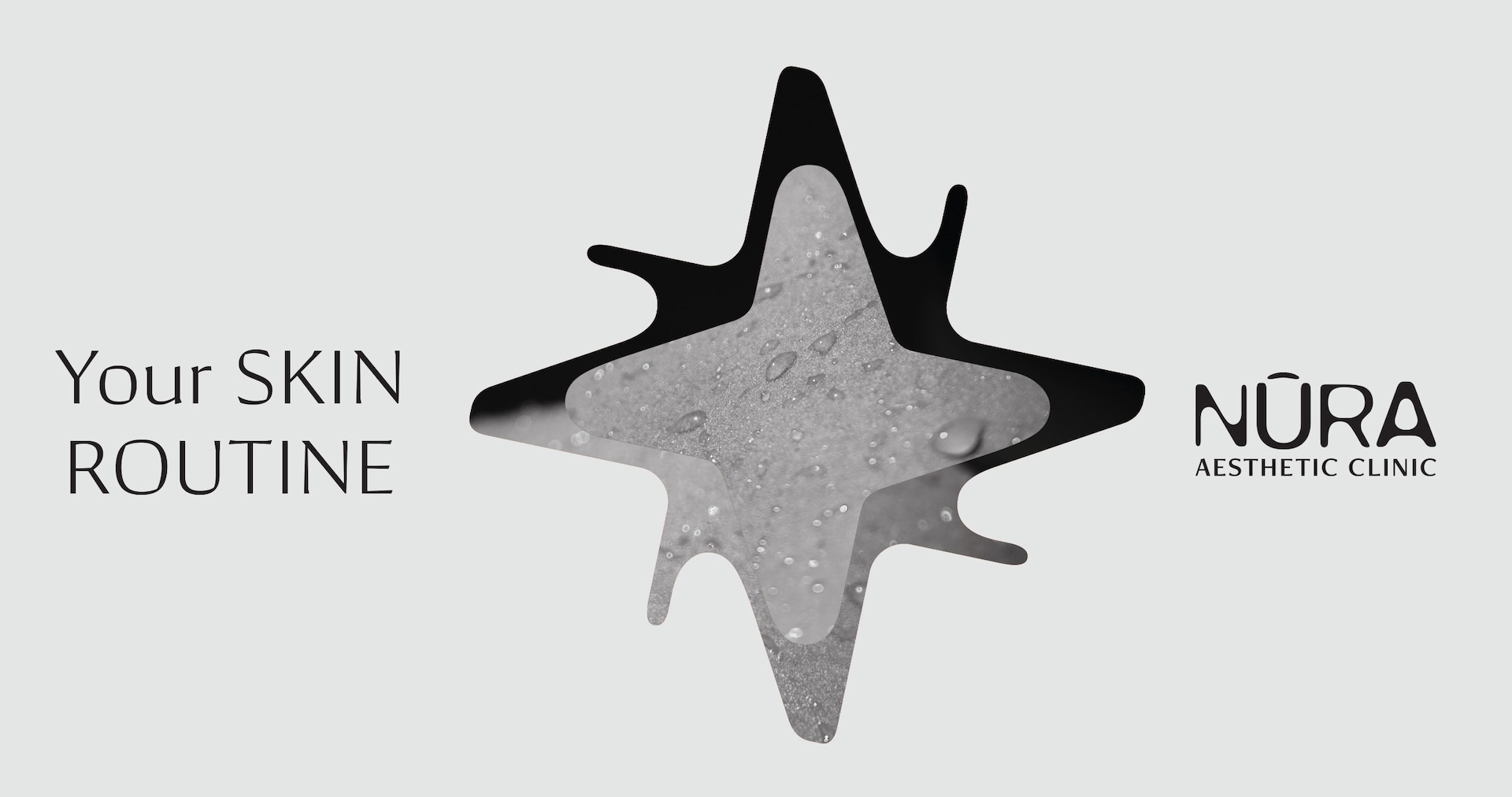
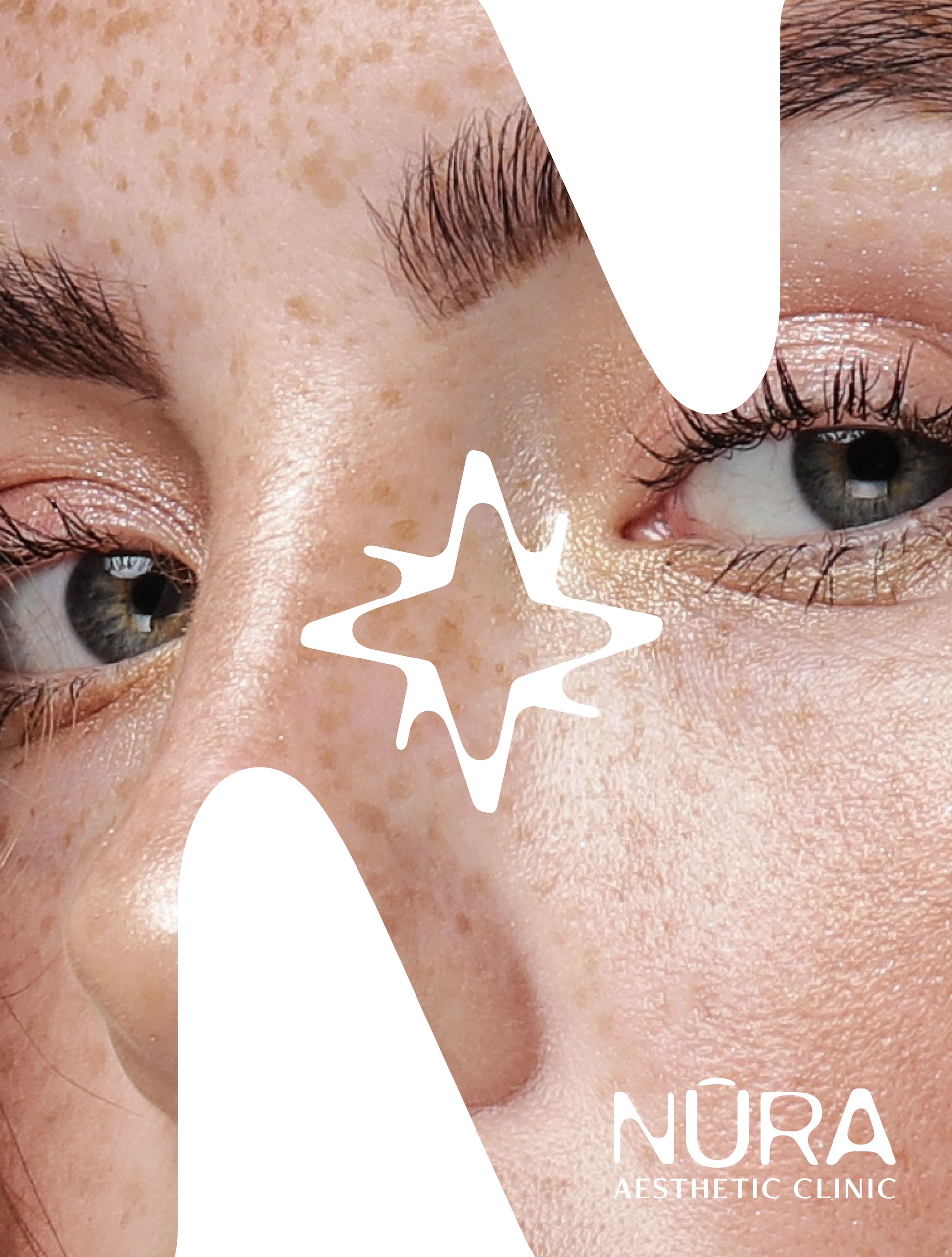
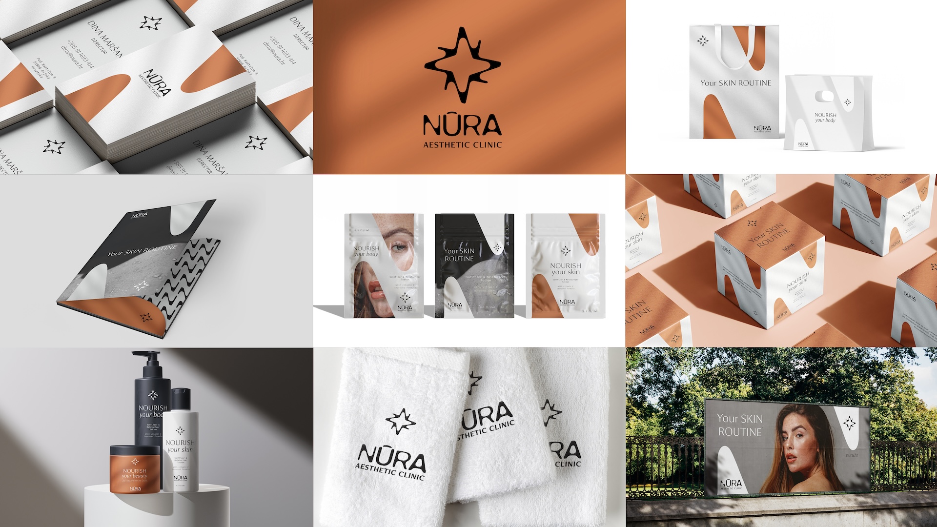
Visual Identity
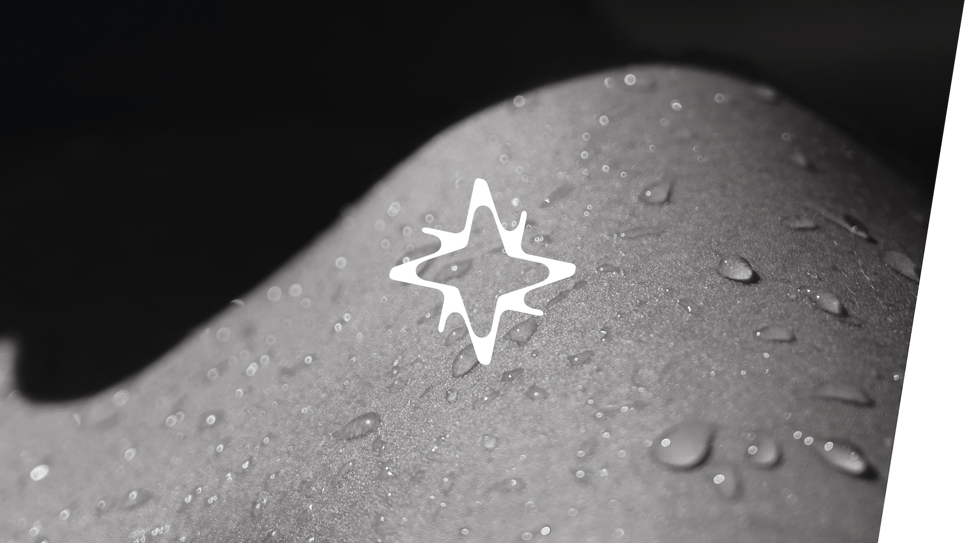
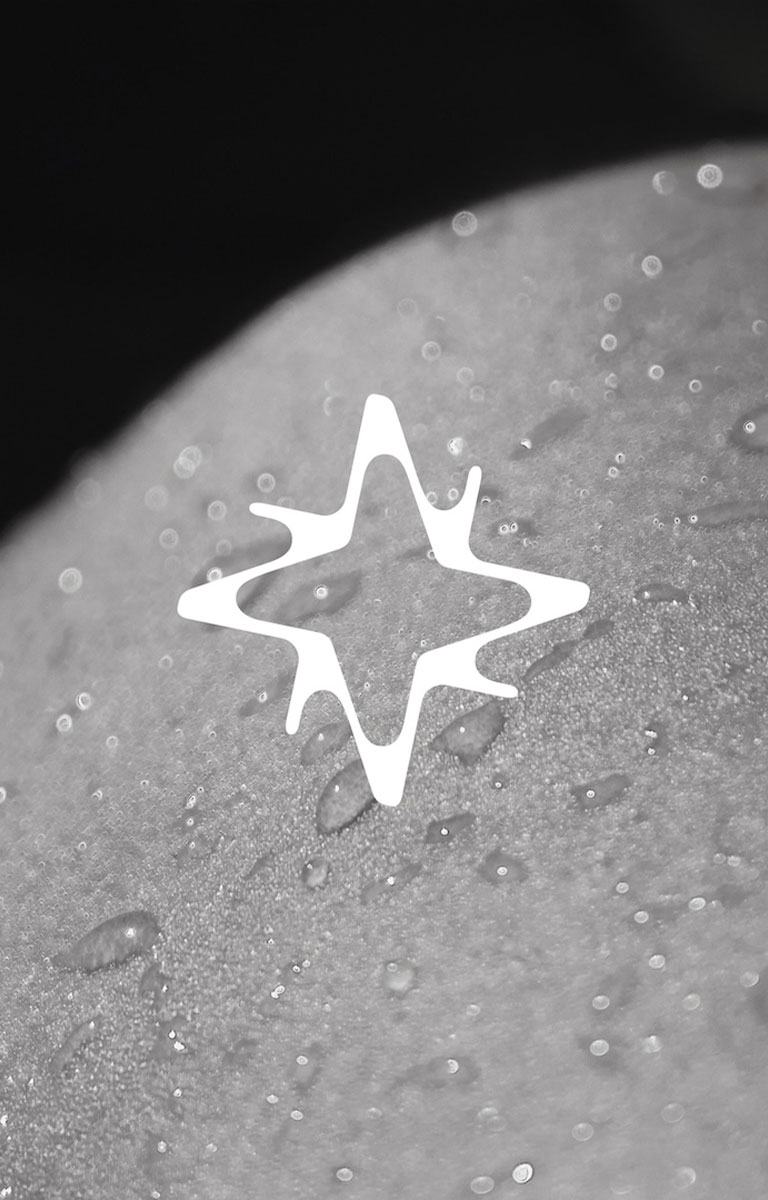
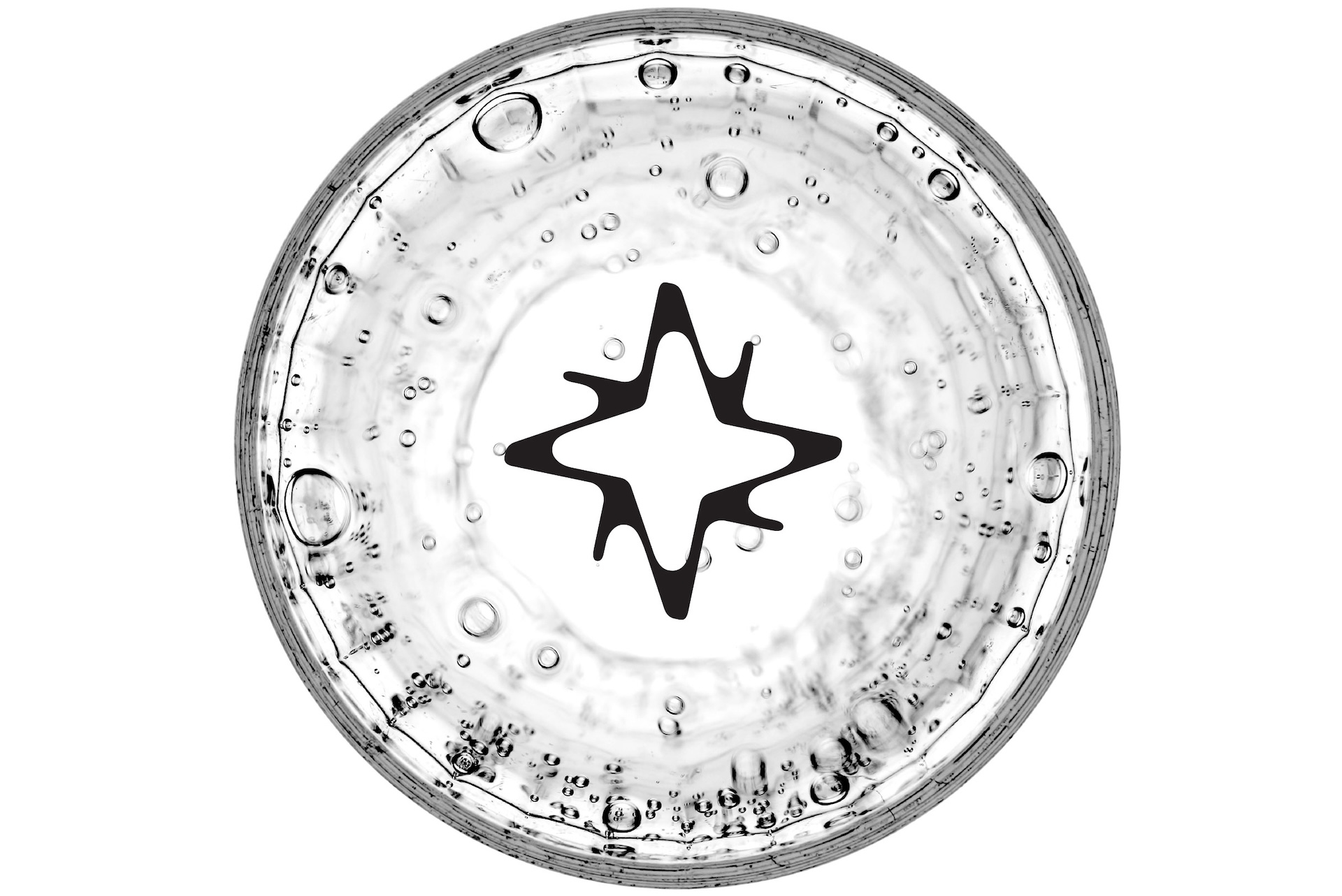
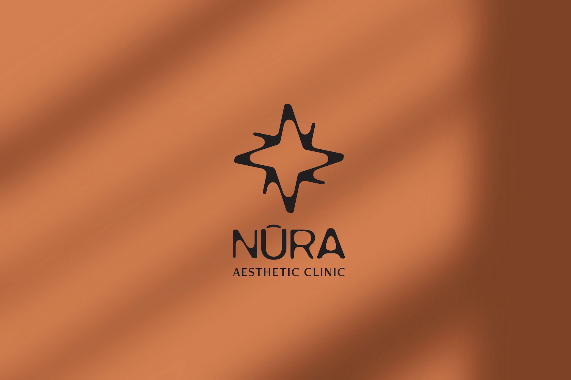
We aimed to reflect the fundamental values of the brand through visual identity. Nurtured, shiny, and soft skin, a result of top-notch services, was depicted using clean typography and soft lines. By choosing terracotta, an earthy orange color, we highlighted natural elements like clay and soil, conveying a sense of natural beauty and revitalization. Along with orange, we selected gray and black, colors associated with elegance, reliability, and professionalism. In the typographic part of the logo, rounded lines were used to depict skin epidermis cells. The initial letter "N" was utilized in various brand applications. The sign was created by grouping the initial letter of the brand "N" formed into a stylized diamond, a symbol of purity and shine. With a symbol of shine or star, the brand visually communicates its commitment to quality skin care.
Result
The branding for the clinic was successfully created and implemented, including the visual design of the physical space. Based on the new identity, further communication strategies will be developed targeting the retention of existing clients and attracting new ones, laying the foundation for long-term growth and development of the clinic.