OPIA
CLIENT
Nikolina ZimmermannYEAR
2023SERVICES
BRANDING VERBAL IDENTITY VISUAL IDENTITYAfter a successful branding project for a dental clinic, the same family engaged us to create an identity for their new optometry business. In a market saturated with optical services, we saw an opportunity to create a brand that would stand out through a unique approach that focuses entirely on the client. The goal was to create a distinctive and attractive brand that appeals to a specific audience valuing sophisticated design, high quality, and modern styles.
Strategic Approach and Market Analysis
Market analysis revealed high competition among optometrists in Rijeka, which motivated us to create the "Opia" brand with a focus on exclusivity and personalized service. Our research included market segmentation, studying consumer habits and preferences, and analyzing competitive strengths and weaknesses. Based on these insights, we developed a strategy that emphasizes dedication and an individual approach as a key differentiator from the competition, similar to a "personal shopper" experience. This laid the foundation for an exclusive high-end brand modeled on the lover archetype, promising not only top-quality products but also a passion for detail and professional development of selected experts.
Verbal Identity
We started by designing the verbal identity, wanting to convey the key characteristics of the brand. The name Opia was chosen - a word that signifies the intense feeling when looking someone directly in the eyes. The short and simple name has a modern, minimalist sound that fits a brand combining elegance and modernity. It sounds smooth and melodic, making it easy to remember and pleasant to pronounce. The name is unique enough to stand out in the market, yet simple enough to be easily recognized and remembered.
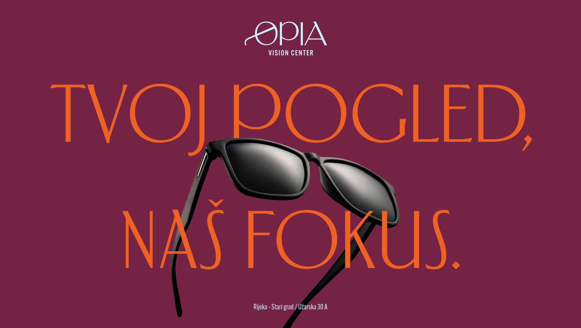
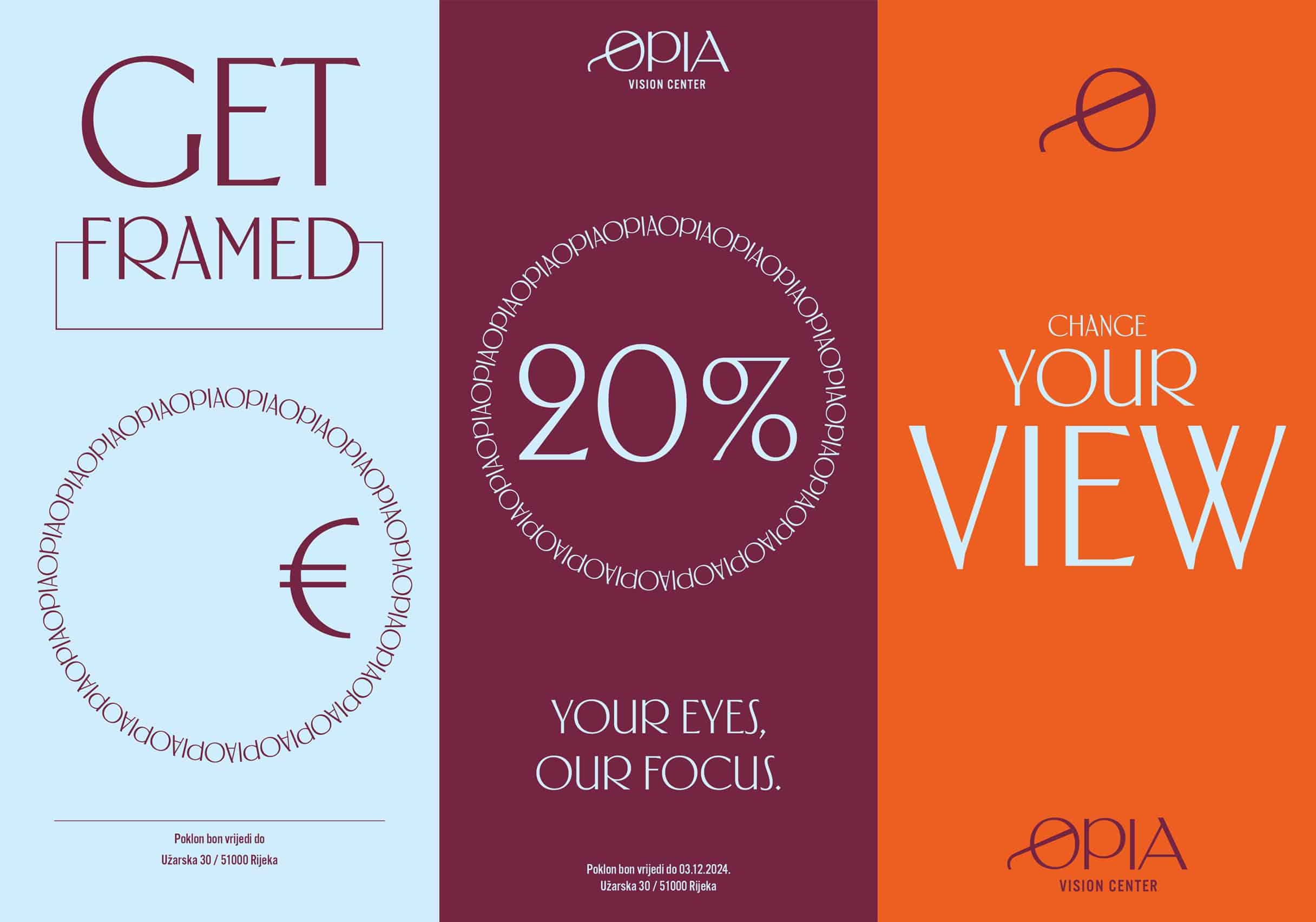
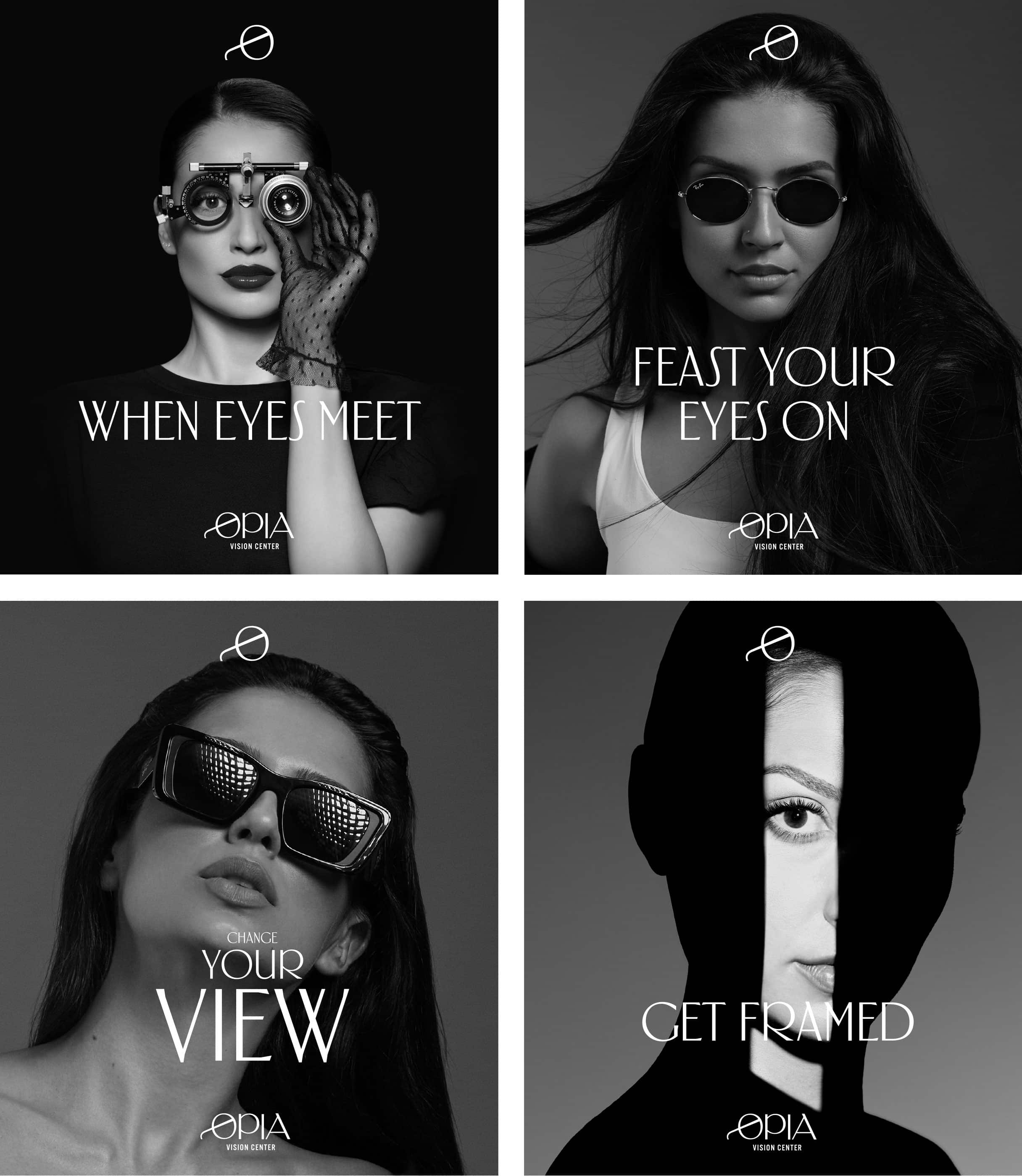
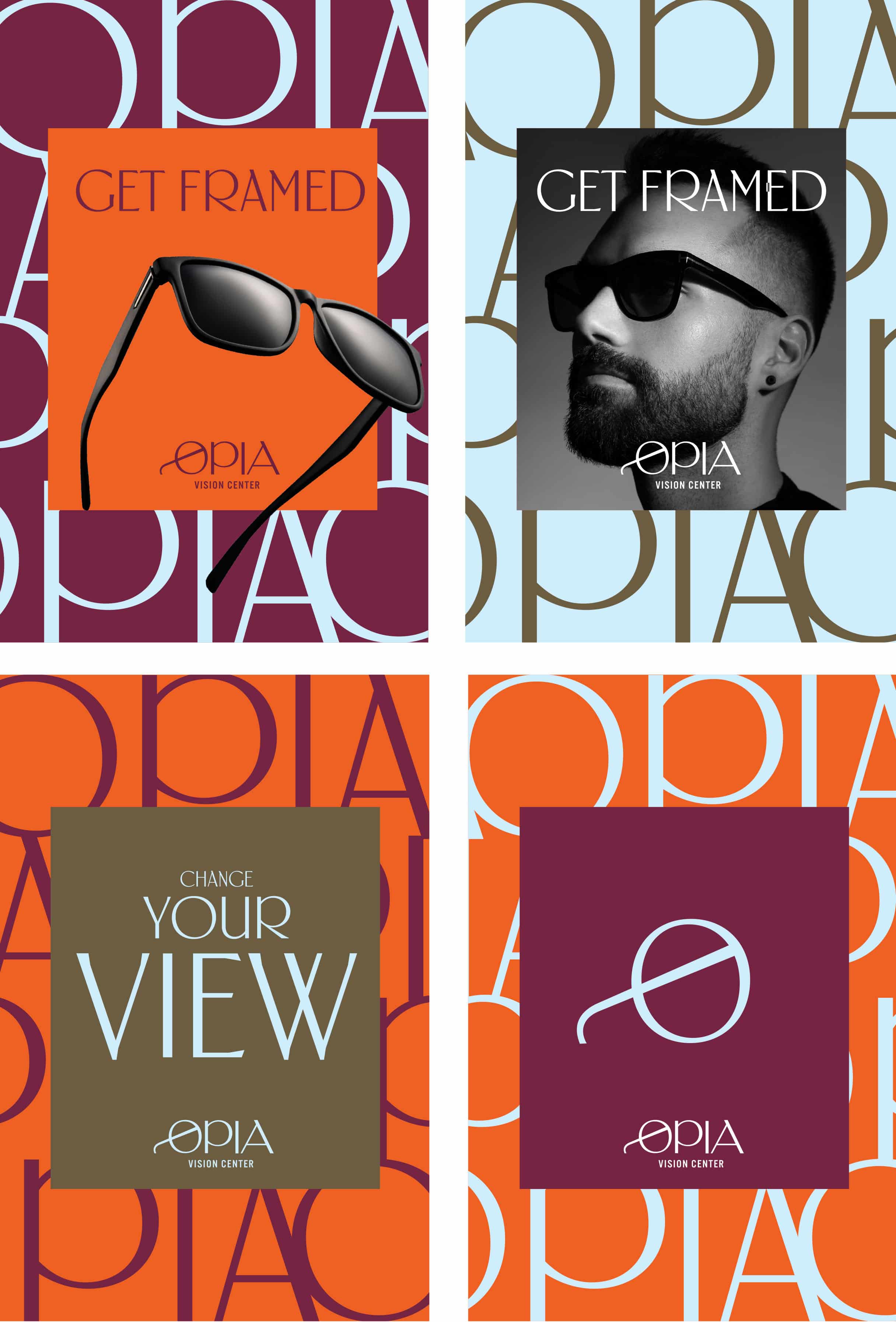
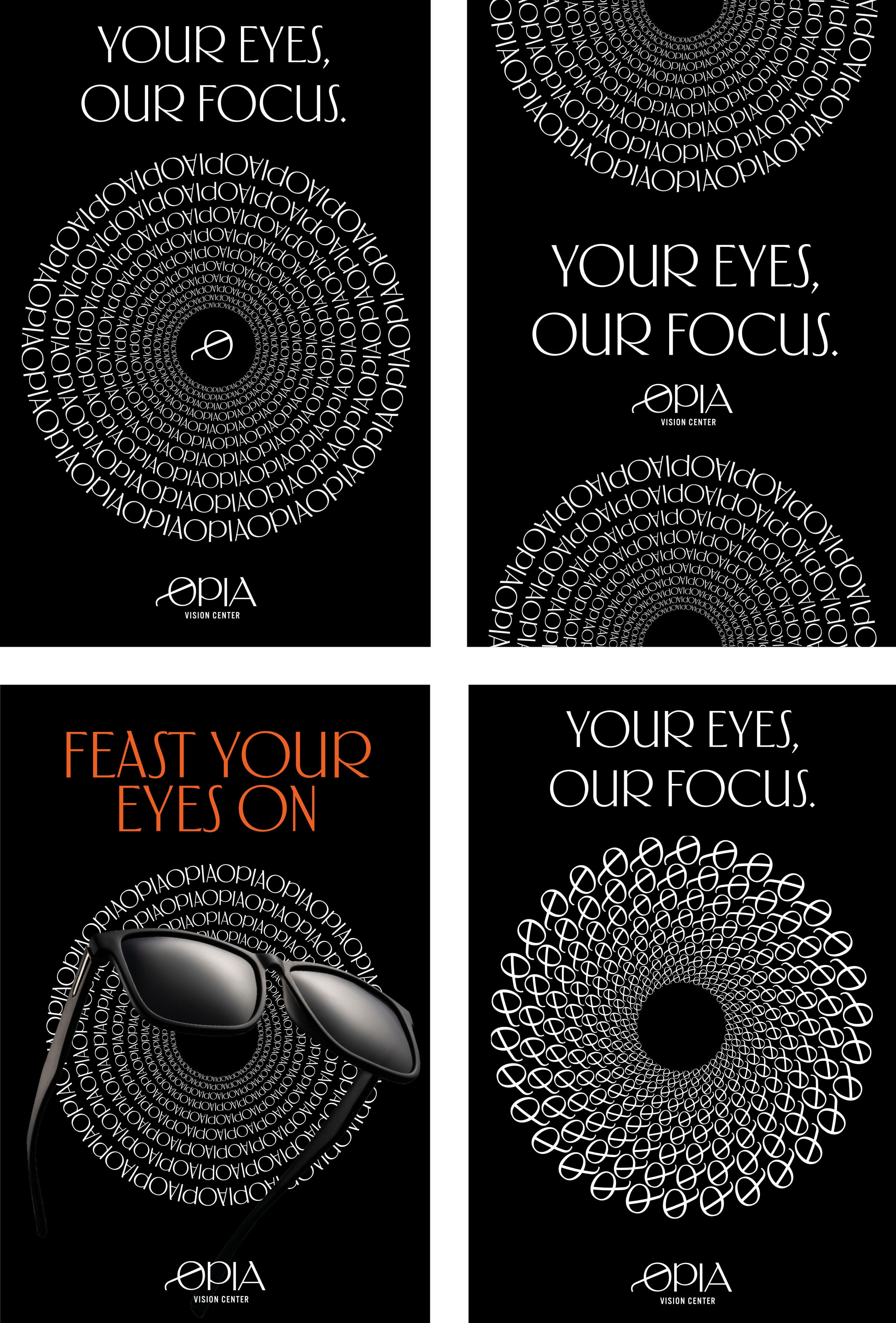
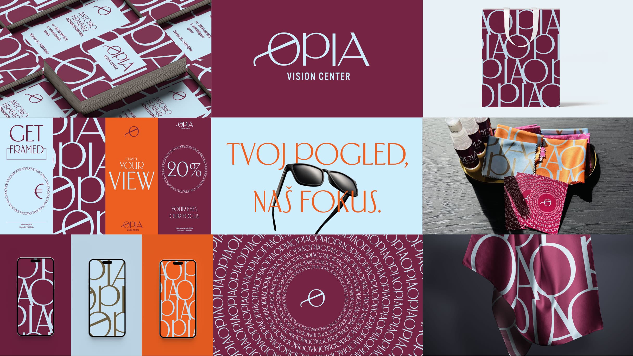
We developed key messages like "When eyes meet," "Your eyes, our focus," and "Change your view," based on the idea that every client deserves personalized attention. Each of these messages targets different aspects of the customer experience: from the moment of eye contact, focusing on individual needs, to encouraging a change in the perception of the world through the quality of our products and services.

Visual Identity
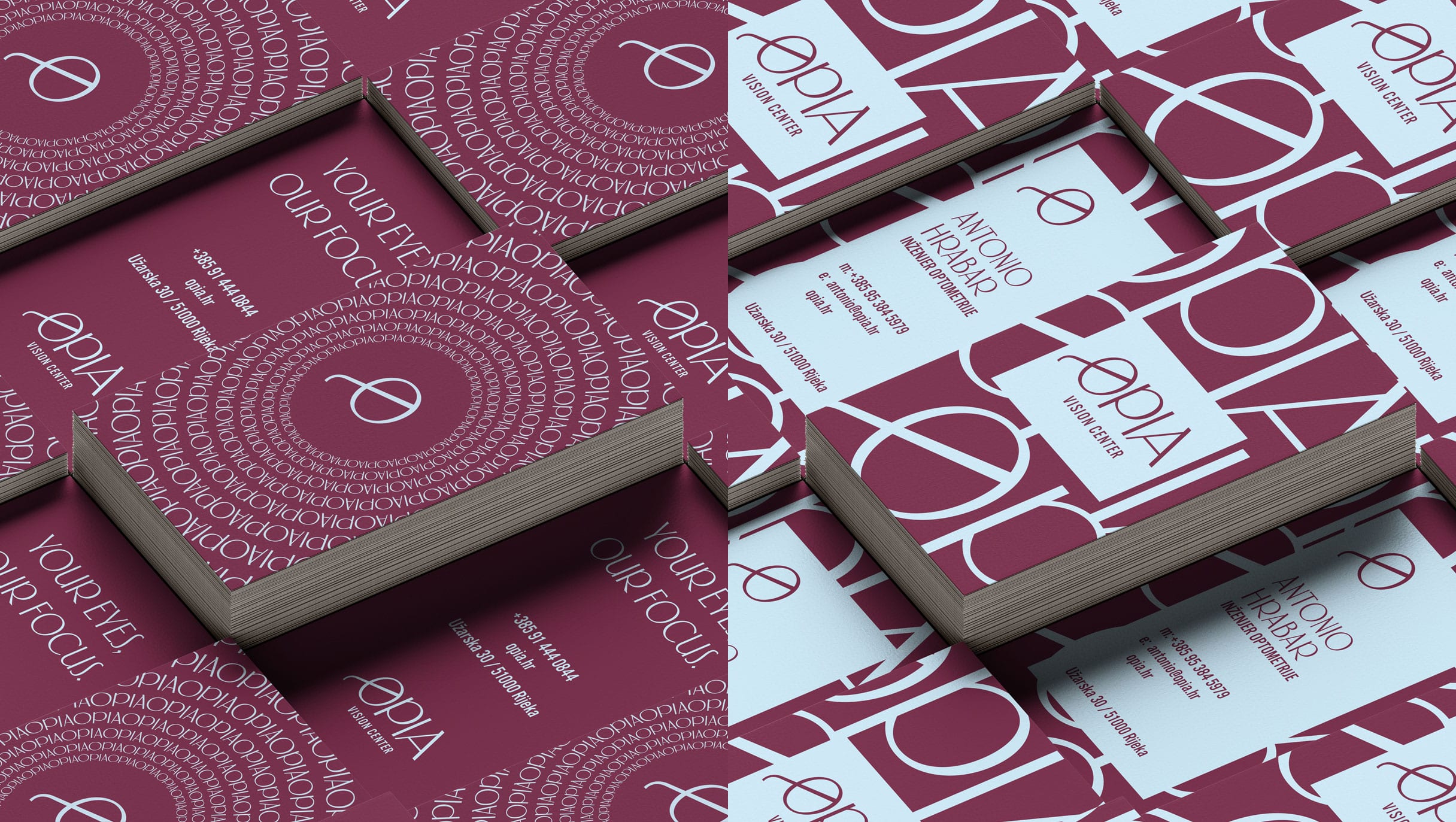
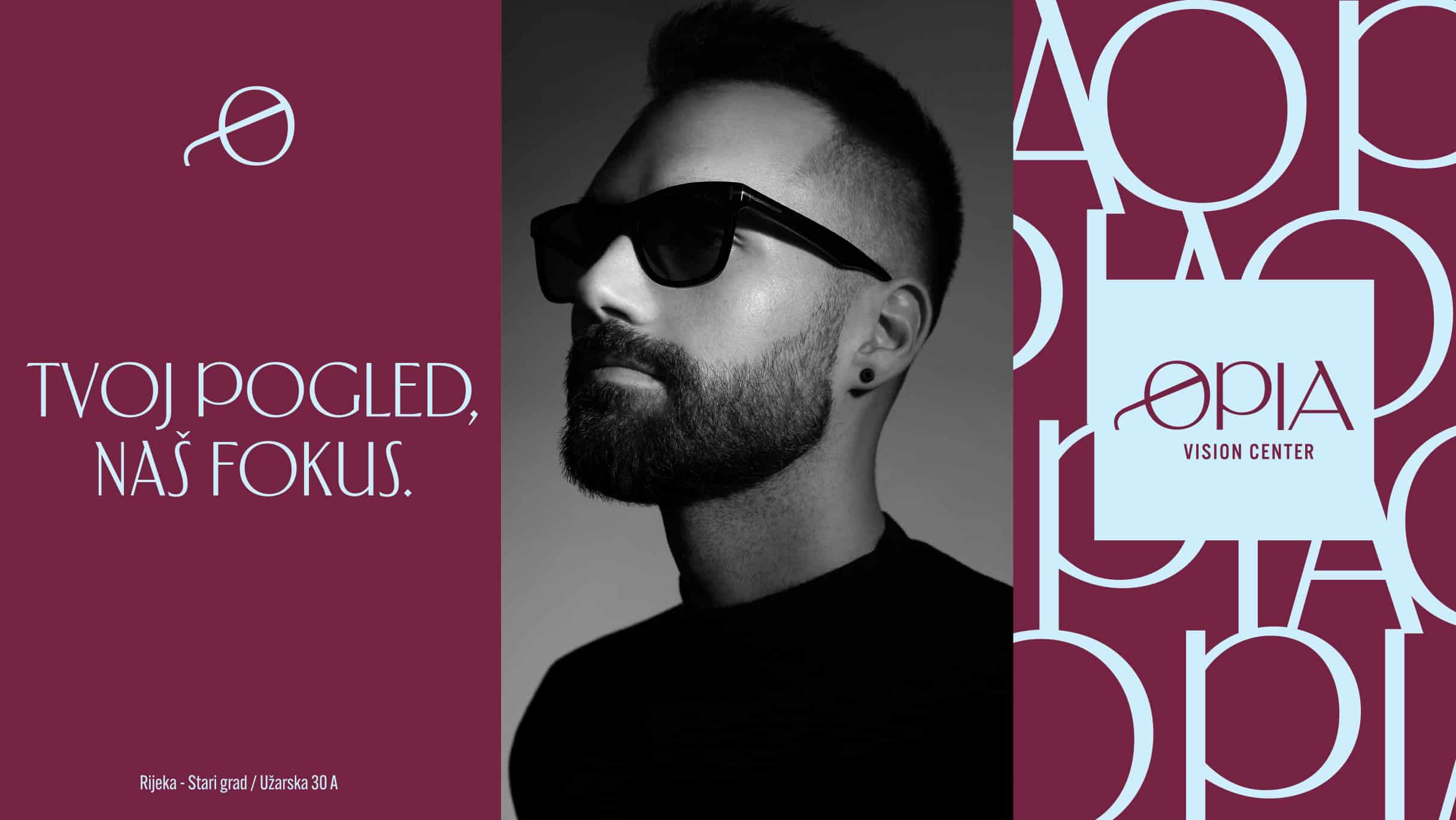
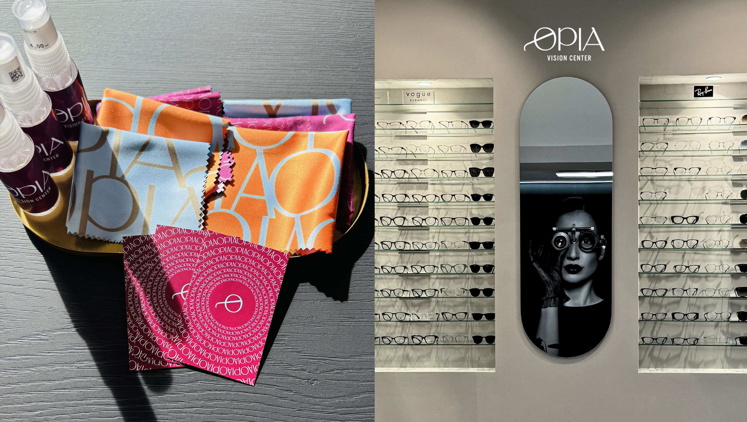
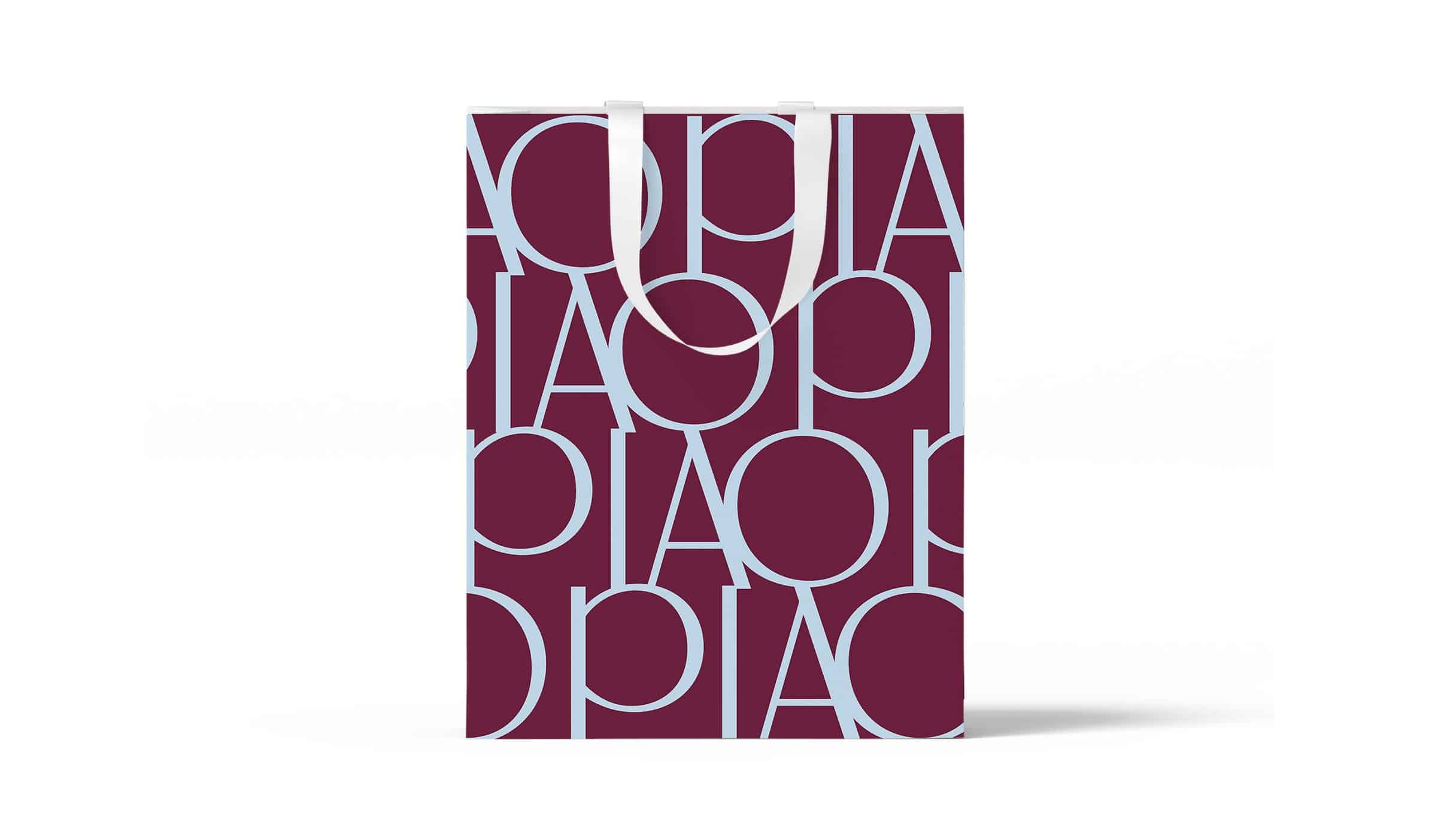
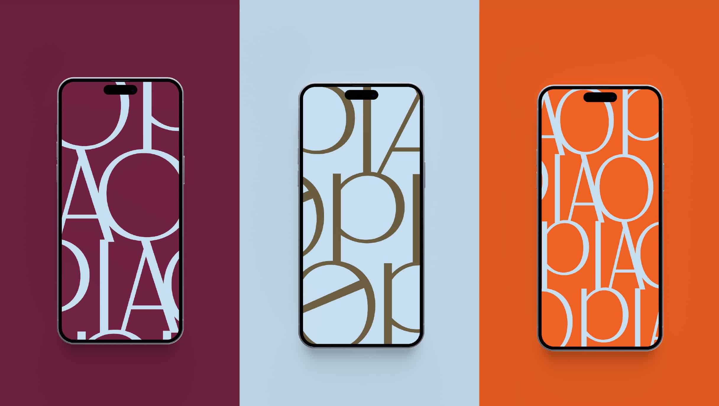
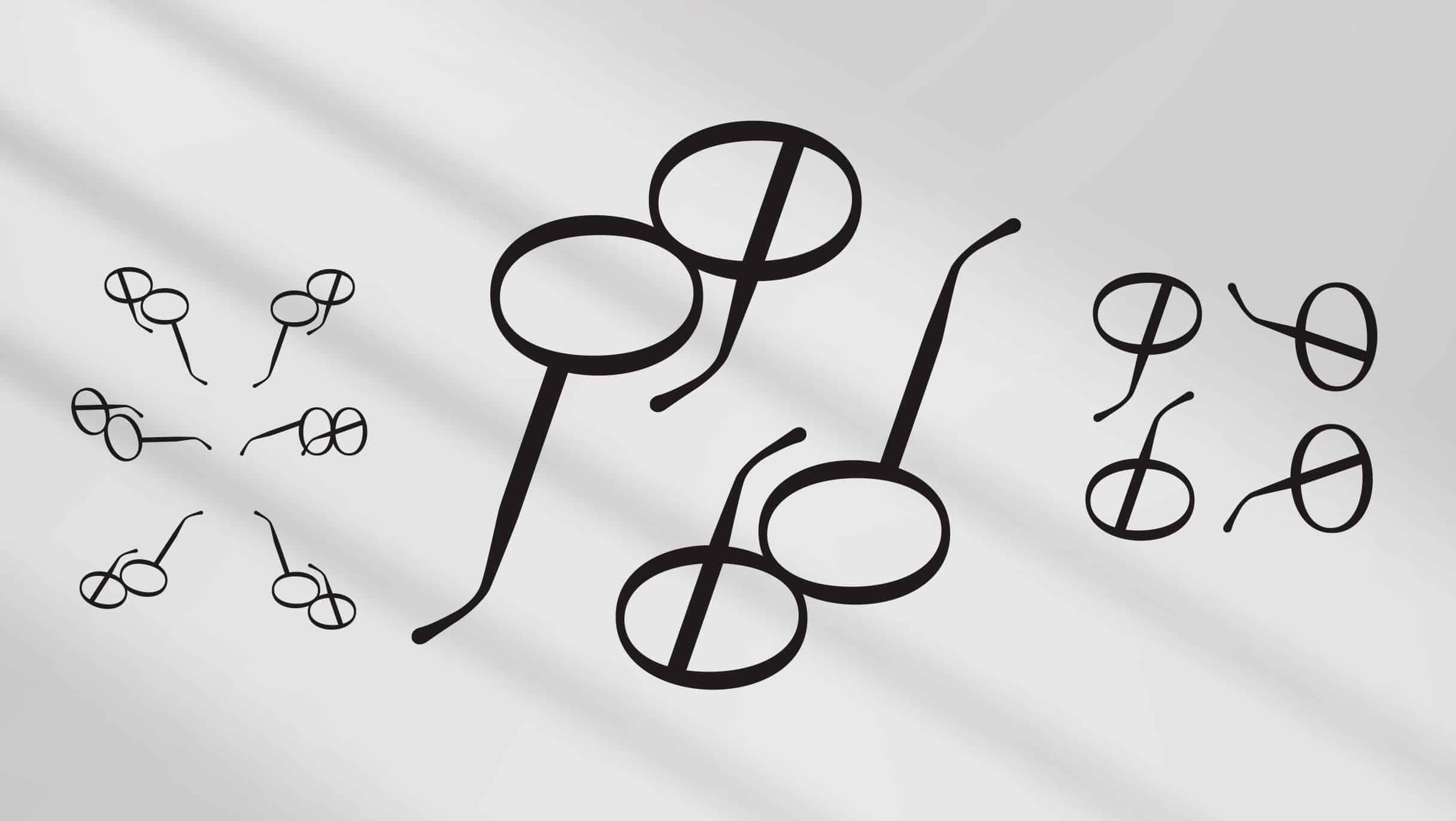
In creating the visual identity, we wanted to move away from the usual visual communications of optometrists. We focused on a modern approach, clarity, and expertise, with an emphasis on personalized service. We simplified the eyeglass frame to the level of an icon, namely the letter O - a letter that symbolically represents the eye, eyes, and gaze. The stylized symbol of glasses, which is easily recognized and associated with optometry, is integrated into the brand logo to immediately communicate the main activity. We added elegant typography and created a unique logo. Both the symbol and the logo are implemented through various patterns and animations that dynamically display the pupil, evoking an attractive and hypnotic effect of intense gaze.
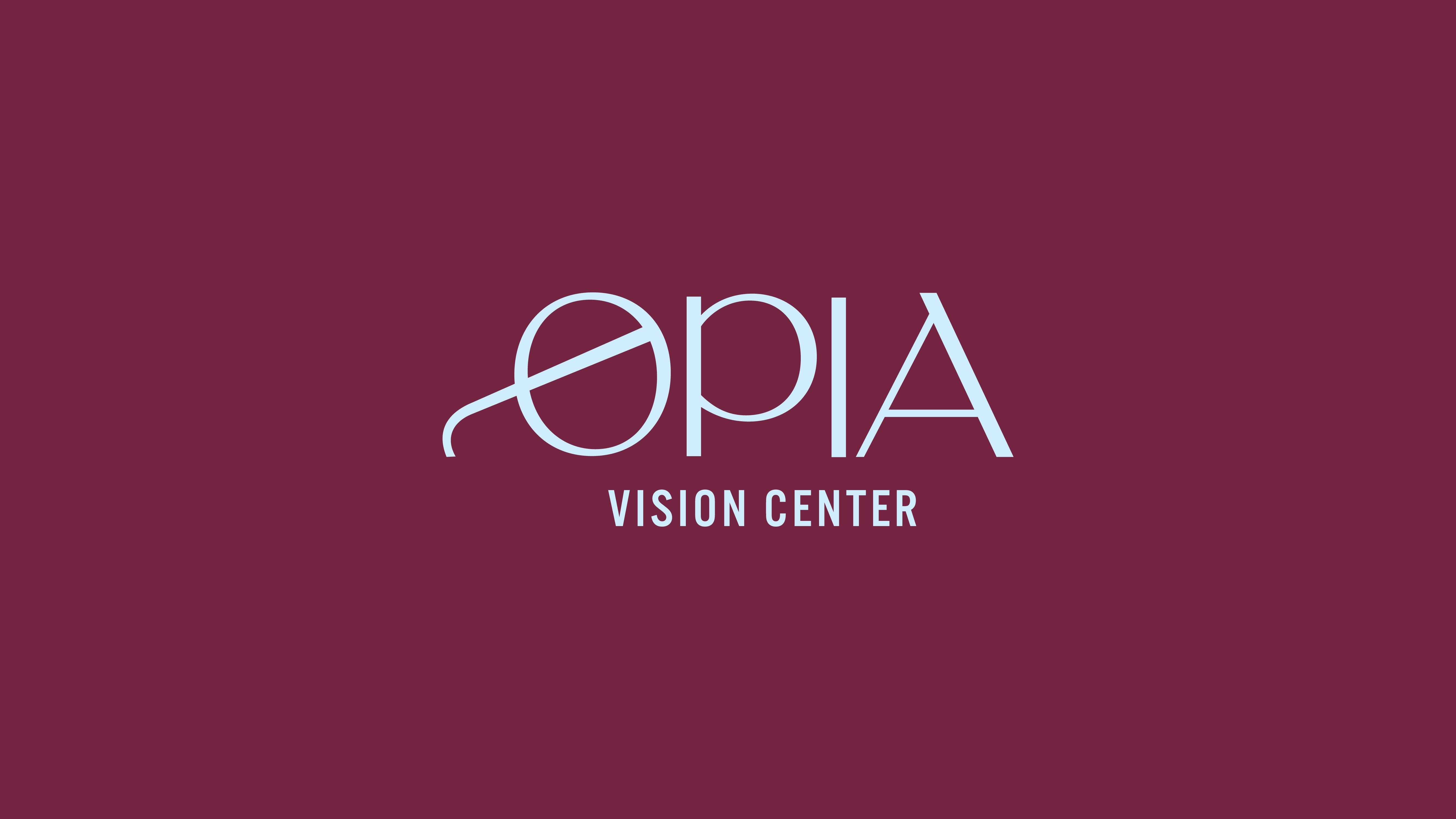
We chose modern typography in art deco style that complements our visual identity. The fonts are simple, elegant, and easy to read, contributing to the professional look of the brand. By choosing colors, the brand communicates its values. Burgundy/purple color signifies wealth, elegance, and value. Burgundy attracts the attention of both men and women and raises the confidence and courage of the wearer - a feeling we also want to transfer to customers. Orange symbolizes originality and courage, and blue trust and clarity of gaze.
Results
The "Opia" brand was successfully launched in the market, with the first optometry open in Rijeka. It is now up to the owners to implement and maintain consistency to fully realize the vision and design.
