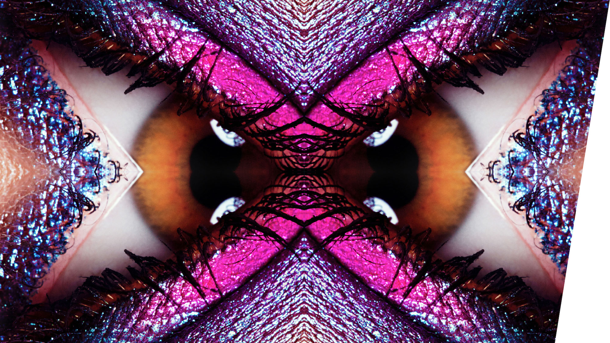
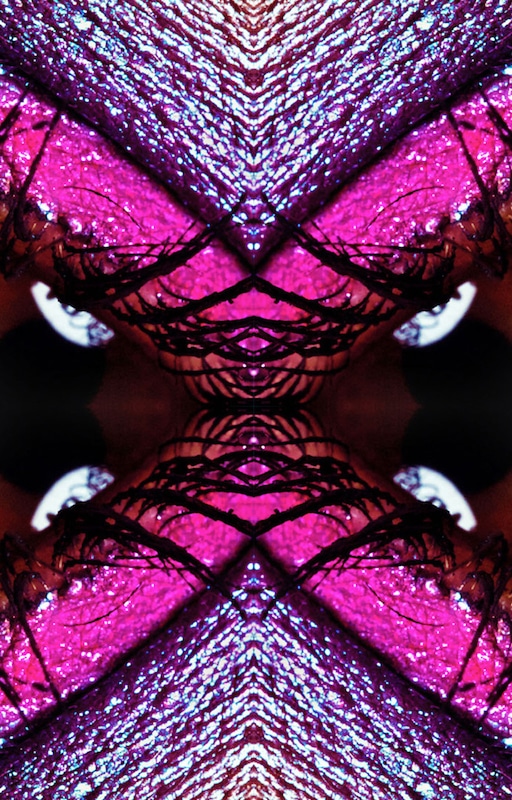
House of Beauty is a place where luxurious cosmetic treatments for outer beauty meets inner beauty treatments.
Request
To create a contemporary visual concept that communicates the basic brand characteristics.
Challenge
Incorporating main brand characteristics into the visual identity elements. Also, a visualization of the blend of inner and outer beauty.
Solution
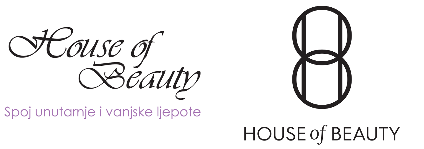
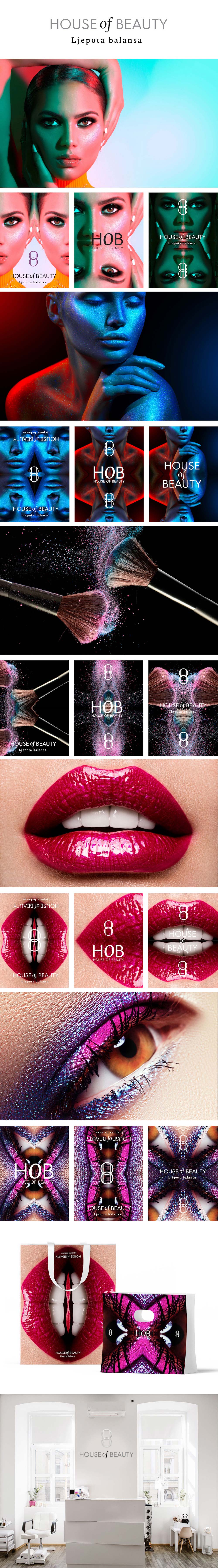
By combining the two segments (inner and outer beauty) into a unique unity (House of Beauty) we’ve created a solution that shows harmony and communicates the brand name. Brand's initials have been interwined to the number "8", which represents a symbol of harmony and eternity.
Rebranding
The new standard book has brought new visual components; logo, sign, visuals, typographic solutions. The logo harmoniously combines two elements and with those two forms wholly. Two equal elements - inner and the outer beauty - make an inseparably circle that overlappes. The structural composition that forms a unique entity simultaneously includes the three initial letters of the brand - H, O and B.
We used symbolism of the number “8” - eight is taken as the number of cosmic equilibrium, unites four cardinal and four intercardinal direction and in that way describes all the possible movements within this world.
A communication strategy also included a new slogan, Beauty of Balance, which communicates two unified spheres of salon activities.