LULL
CLIENT
Private personYEAR
2022SERVICES
BRANDING VERBAL IDENTITY VISUAL IDENTITY AND COMMUNICATIONSThe freedom, the adrenalin and feeling of floating above the see are the main characteristics of eFoiling. The task of the agency was to create a brand that will bring this surfing-like activity closer to a wider audience and that will convey the experience of the "fin with which you float".
Verbalni identitet
Unlike surfing, you don't need wind or waves for eFoiling. You can surf in complete silence, because the board no longer touches the sea at all, thanks to the lithium-ion battery. It was the silence and the pause from the waves that served as our inspiration for creating the brand name. In the surfer’s dictionary, Lull represents a break between two waves. And as the definition of Fliteboard is surfing without wind and waves - Lull is the perfect presentation of that break that becomes an activity.
Equally, by emphasising the absence of waves, we made a distinction between eFoiling and the ordinary surfing. We added the signature eFoil surfing to the brand, in order to specify the activity of the brand.
Vizualni identitet
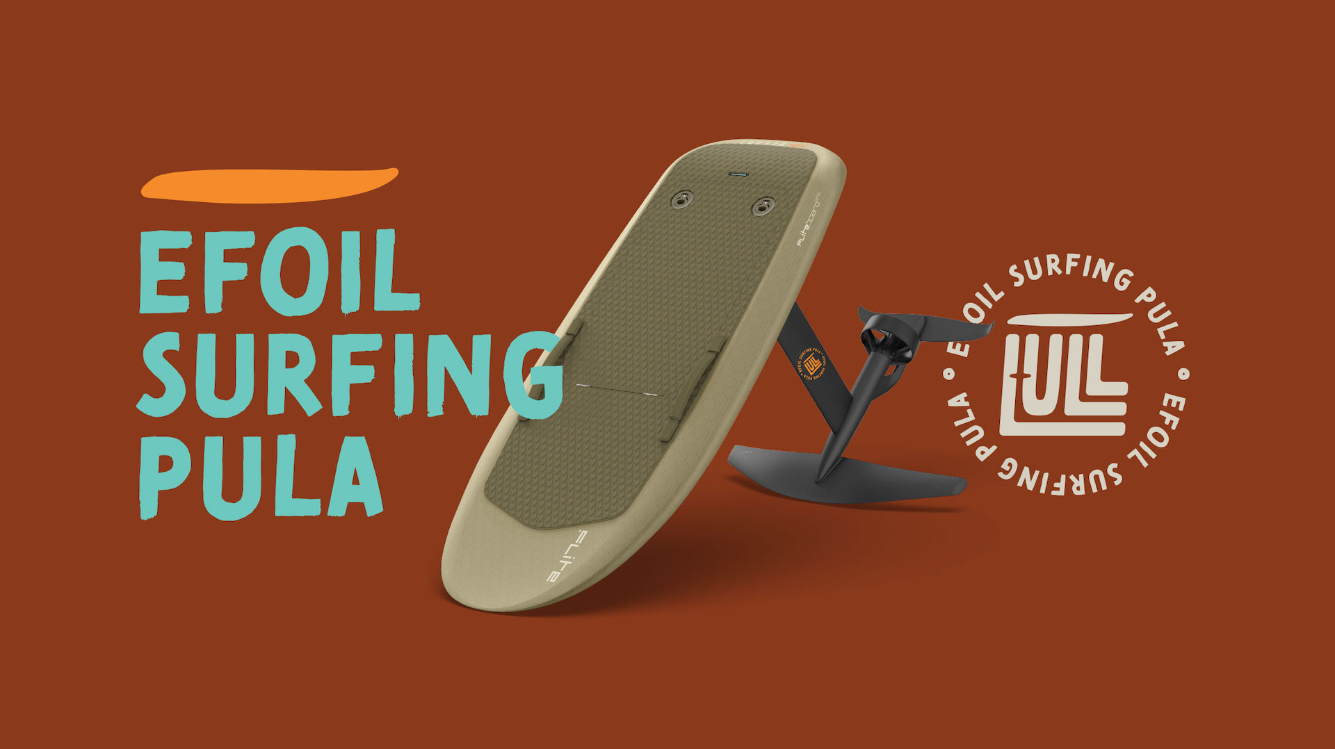
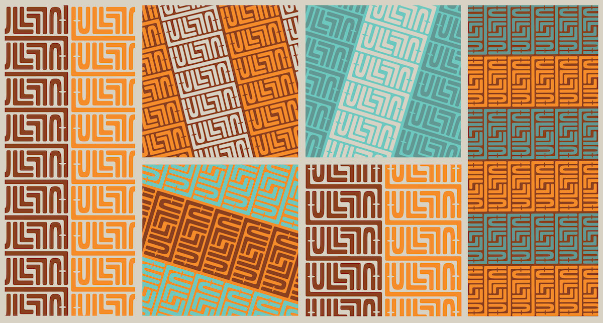
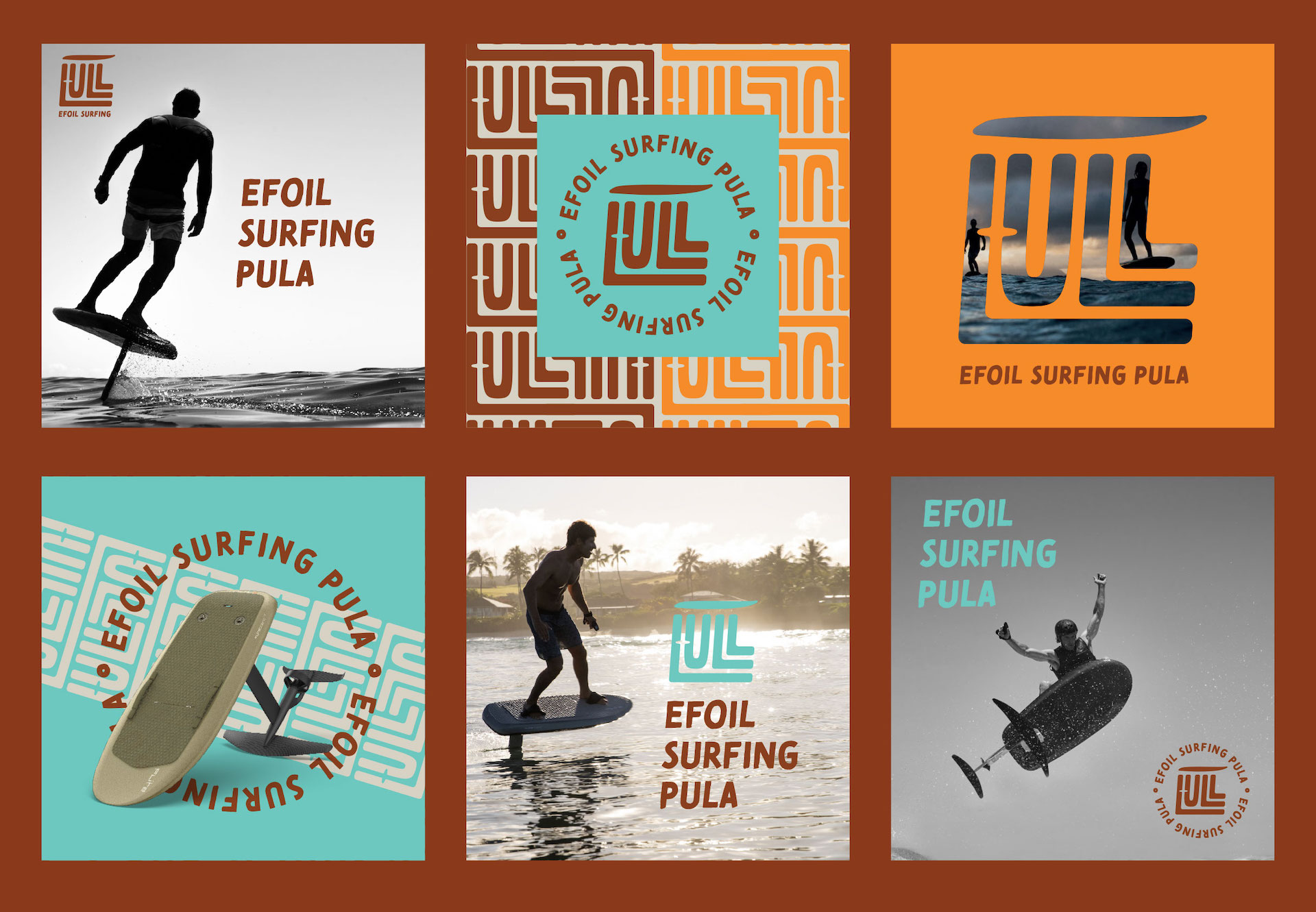
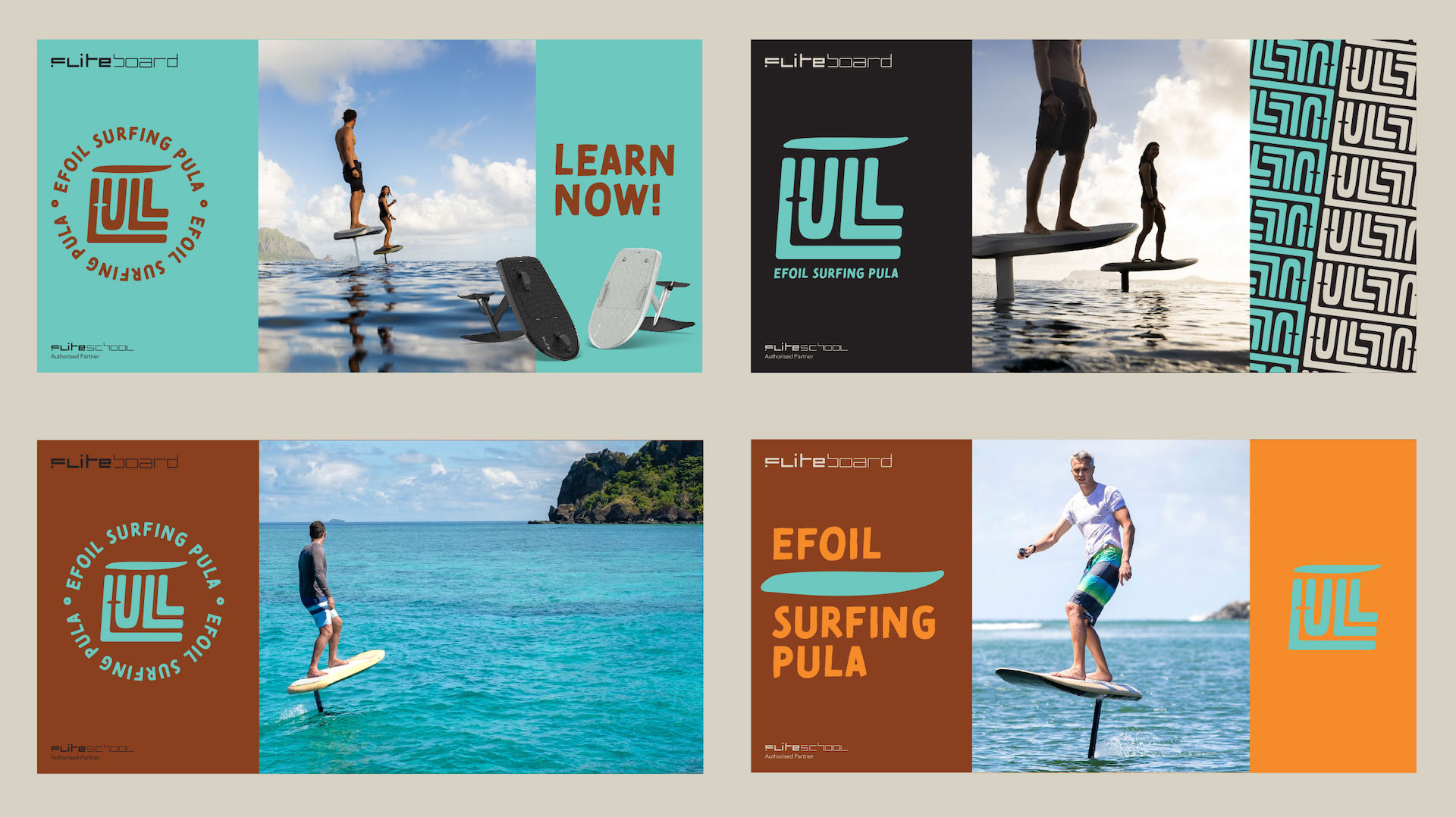
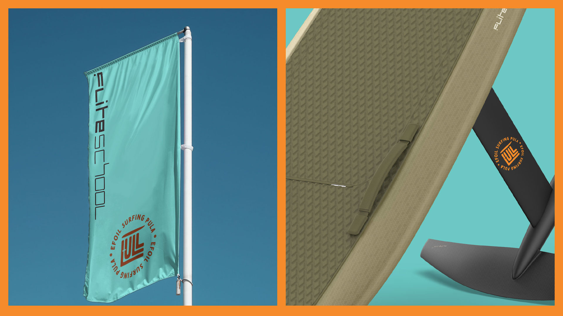
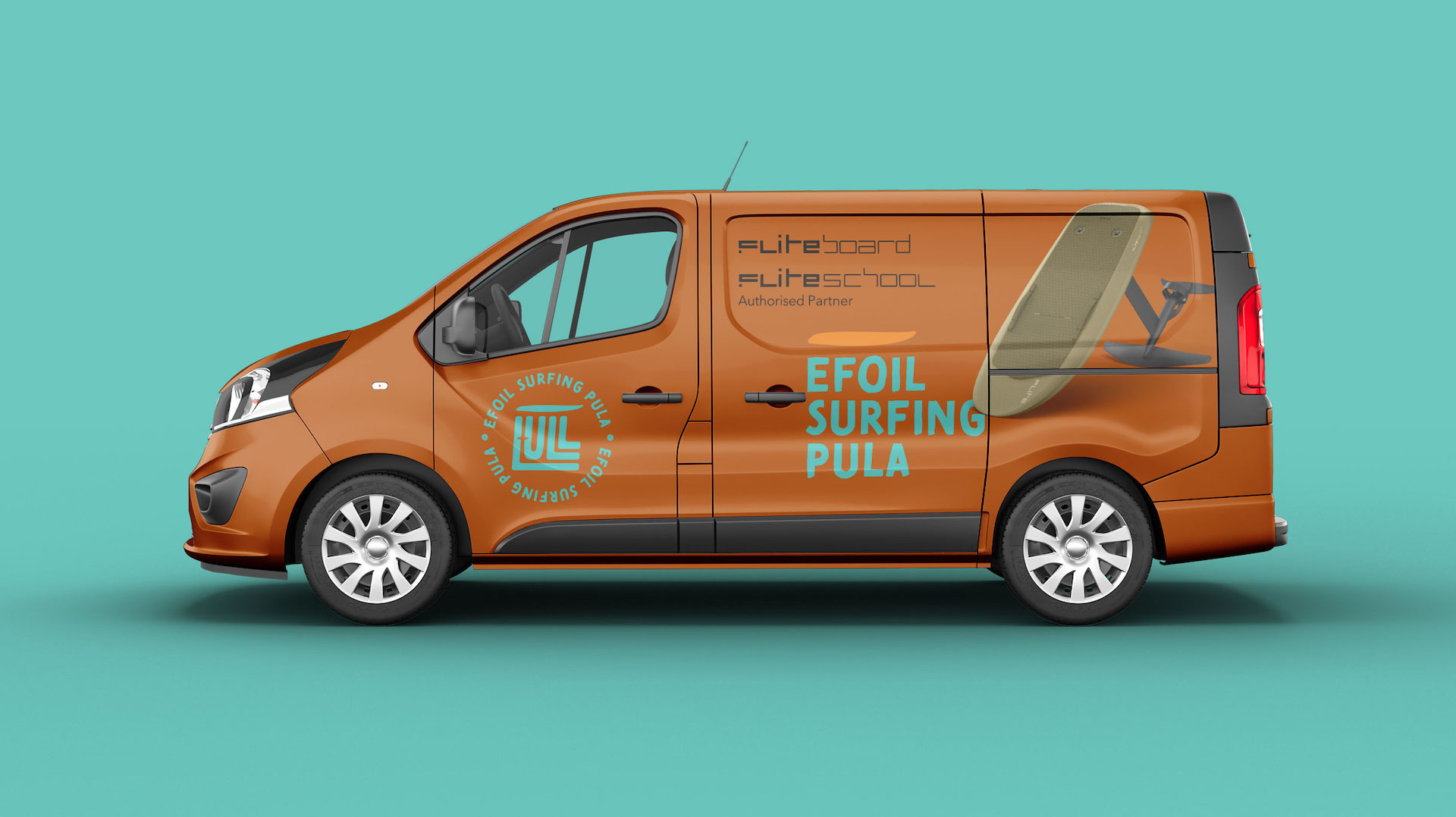
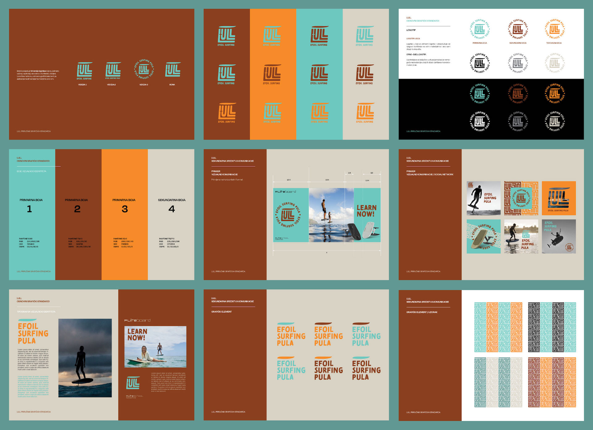
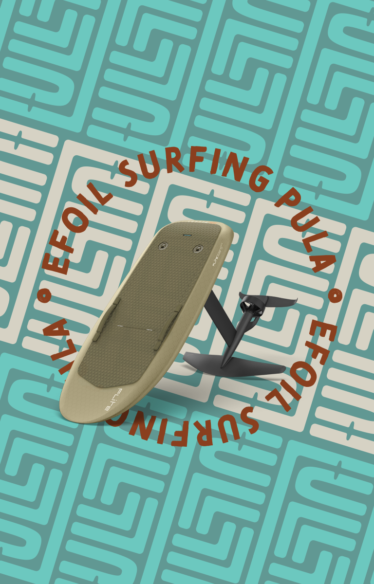
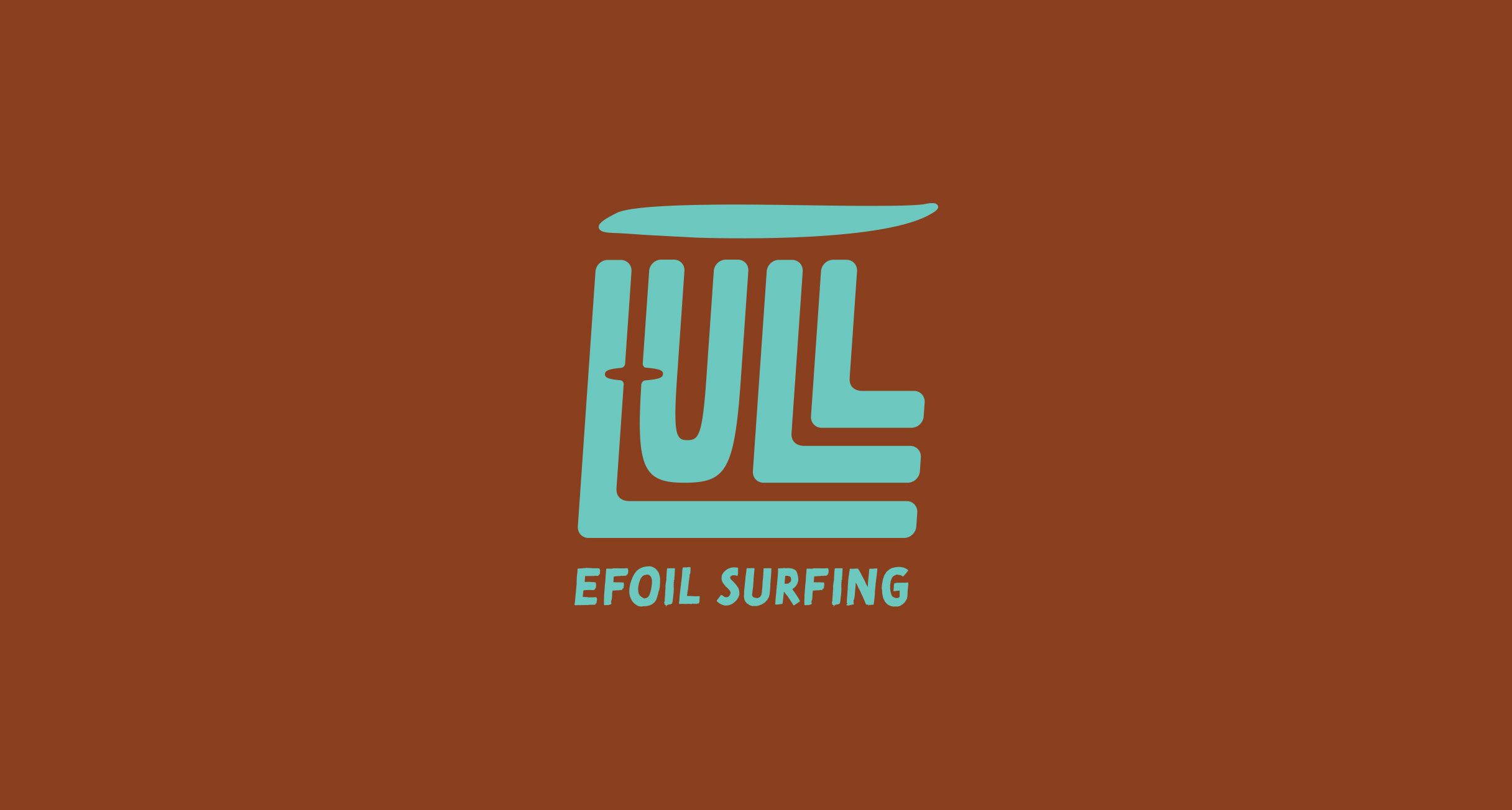
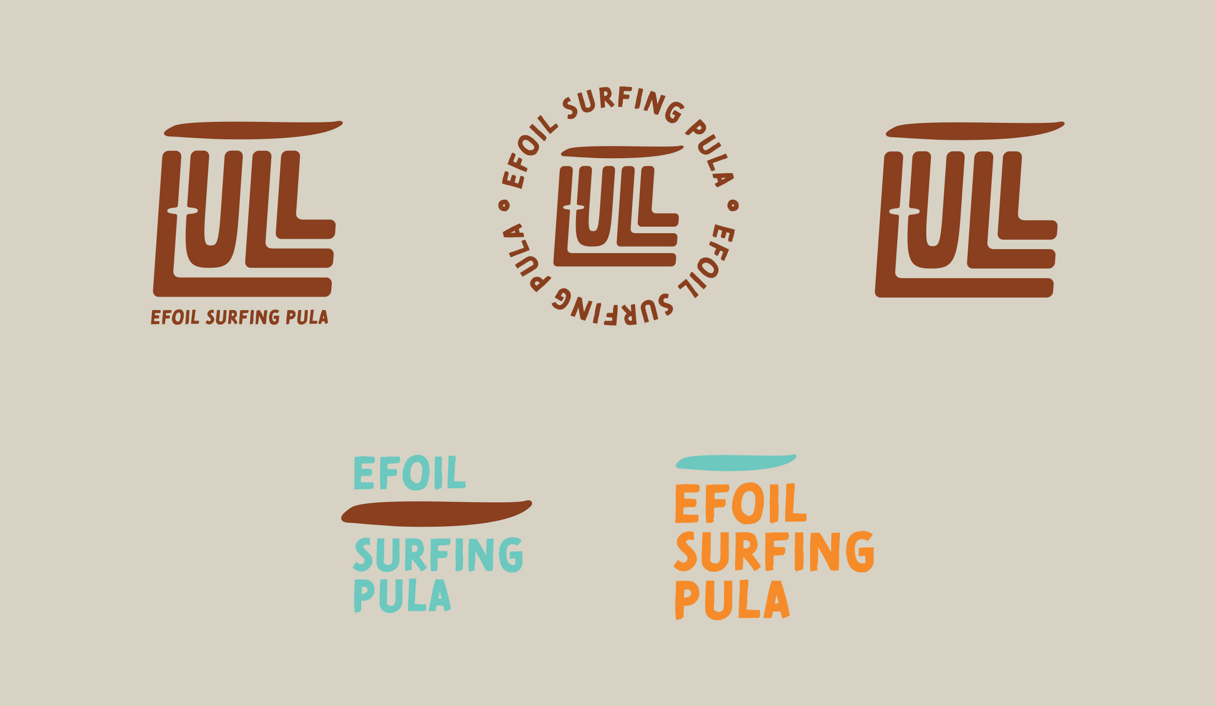
Since eFoiling is still unknown to many, when creating a visual identity, we wanted to show the uniqueness of this activity, and that is the board with which you float. This is how a typographic solution was created, which contains the fin board itself in a negative space. Playful typography communicates enjoyment and free time on the high seas.
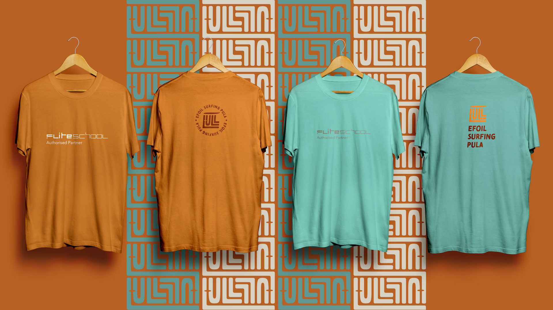
The colours of the brand are inspired by the beach and the sea. From earth tones to the colour of sand, sea and sun.
