NOSH
CLIENT
NOSHYEAR
2021.SERVICES
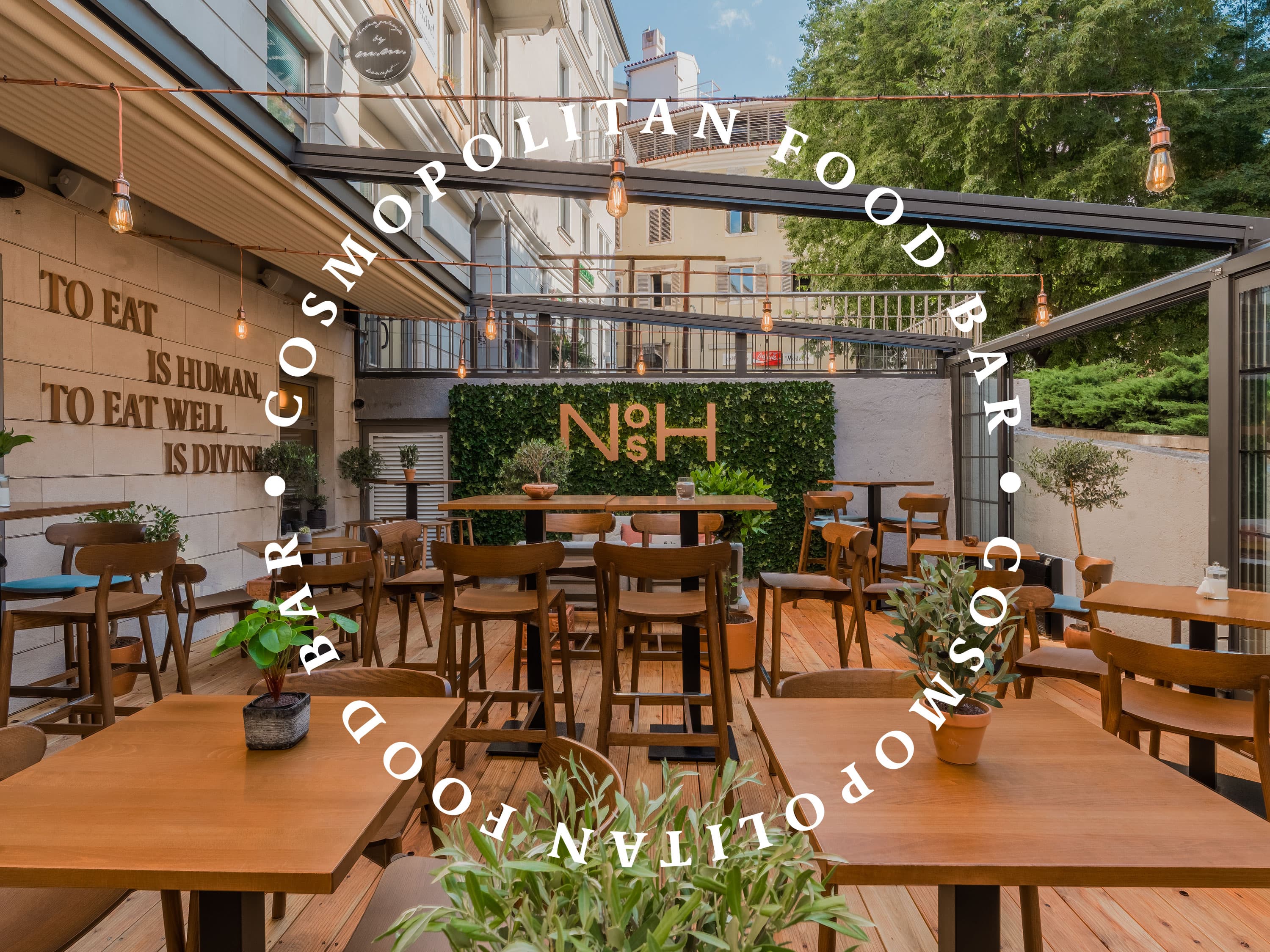
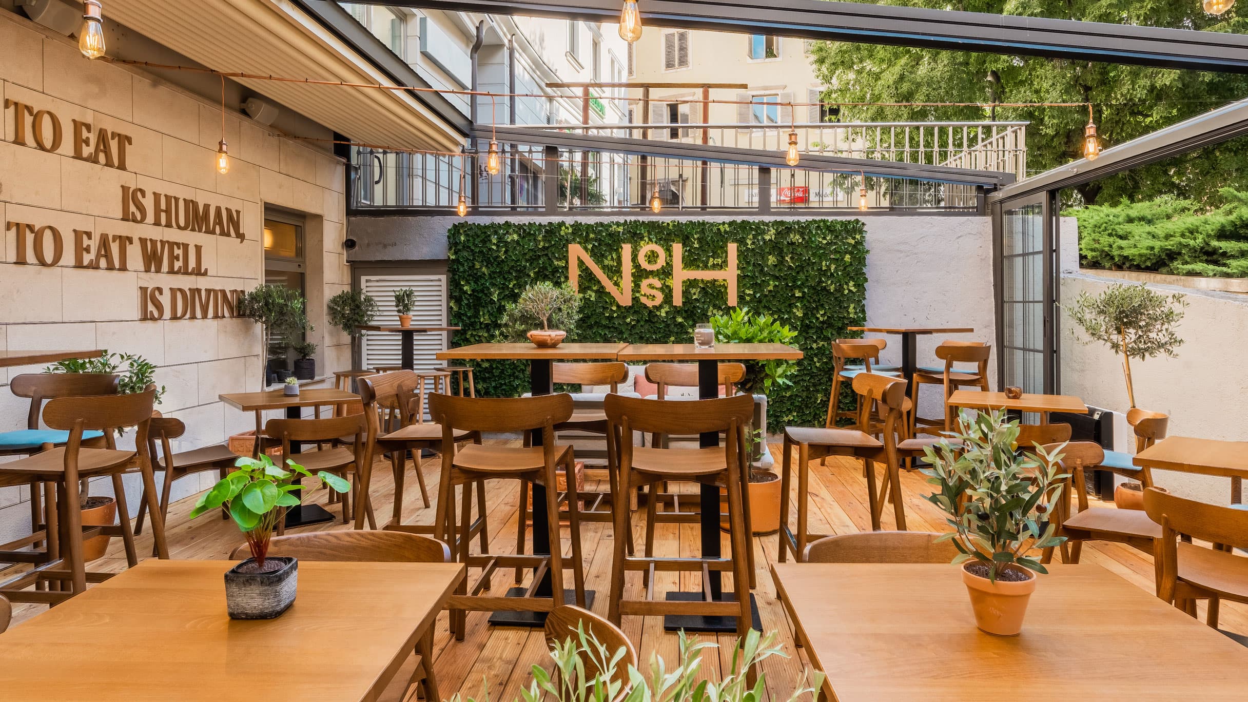
BRANDING VERBAL IDENTITY VISUAL IDENTITY AND COMMUNICATION INTERIOR INTERVENTIONSSituated in a familiar location, in the very centre of the town, this space became a new gastronomic destination of Rijeka. The owners wanted to tell a slightly different kind of story - with the help of the interior, the new terrace but also through the story behind the creation of the menu. The ideas of brunch and tapas needed to be unified in a unique story capable to create a brand whose idea will be recognised.
Verbal identity
After finishing the workshops with the client, we started with the elaboration of verbal identity. We wanted to satisfy many requirements: a contemporary yet short and easily pronounceable name, able to integrate the experience and the philosophy of chef Luka and bring everything together in a concept opened enough to be adaptable to future trends.
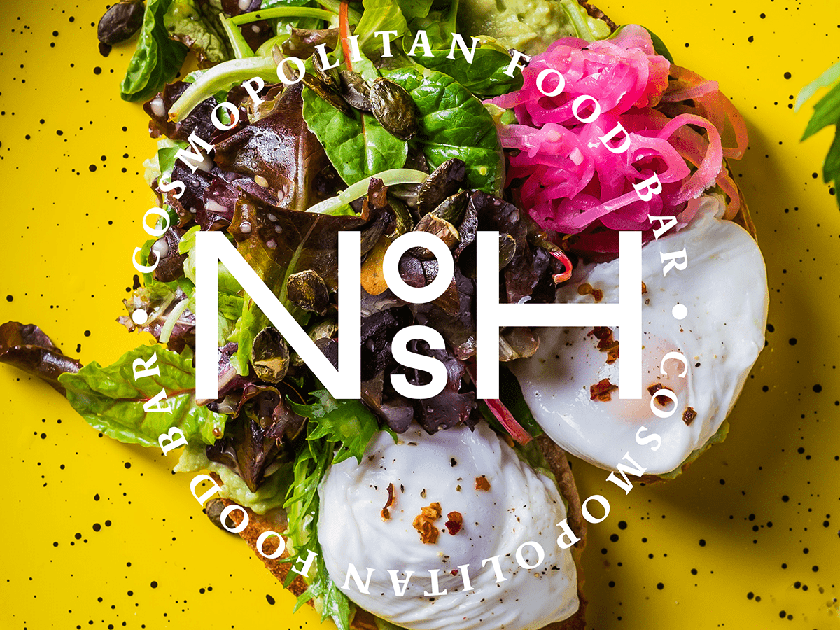
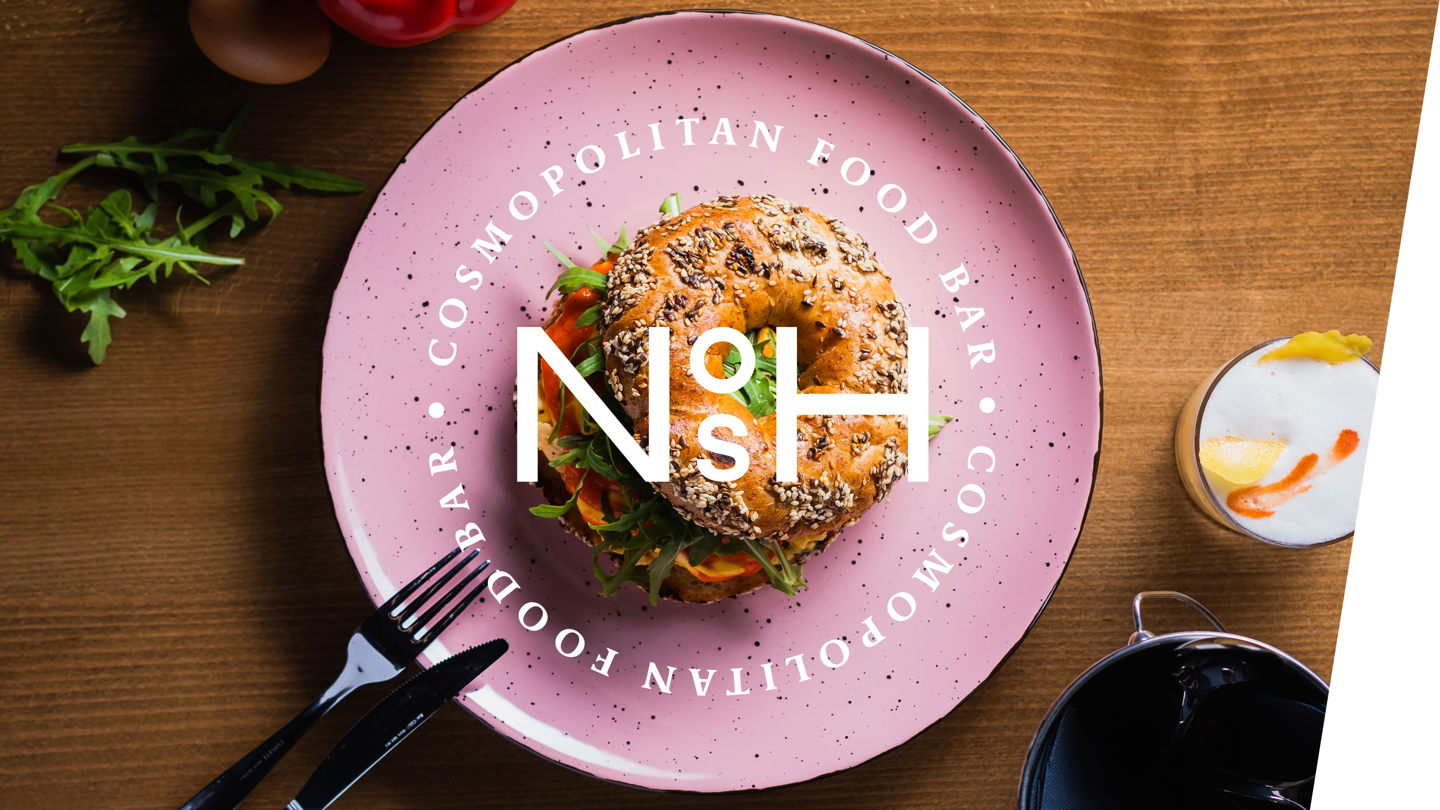
That is how we created NOSH. In order to create a concept completely adaptable to trends and chef’s surprises - we have chosen a very generic, yet exceptionally audible word nosh whose meaning in English is meal, food. Our aim was bringing the experience and the philosophy of the chef and the offer of the place closer to the people, so we added Cosmopolit food bar to the name - a signature that perfectly describes the free world cuisine and the offer of dishes from all over the world.
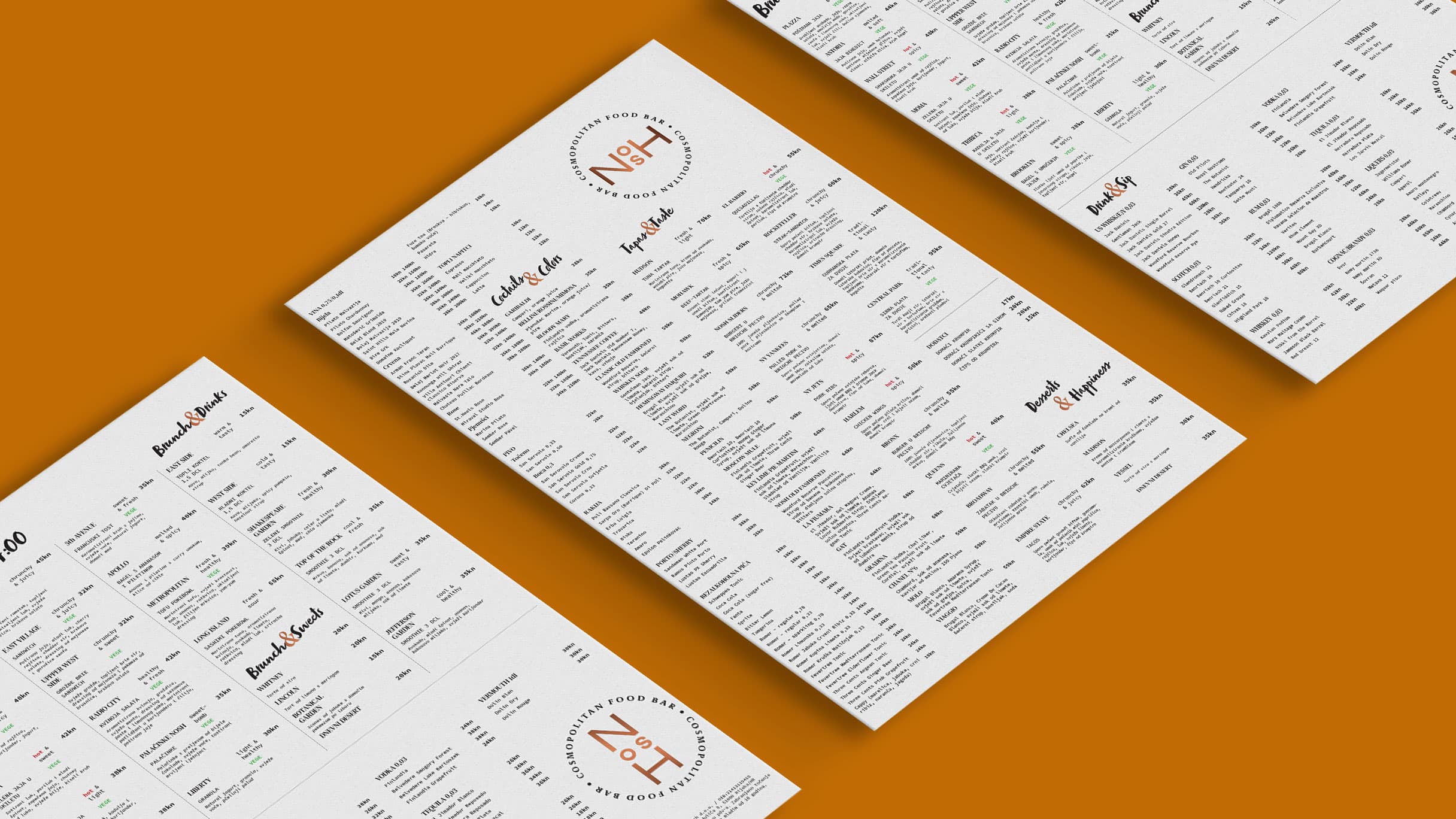
The story continues through naming of the dishes. We found the inspiration in New York, the capital of the world and in english, the official language of the world. That’s how we crafted the character of NOSH, the pioneer of free cuisine in Rijeka.
Visual identity and communication
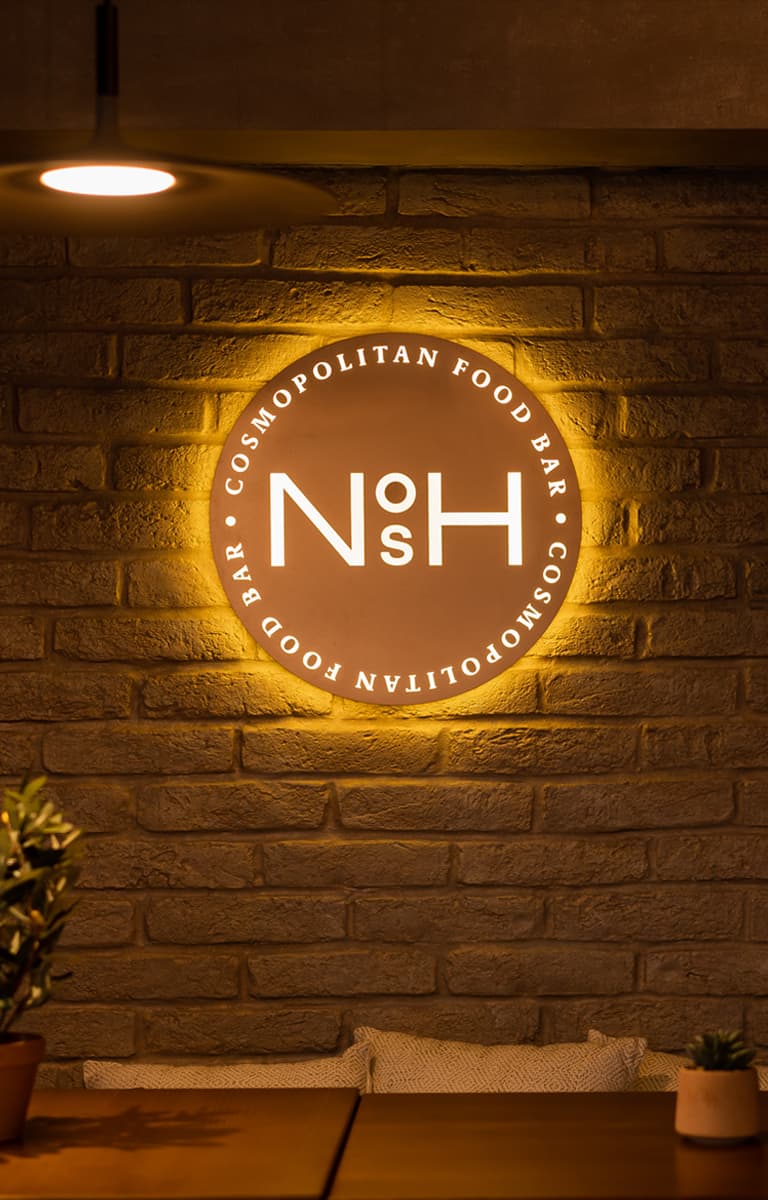
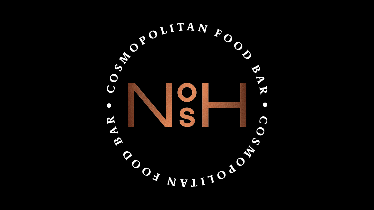
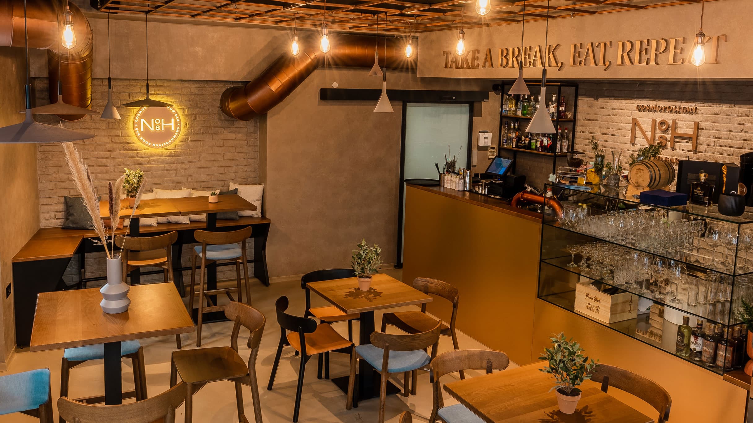
After verbal identity was authorised, we began with the development of visual identity which needed to be implemented and blended with the architect’s idea of the space. The client wished to combine the industrial style with minimalism and a touch of elegance. We based our visual identity on the colour of copper as an element of industrial style, custom made typography which with its composition encourages curiosity and combined it with black colour in order to achieve the desired elegance and minimalist approach.
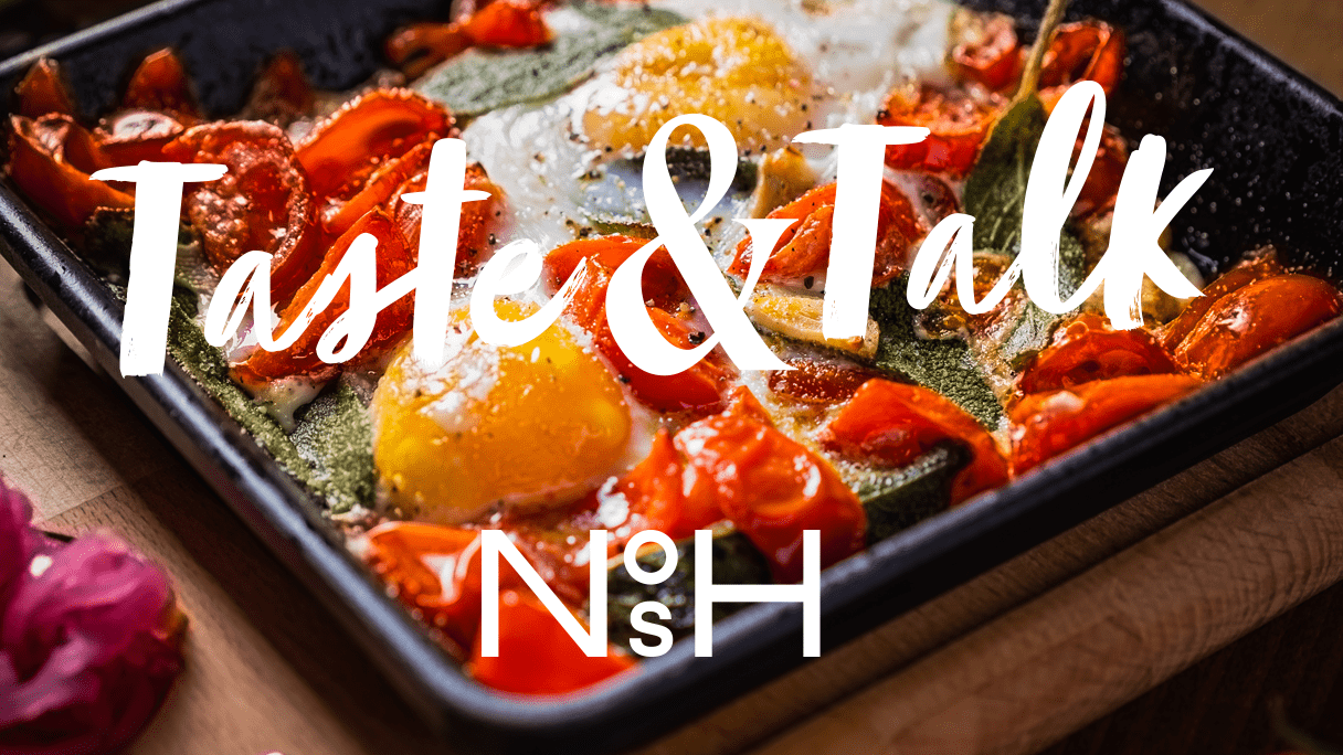
In visual communication, we accompanied visual identity with a touch of playfulness, choosing the script typography, which with its shape perfectly complements the tasty visuals.
Interior interventions
In collaboration with the architect and contractors, we unified the ideas and the experience in a unique place created to enjoy interesting dishes, fine drinks, hanging out with the people we like. Visual identity and the messages blended perfectly with the existing ideas of the architect, additionally emphasised with custom lighting.
In conclusion, satisfied with the collaboration, we conclude it was truly a great project. Visit NOSH, try the free world cuisine and enjoy in a new gastro oasis in Rijeka, we happily recommend.
