

POETICA
CLIENT
Family NosićYEAR
2021SERVICES
Verbal identity Visual identity and communication Label designInspired by their native region, the beautiful Vrgorac, and thanks to the expertise of Jelena Nosić and the "nose for good things" Drago Nosić, the Nosić family decided to open a distillery where they would produce craft gin; to start with. They came to us with an idea that needed to be put into practice - they took care of the gin, and we were given the task of branding the distillery and the gin.
Verbal identity
Verbal identity stands at the beginning of every branding story. Listening to the Nosić family talking about Vrgorac and the aromatic plants that inspired them to make gin, we also decided to explore the area.
THE IDEA
If by chance the people of Vrgorac were asked about one of the greatest prides of their hometown, the majority would single out a great man who needs no special introduction - Tin Ujević. A poet, a bohemian, an individual born only once.
We wanted to weave into the brand’s name a touch of that bohemianism, those verses, that lifestyle that finds inspiration by exploring the boundaries of voice and silence. With his creativity, he challenged a poetic tradition and created a brand new one. Just like Tin's poetry, we wanted to present this gin as a renaissance in the craft world, as a challenge; for customers and for production tradition.

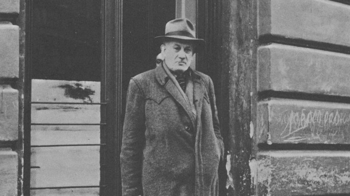
"A Poem - to the one who has reached it - is already a drink in itself; therefore, we are not surprised by those who do not pass through it, and consider the drink a poem."
TIN UJEVIĆ
NAME
We had Tin's poetry, but it was necessary to dive deeper into the glass and return to the very beginning. According to the Greek language, poetry means creativity. Further investigating, we came to ancient Rome, and one of it’s most famous poets - Horace, and his poem Ars Poetika, where we found the name of our gin - POETICA.
Poetica means the skill of creativity, craftsmanship - which perfectly corresponds to CRAFT gin.
It embodies the philosophy.
Alcohol has always been an artist's muse. Writers drank for pleasure or pose, in order to invigorate the soul, in honour of bohemians, following the literary tradition of drinking, imitating each other, out of desperation or addiction, curing love woes or some other ailments, out of rebellion and fear of death, in escape from loneliness or in the misery of emigration.
"If something bad happens you drink in an attempt to forget;
if something good happens you drink in order to celebrate;
and if nothing happens you drink to make something happen.. "
CHARLES BUKOWSKI
In one of his essays, Tin wrote: "Maybe there was a Baudelaire in me before there was an Ujević." Wine is poetry in a bottle, said Robert Louis Stevenson. Why not gin too?
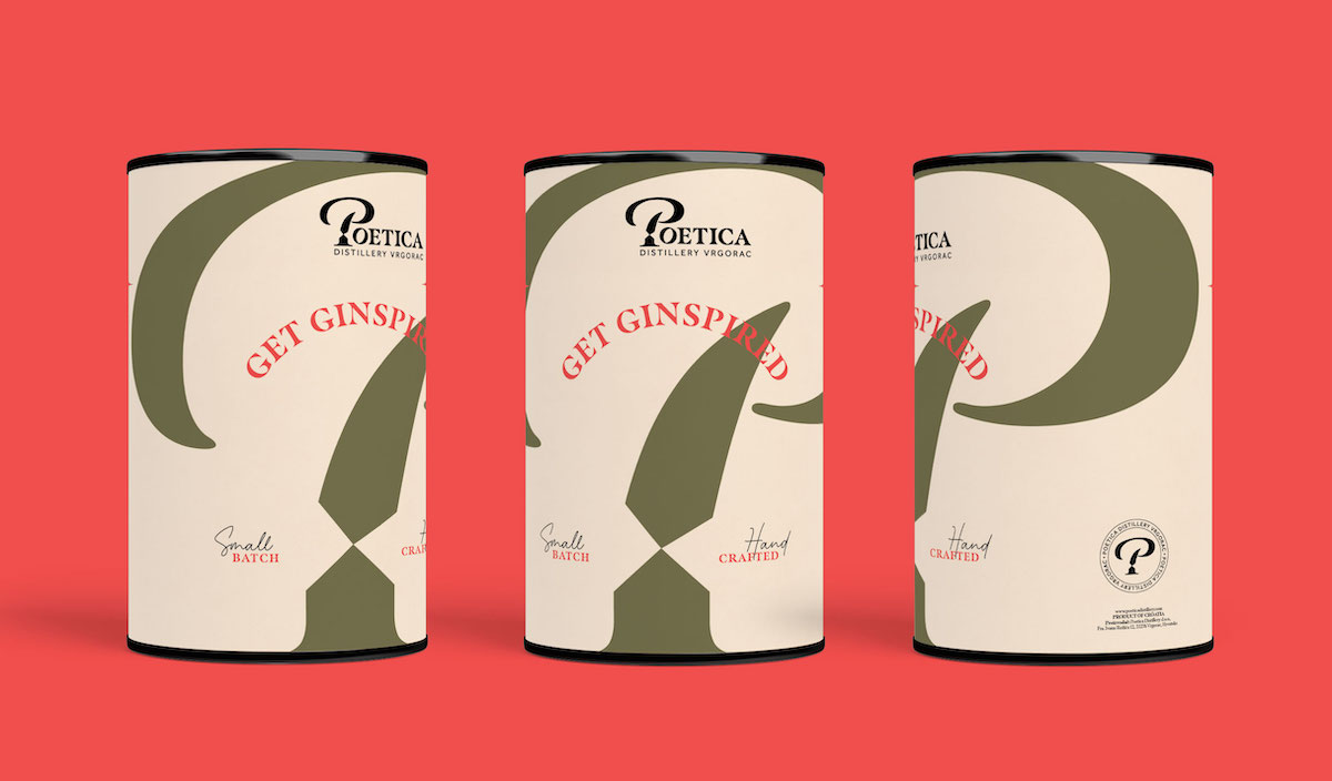
SLOGAN AND OTHER ELEMENTS OF VERBAL IDENTITY
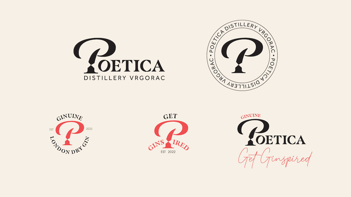
To add value to the originality of the concept, we added the word GINUINE to the name POETICA, in order to avoid the classic Craft gin signature. We had to choose between Original and Ginuine, since both words contain the word gin, but Ginuine sounds somehow more original than Original, as paradoxical as that sounds.
The aim of the slogan was to encourage people to take action, to think and discuss - which is the essence of Poetica.
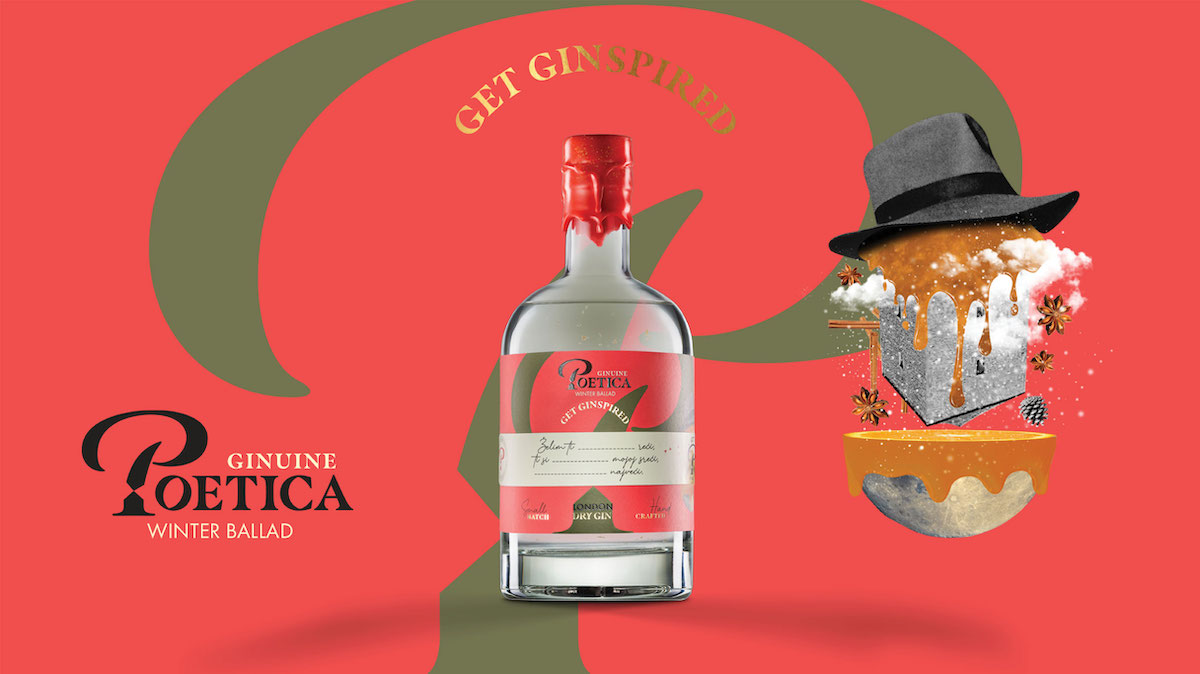
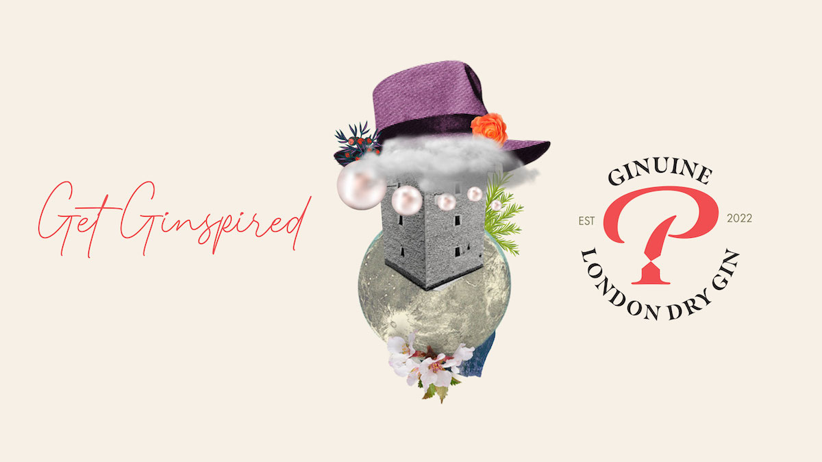
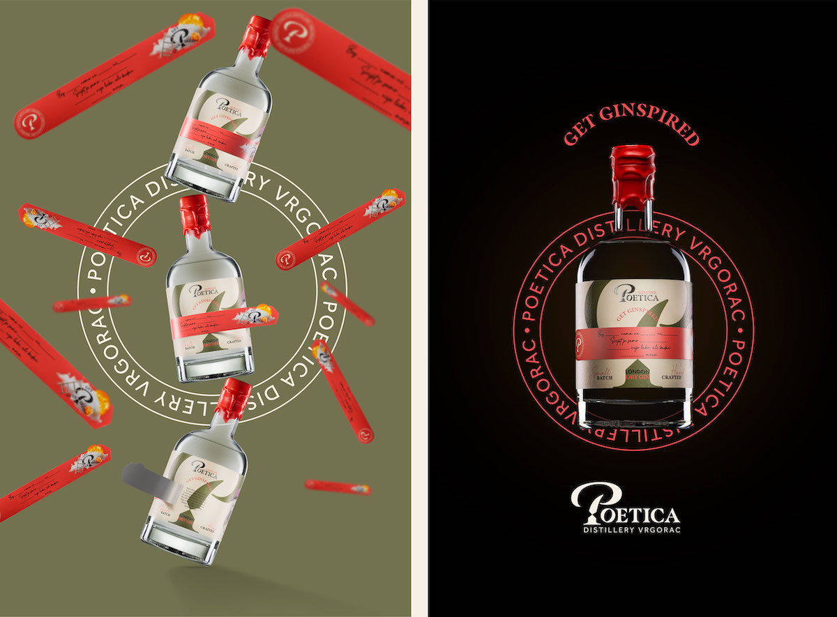
Get Ginspired did the job perfectly. Get inspired by taste, scent and poetry!
Visual identity
If verbal identity represents the beginning of every branding, than colours, atmosphere, visual context and the unavoidable logotype of the brand represent the beginning of every visual identity.
COLOURS, ATMOSPHERE AND LOGOTYPE
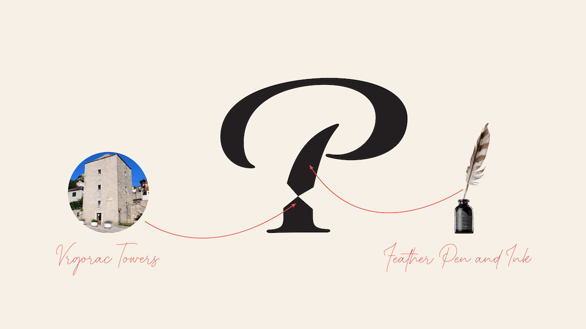
Green as a symbol of self-grown herbs that make gin and red as a symbol of passion and juniper berries that played a key role in the recipe, made the base.
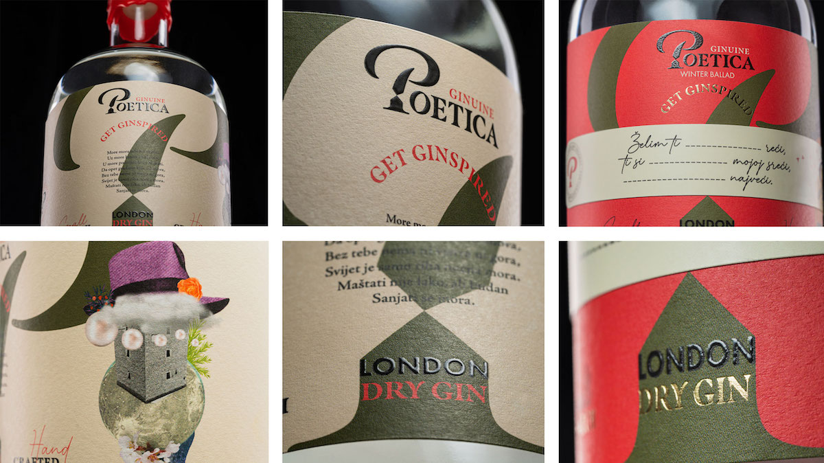
We found the inspiration for the logotype again in Vrgorac - the initial letter of the brand is stylised in the form of a pen dipped in ink, but it also has the form of the Vrgorac Tower, the birthplace of Tin Ujević. So symbolically, everything starts from Tin, from where he himself started. And then into the world of creativity, everyone following his own path. You only have to take a pen in one hand and a glass in the other.
We completed the logo with a slogan for which we chose a typography reminiscent of a handwritten one, just as if it came from Tin's own pen.
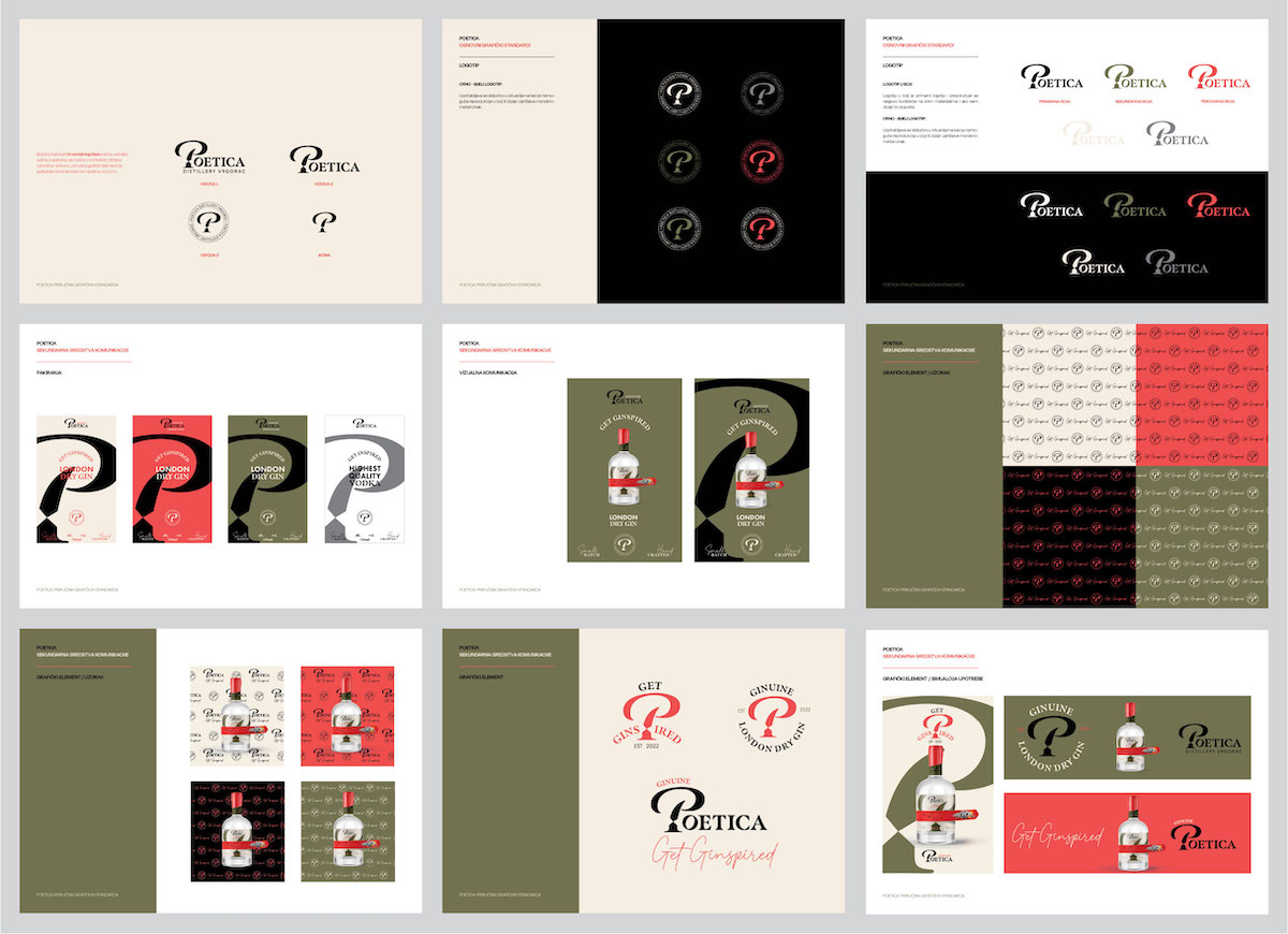
ILLUSTRATIONS
Visual communication was enriched with illustrations which contributed to the integrity of the concept: the unavoidable Tin's hat, the spinning top, ingredients, motifs from Tin's songs.
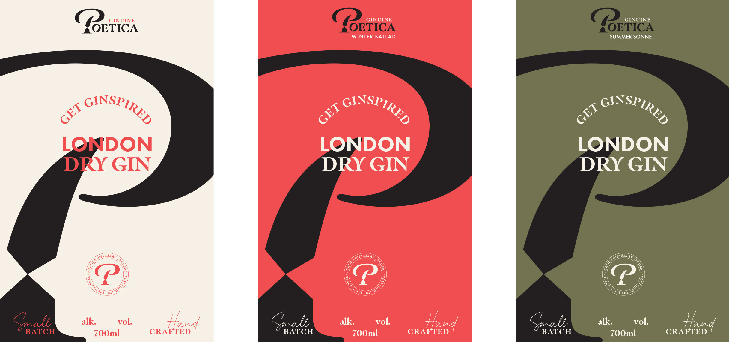
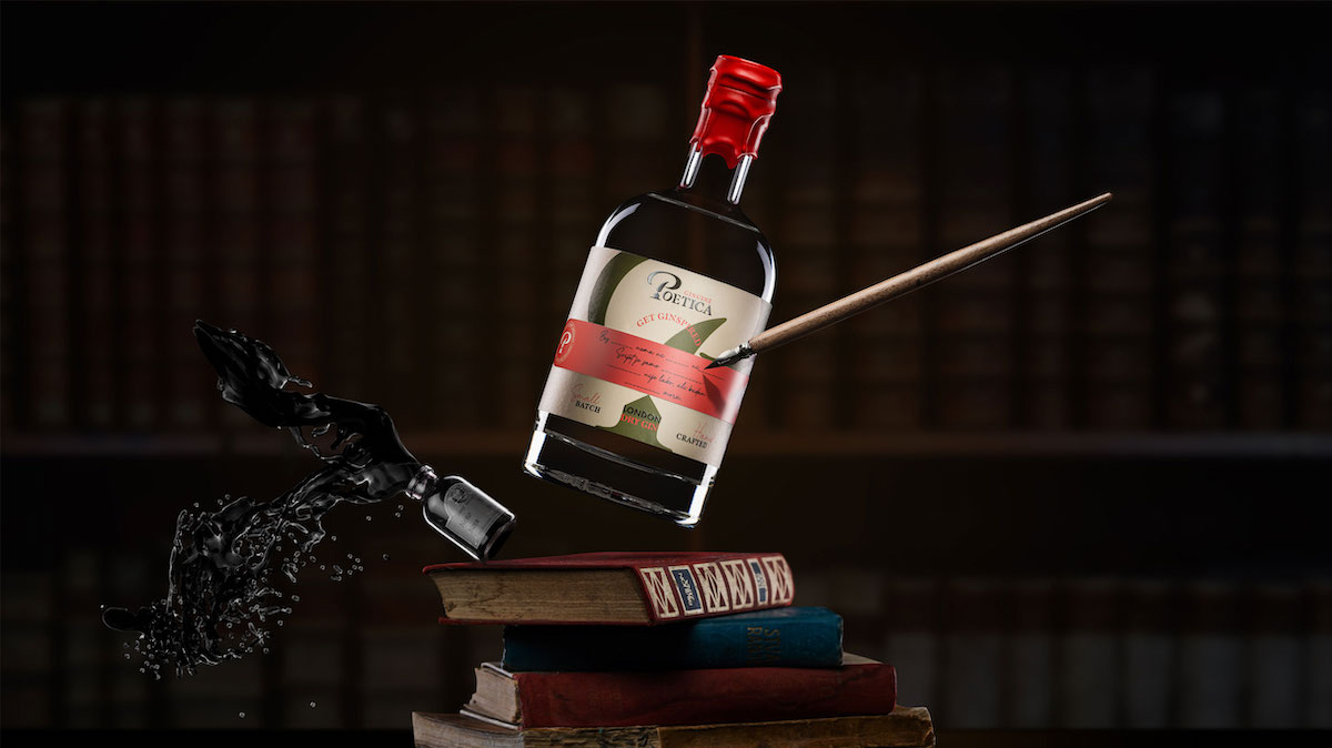
Label designs
It’s easy to tell a story, but to make people react is a whole other thing, in other words it’s easy to say get Ginspired, but how to really inspire and and get someone to create something?
During the process of label design, the whole team agreed we wanted something different and - distinct.
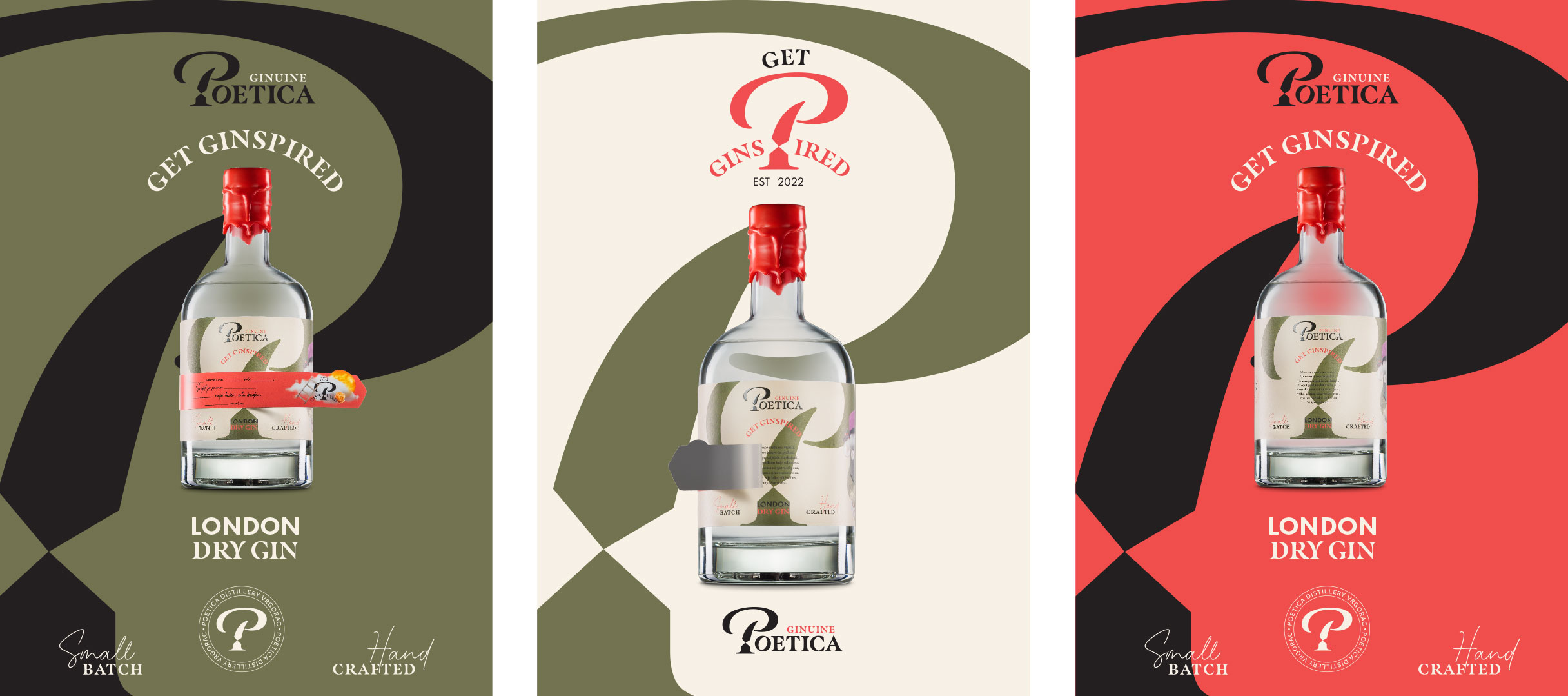
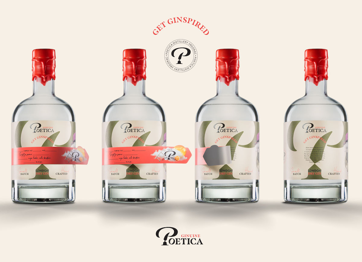
FUNCTION
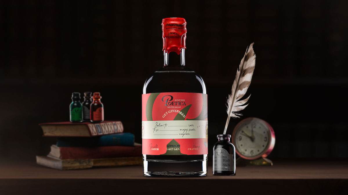
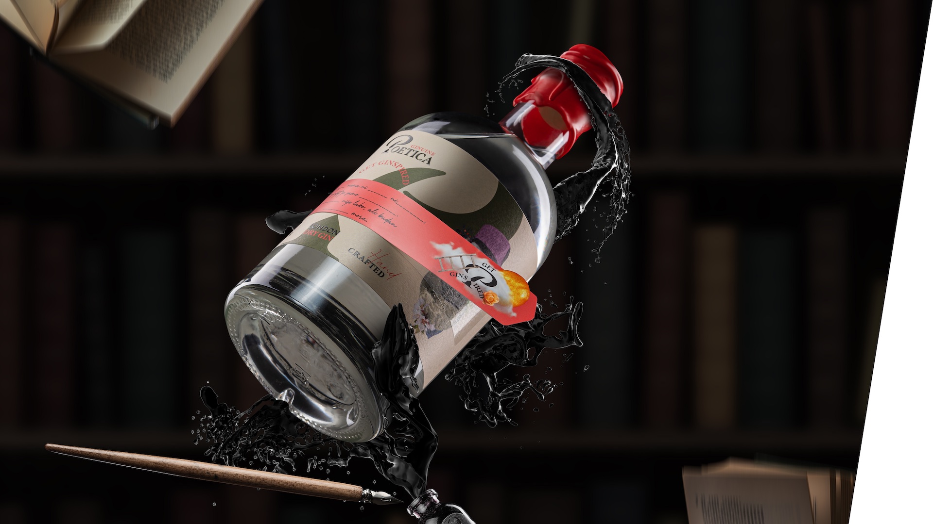
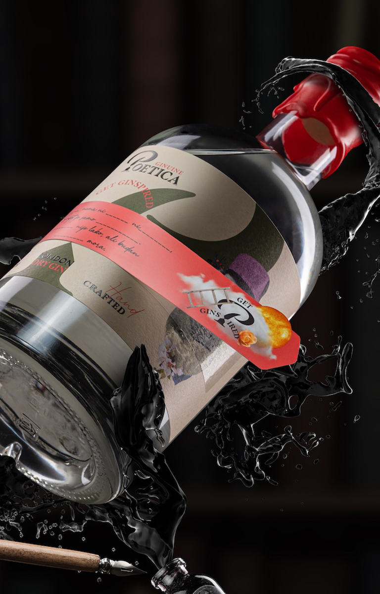
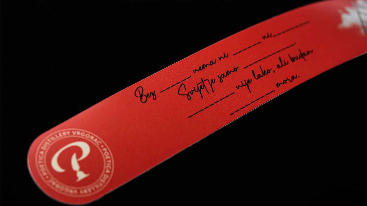
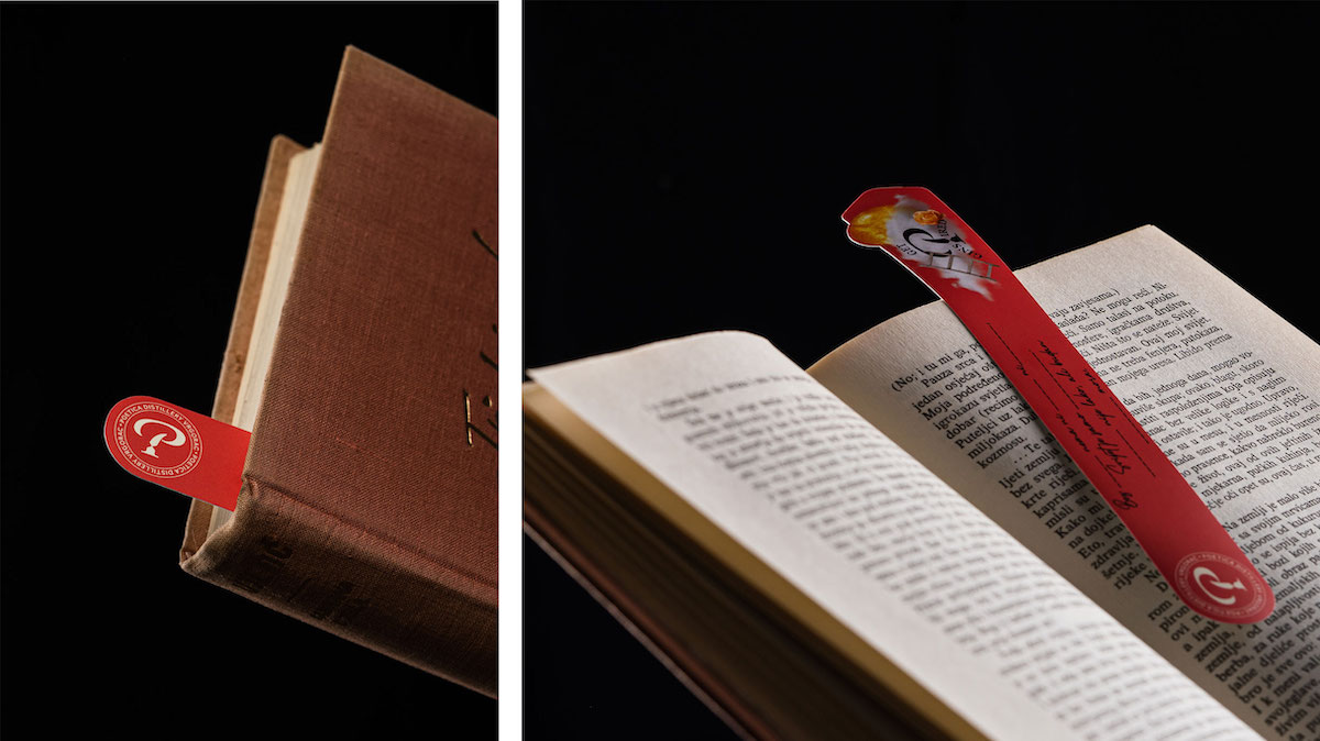
When you design a label, the first thing you need to solve is function. It’s clear that the purpose of the label isn’t solely to describe the product, what it’s made of etc. We wanted our label to have higher, bigger purpose. So, to a classic label we added a bookmark. This way, Poetica stays longer with you, it becomes the faithful companion of the progress you make through verses and lines of your favourite book.
When we solved the label function, we could add the bottle in to the picture - we wanted to make it a personalised gift and reach the level of creativity and intimacy we previously anticipated.
VERSES
Verses were added to the label in order to verbally evoke the essence of Poetica - describing the region from where it comes from, the passion with which it was created and it’s unique character.
"The sea should bring me back to you
and not forever keep
By the sea it’s the pearls that I shall weep,
By the sea it’s to stars that I shall leap,
To build castles in the air, to daydream again,
For without you there is no wind no mountain no rain,
The world is nothing, but a bad dream come true,
Dreaming is not easy but while awake
embrace what dreams may bring to you. "
We deliberately left out some of the words of our poetry on the bookmark, in order to encourage people's imagination and creativity - to fill in the missing words and dedicate it to a loved one when giving gin.
OTHER ELEMENTS
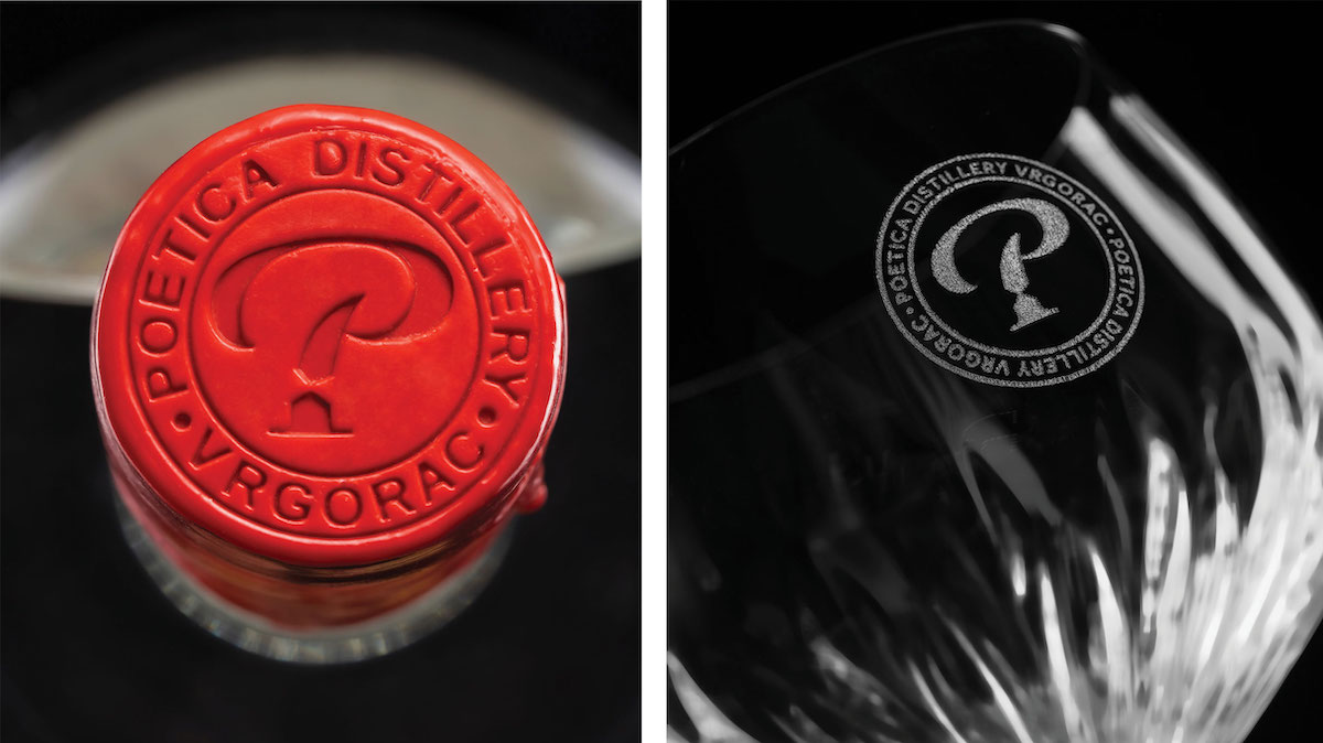
We also applied the elements of the visual identity to the cap of the bottle, using a stamp that is pressed in when placing the wax on the cap.
...and glasses; an indispensable element if we want to share gin with our loved ones.
And we have to admit, that's our favourite thing to do!