SIROLA
CLIENT
Dalibor ŠirolaYEAR
2021.SERVICES
LOGO REDESIGN NEW VISUAL COMMUNICATION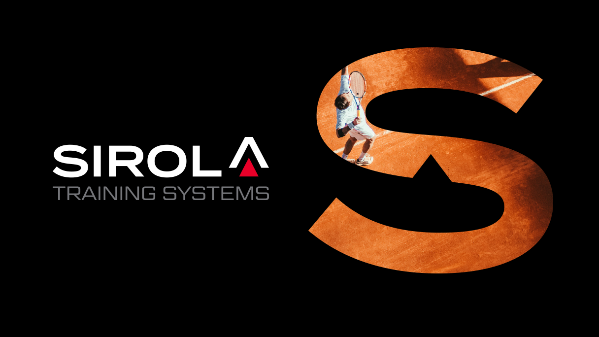
Dalibor Širola is a training expert and personal trainer with expertise in the field of tennis with more than 20 years of experience. He has coached many great athletes around the world, but in recent years he has mostly collaborated with tennis players. To his well established services he has also added the ones online. And for these very reasons, he wanted to modernise his existing brand and put the focus - on tennis players.
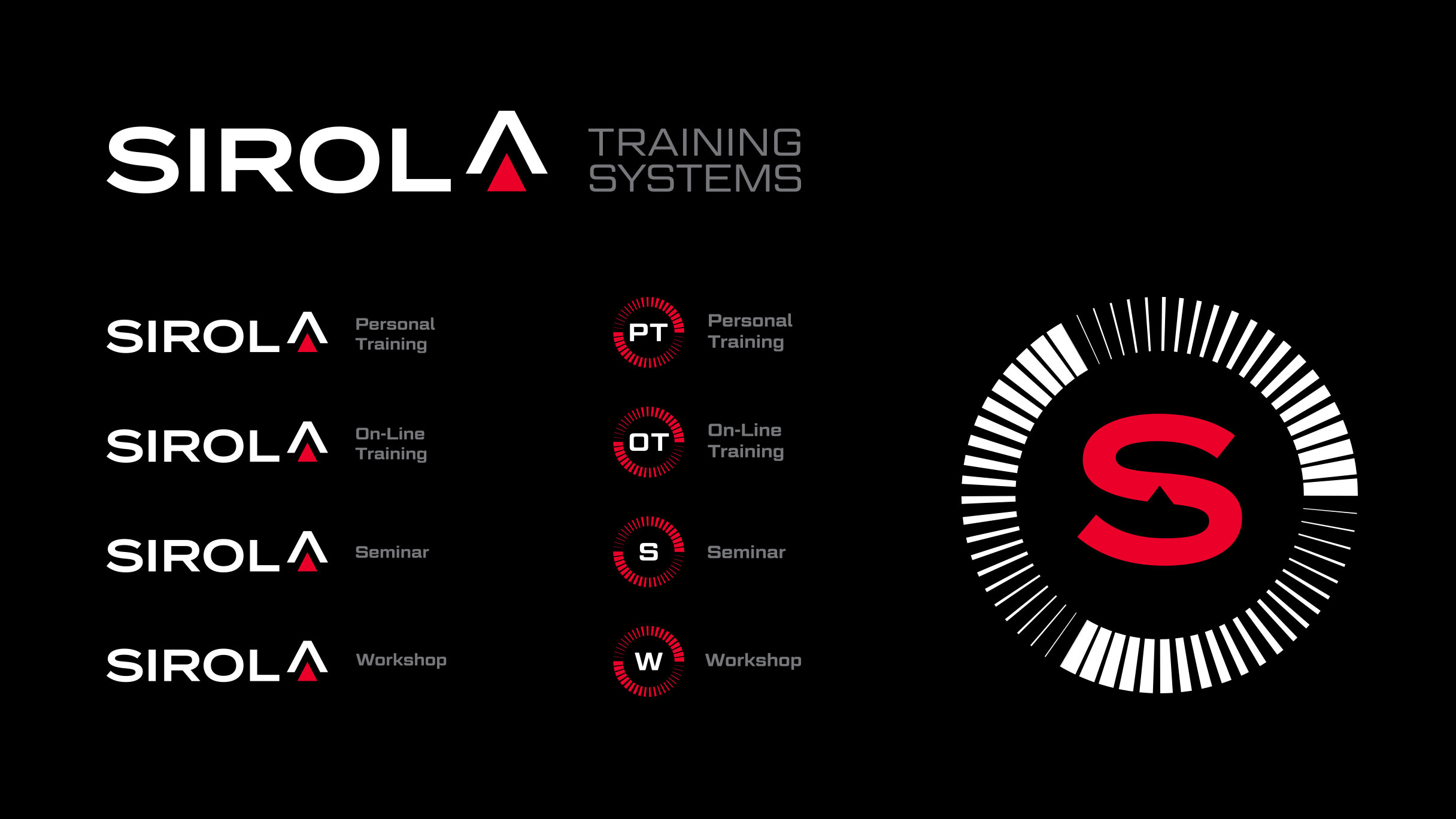
Logo redesign
The need for a complete rebranding is a result of the logo’s obsolesce, unclear communication and the redirection of the business focus strictly on tennis players Although the client is well known for his collaboration with athletes, he focused his activity mainly on tennis players of the world rank, specialising additionally the offered services; from personal trainings, seminars and workshops. The inclusion of the digital channels in the business demanded a new logo and visual communication adapted to those types of media.

The client required a new visual communication visible primarily on the web and on social media, with the focus on the surname Širola/Sirola.
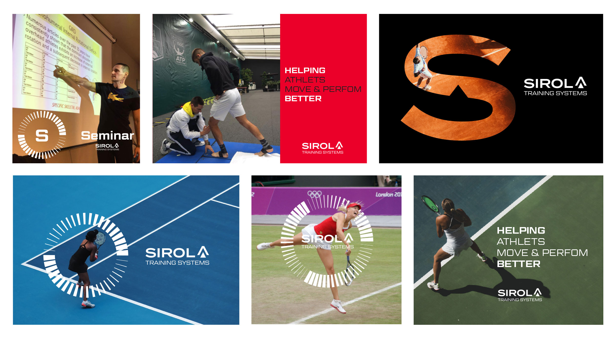
New visual communication
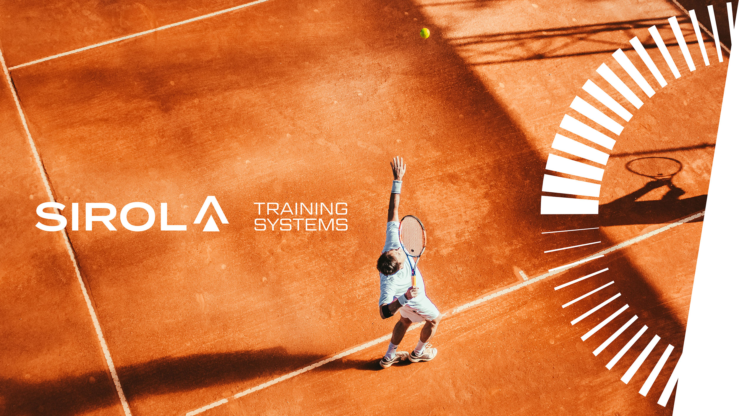
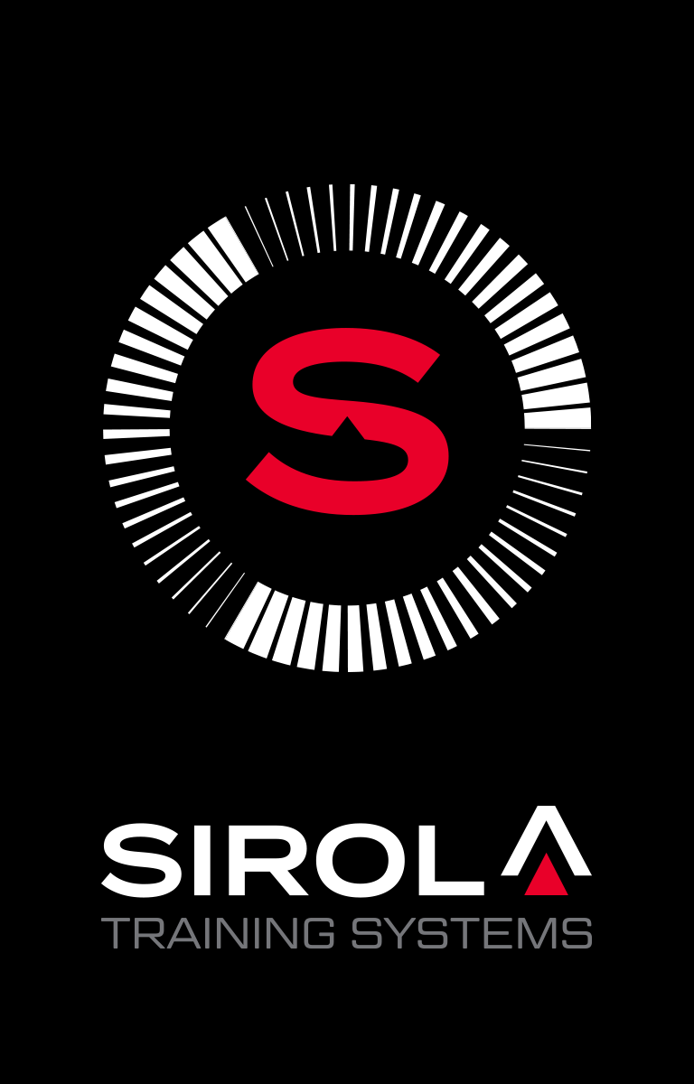
The design of the logo and the featured elements were inspired by the speed, the movement and the growth/progress of the athlete. Sirola training systems is focused on condition and performance improvements of the athlete thus the graphic element represent the speed and the progress. In the name Sirola, the focus was put on the last letter which is also the first letter of the alphabet: everything begins from the point A, that is why A was transformed into an arrow of growth symbolising growth and condition, movement and performance improvement.
